 Hogwarts
Basic CSS Style 1
root, font, background, css initialize, float, clear, object-fit
1. Base Settings 👩💻
1. Charset
CSS를 하기 위해 전역으로 설정하는 것들이 있다.
@charset "utf-8";
html 처럼 charset을 누락하면 브라우저가 기본값으로 utf-8을 사용하겠지만 명시해주는 것이 좋다.
2. Global Settings :root
그리고 전역으로 설정을 하고 시작해야 하는 것들이 존재하는데 다음과 같이 Pseudo-classes 중 :root 사용해 전역 변수로 사용할 수 있다.
:root {
  --emphasis-color: hotpink;
}
:root에 변수와 값을 정의한 다음
ul li:nth-of-type(2) {
  color: var(--emphasis-color);
}
var()함수를 이용해 변수를 가져다 사용한다.
3. Universal Selectors *
위에서 :root가 전역에 사용할 값을 변수로 처리할 수 있었다면 *는 모든 elements에 대해 값을 아예 지정한다.
ns|*: 네임스페이스 ns 안의 모든 요소 선택*|*: 모든 요소 선택|*: 네임스페이스 없는 모든 요소 선택
See the Pen Universal Selectors by SB Park (@sbpark88) on CodePen.
2. Selectors 👩💻
1. Elements & Class
Elements 와 Class 2가지 조건을 모두 주어 && 연산을 통해 좀 더 세분화된 선택을 할 수 있다.
pelements 중some__class인 것
p.some__class { }
2. Elements & Attributes with Value
Elements 와 Attributes 와 Values 를 주어 && 연산을 통해 세분화된 선택을 한다.
input[type="text"] { }
input[type="password"] { }
3. :nth-of-type & :nth-of-child
ulelements 의 모든 자식 중n번째li
ul li:nth-of-type(1) { }
ul li:nth-of-type(2n+1) { }
ul li:nth-of-type(even) { }
ul li:nth-of-type(odd) { }
ul li:nth-of-type(1) { }
ul li:first-of-type { }
ul li:last-of-type { }
ulelements 의 직계 자식 중n번째li
ul > li:nth-of-type(1) { }
ul > li:nth-of-type(2n+1) { }
ul > li:nth-of-type(even) { }
ul > li:nth-of-type(odd) { }
ul > li:nth-of-type(1) { }
ul > li:first-of-type { }
ul > li:last-of-type { }
See the Pen Untitled by SB Park (@sbpark88) on CodePen.
ulelements 의 모든 자식 중li를 찾은 다음 그li의 부모를 기준으로n번째 자식을 찾는다.
See the Pen Style : nth-of-child by SB Park (@sbpark88) on CodePen.
:nth-of-type은ul li의 경우li를 기준으로n번째를 찾지만,:nth-of-child는ul li를 먼저 찾은 다음 그li의 부모의n번째 자식을 찾는다. 따라서 HTML 이 변경될 경우 CSS 가 엉뚱한 곳에 적용될 수 있으며 예측하기가 힘들다.
3. Pseudo Classes
h1:hover {
  border: 1px solid red;
}
h1::before {
  content: "before content";
  color: blue;
}
h1::after {
  content: "after content";
  color: green;
}
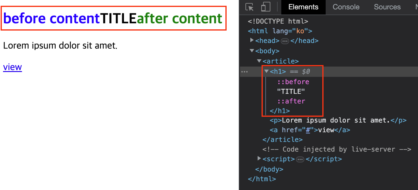
:before,:after를 이용하면 HTML 의 수정 없이도content를 가상으로 삽입할 수 있다.
뿐만 아니라:enabled,:disabled를 이용하면 attributes 의 추가 없이 간단하게 상태값을 변경할 수 있다. CSS 를 잘 다룰 수 있게 되면 DOM 을 수정하거나 JavaScript 에 의존하지 않고도 더 쉽고 간결하게 또한 더 높은 퍼포먼스를 갖도록 기능적인 것들을 처리하는 것도 가능하다.
3. Fonts 👩💻
1. HTML 을 기준으로 설정하기
/* HTML 기준 */
html {
  font-size: 16px; /* default 16px */
}
article h1 {
  font-size: 3rem; /* radio */
}
article p {
  font-size: 1rem;
}
article a {
  font-size: 0.8rem;
}
2. 부모를 기준으로 설정하기
/* 부모 기준 */
article {
  font-size: 30px; /* default 16px */
}
article h1 {
  font-size: 3em; /* radio */
}
article p {
  font-size: 2em;
}
article a {
  font-size: 0.8em;
}
비슷하게 절대값이 아닌 상대값을 사용하는 단위로 em도 존재한다. 근데 프로젝트가 커지면 부모 추적이 어려움. rem 을 쓰는게 낫다.
3. 반응형으로 설정하기
하지만 rem, em 모두 데스크탑 페이지를 기준으로 사용할 때 잘 어울리는 단위이다. 하지만 모바일 기준의 페이지를 만들 경우는 모바일
기기마다 화면 크기가 다르기 때문에 글씨 크기 역시 화면 크기에 맞게 유동적인게 더 유용한 경우가 있다.
이를 위해 vw, vh, vmin, vmax를 사용하면 화면 크기에 따라 글씨 크기가 반응하도록 할 수 있다.
article h1 {
  font-size: 6vw;
}
article p {
  font-size: 3.5vw;
}
article a {
  font-size: 3vw;
}
4. System Fonts
/* 한글 */
ul li:first-of-type {
  font-family: "바탕";
}
ul li:nth-of-type(2) {
  font-family: "굴림";
}

/* 영어 */
ul li:nth-of-type(3) {
  font-family: Verdana, Geneva, Tahoma, sans-serif;
}
ul li:nth-of-type(4) {
  font-family: 'Gill Sans', 'Gill Sans MT', Calibri, 'Trebuchet MS', sans-serif;
}
일반적으로 시스템에 기본 설치된 폰트를 말하며, 언어에 따라 설치된 폰트가 다르다.
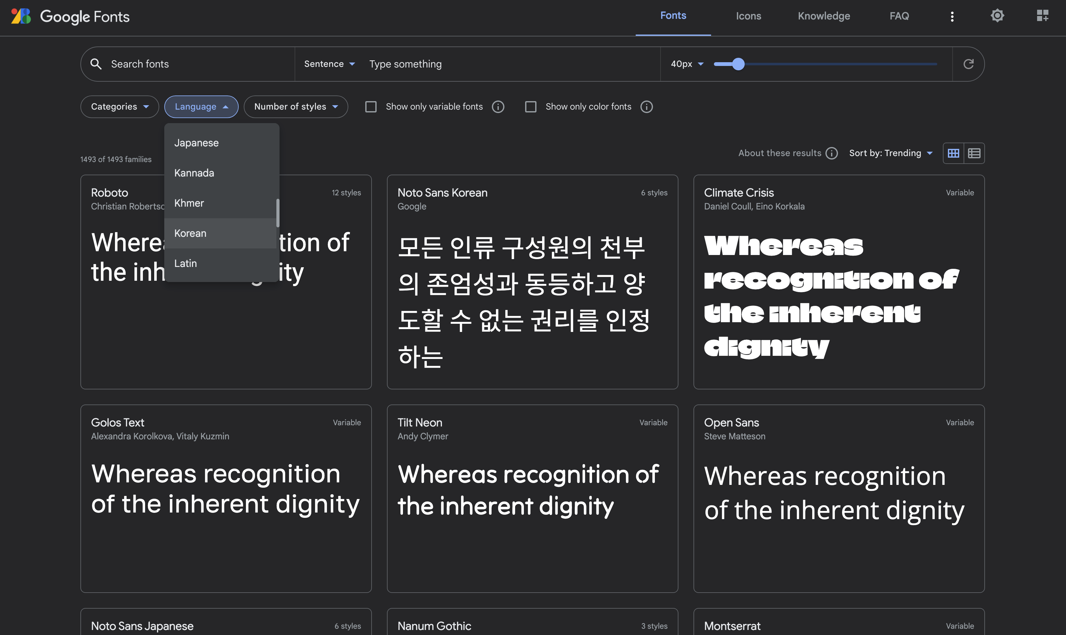
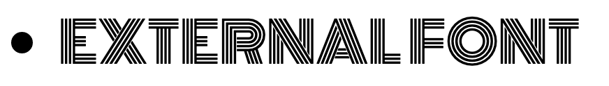
5. Web Fonts
시스템에 폰트 설치 유무와 상관 없이 어느 시스템에서나 동일 폰트를 사용할 수 있으면서 다양한 폰트를 사용할 수 있도록 웹 폰트를 사용하도록 설정할 수 있다.
Google Fonts 를 방문해보자.
ul li:last-of-type {
  font-family: 'Monoton', cursive;
}
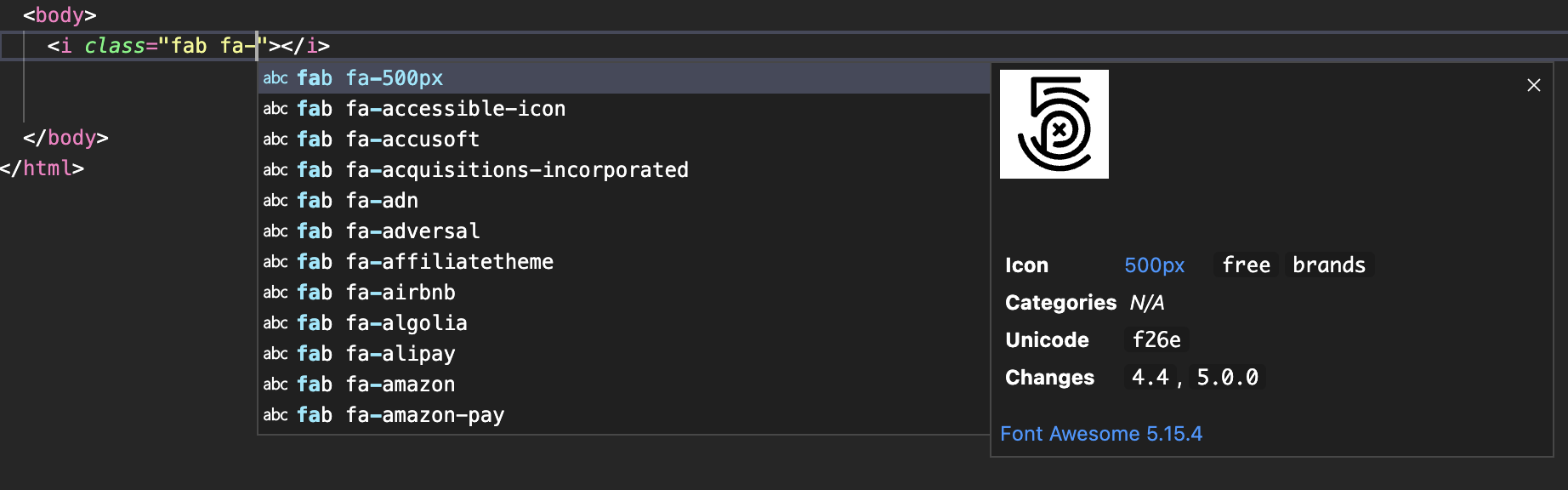
6. Font Awesome
Font Awesome 은 폰트를 이용해 Icons 이미지처럼 보이게 디자인 가능한 외부 라이브러리다.
예를 들어 😀🫠👏☀ ︎⚄ ❆ 이런 아이들은 폰트 아이콘이다. images 요소는 아니지만 이미지처럼 사용할 수 있는 특수문자 폰트다.
이런 것을 가능하게 해주는 라이브러리라 생각하면 된다. 문제는 애플 기기나 최신 안드로이드 기기에서는 정상적으로 표현이 되지만 윈도우 기기는
아이콘이 투박하게 보이기도 하고 웹에서 디자인을 위해 사용하기에는 아이콘 종류가 턱없이 부족하다.
Font Awesome 의 .js 라이브러리를 추가하면 i 태그의 class 에 fab fa-를 치면 자동완성이 되며 목록을 보여준다(근데 막상
해보니 fab fa- 뒤에 abc 등을 작성해야 자동완성이 뜨고 자동완성 단축키 또는 한 글자만 더 쳤을때는 잘 안 뜬다. 자동완성 목록은
나오는데 아이콘 미리보기가 안 될 때는 control + space를 치면 미리보기 자동완성이 뜬다.).
<p>
  <i class="fab fa-apple"></i>
</p>
<p>
  <i class="fab fa-apple">apple</i>
</p>
<p>
  <i class="fab fa-apple"> apple</i>
</p>
<p>
  <i class="fab fab fa-android"></i>
</p>
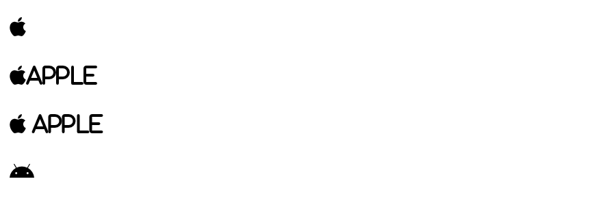
폰트인 만큼 크기 조절이나 좌우 배치, 색상 조정 역시 쉽다는 장점이 있다.
p i.fa-apple {
  font-size: 50px;
  color: darkslategray
}
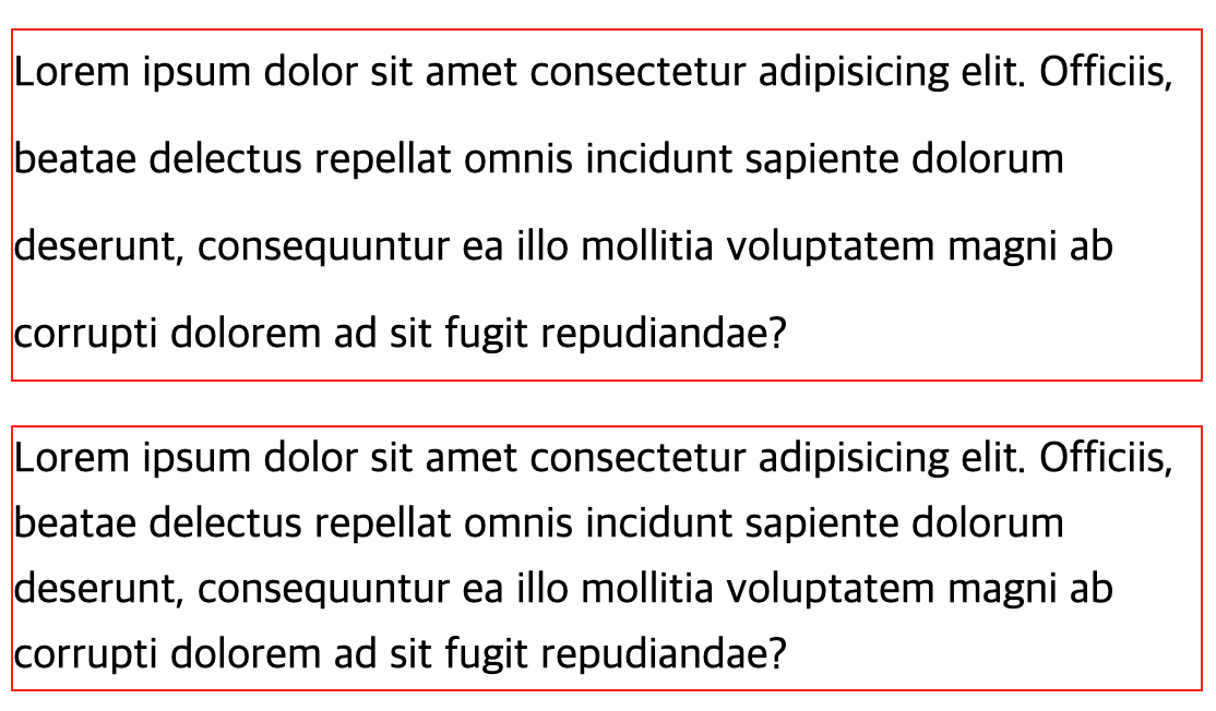
7. Line Height
.text1 {
  font-size: 20px;
  line-height: 40px;
  border: 1px solid red;
}
.text2 {
  font-size: 20px;
  line-height: 1.5;
  border: 1px solid red;
}
line-height를 비율로 줄 수 있다. 1은 위아래 글자 사이의 간격이 없음을 의미하고, 1.5는 글자 크기의 1.5 배, 그러니까
이 경우 30px이 되어 글자 자신의 크기인 20px 를 제외하면 10px 이 위아래로 각각 5px 씩 여백을 차지한다.
그리고 디자인 적으로는 padding요소처럼 글자 사이 간격이 조절되어 margin collapse와 같이 중복이 무시되지는 않는 것으로 보인다.
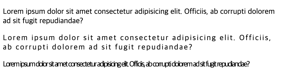
8. Letter Spacing
p:nth-of-type(1) {
  letter-spacing: 0px;
}
p:nth-of-type(2) {
  letter-spacing: 2px;
}
p:nth-of-type(3) {
  letter-spacing: -2px;
}
9. Block Size
article {
  border: 1px solid red;
  margin: 10px 0;
}
article:nth-of-type(1) {
  width: 100px;
  height: 100px;
}
article:nth-of-type(2) {
  width: 20%;
  height: 20%;
}
article:nth-of-type(3) {
  width: 20vw;
  height: 20vw;
}
article:nth-of-type(4) {
  width: 20vh;
  height: 20vh;
}
article:nth-of-type(5) {
  width: 20vmin;
  height: 20vmin;
}
article:nth-of-type(6) {
  width: 20vmax;
  height: 20vmax;
}
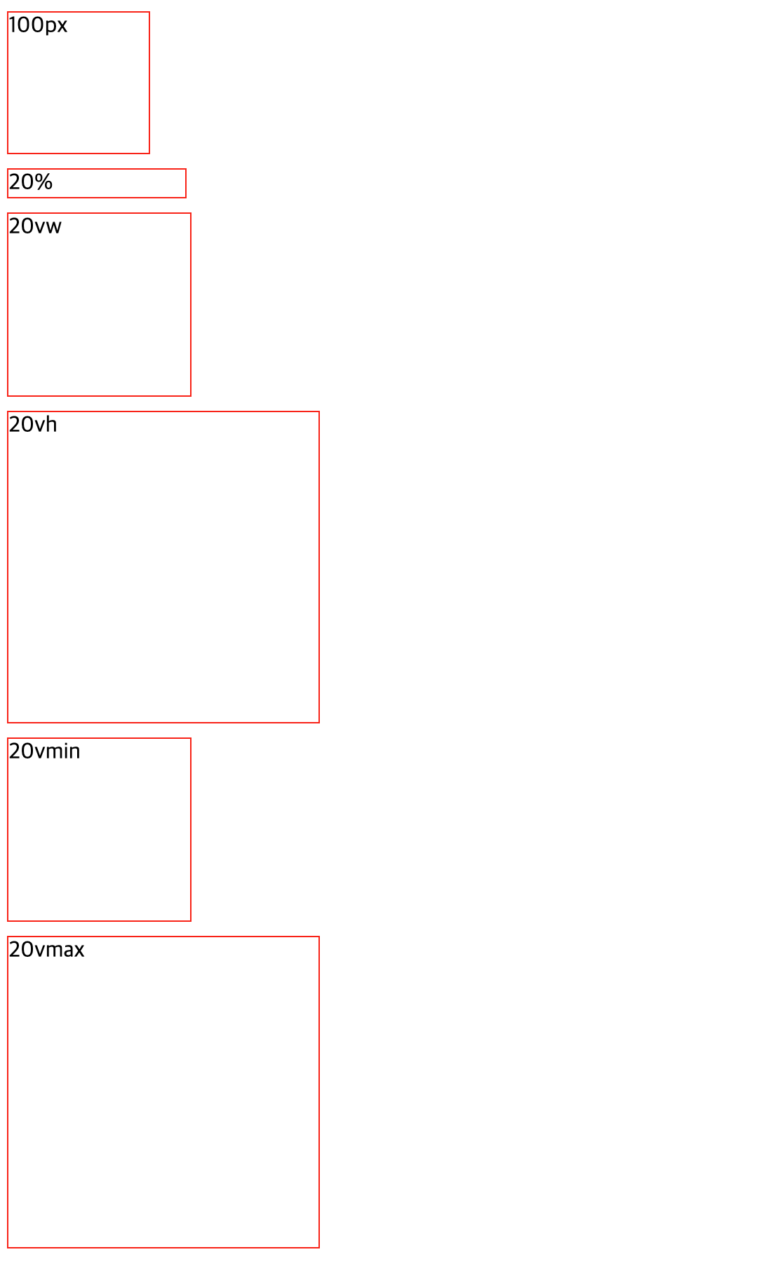
%는 높이를 지정할 때 부모의 크기가 없다면 무시된다.
10. Box Sizing
<article><div>box1</div></article>
<article><div>box2</div></article>
<article><div>box3</div></article>
article {
  width: 100px;
  height: 100px;
  border: 1px solid red;
}
article > div {
  width: 100%;
  height: 100%;
  background-color: bisque;
}
article:nth-of-type(1) {
  padding: 0;
}
article:nth-of-type(2) {
  padding: 20px;
}
article:nth-of-type(3) {
  padding: 20px;
  box-sizing: border-box;
}
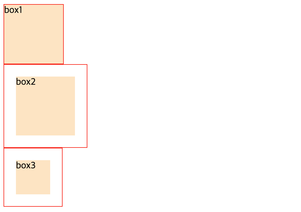
padding을 주면 의도치 않게 margin을 줄때마냥 화면에서 차지하는 공간의 크기가 변경되는 문제가 있었는데, 이럴때 이 block 요소의
box 크기를 box-sizing: border-box;를 주어 고정할 수 있다.
11. Inline
<p>
  블록 요소 태그는 자동 줄 바꿈 됩니다.
</p>
<p>
  <span>
    <strong>인라인 요소 태그</strong> 등은 <em>좌우로</em> 배치됩니다.
  </span>
</p>
p {
  border: 1px solid red;
  height: 100px;
}
strong, em {
  border: 1px solid blue;
  width: 50px;
  height: 50px;
}
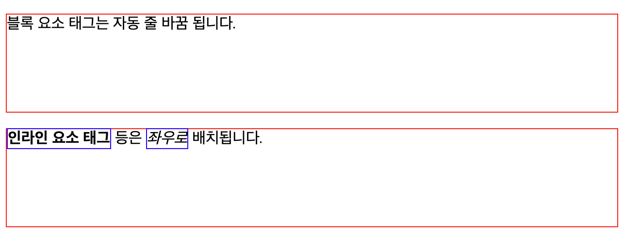
block요소 태그와 달리inline요소 태그는 영역을 잡기 위함이 아니라 글자를 꾸며주거나 서식의 기능을 배치하기 위한 것이기 때문에 기본적으로widht,height와 같은block을 다루는 설정은 무시된다.
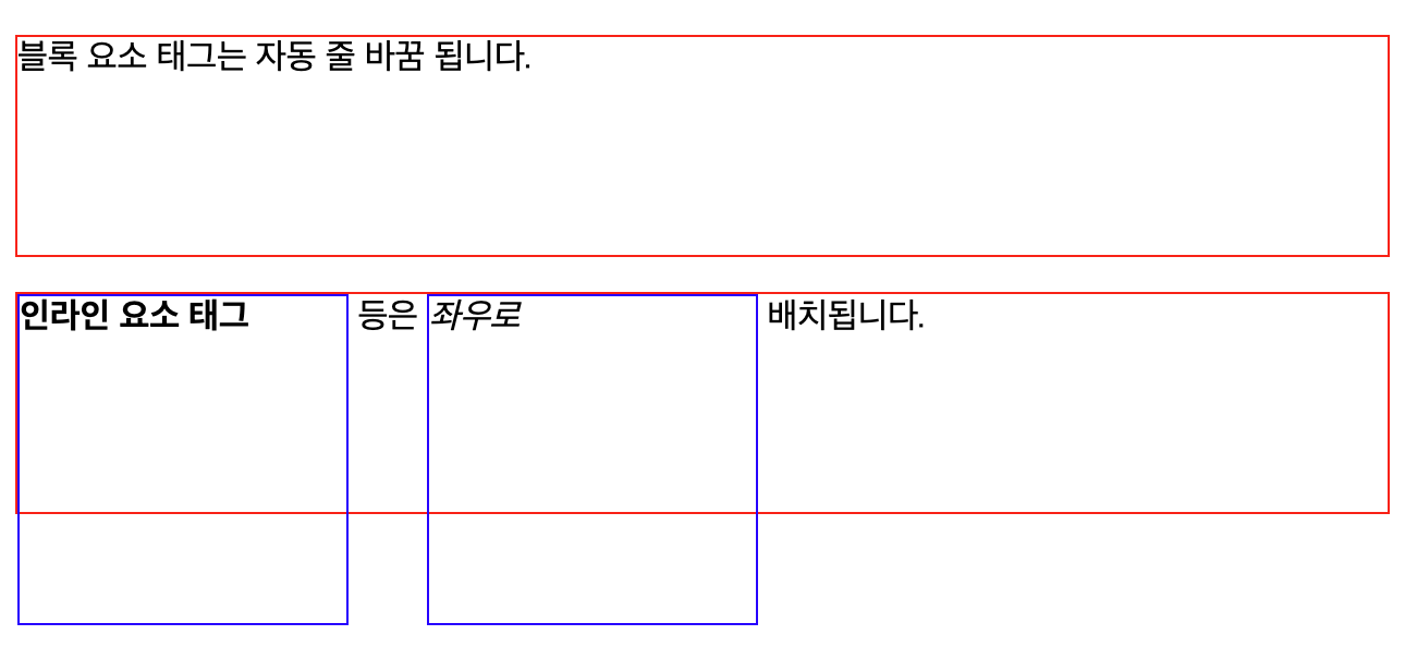
우리는 이 display 설정을 변경할 수 있다.
strong, em {
  border: 1px solid blue;
  display: inline-block;
}
display 속성값을 inline-block으로 주면 기본적으로 inline으로 작동하고,
width나 height같은 block 속성을 주게되면 inline과 block의 속성을 모두 갖는다.
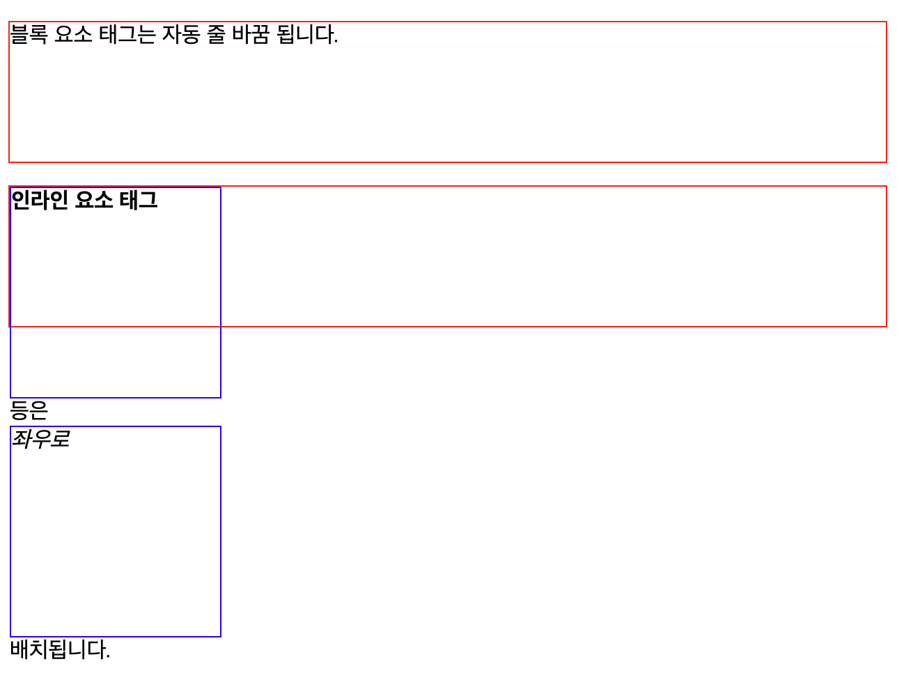
strong, em {
  border: 1px solid blue;
  display: inline-block;
  width: 150px;
  height: 150px;
}
만약, display의 속성값을 block으로 주게되면 inline 요소는 무시되고 block 요소처럼 작동한다.
strong, em {
  border: 1px solid blue;
  display: block;
  width: 150px;
  height: 150px;
}
4. Backgrounds 👩💻
기본적으로 CSS 를 이용해 배경 이미지를 다음과 같이 줄 수 있다.
section {
  width: 300px;
  height: 200px;
  border: 1px solid black;
  background-image: url("../asstes/images/greendreamtree.png");
  background-repeat: no-repeat;
  background-size: cover;
  background-position: left center;
}
background-position은 가로축, 세로축 순으로 설정하며, px, %, vw, vh, vmin, vmax와 같은 단위는 물론이고,
left/center/right와 top/center/bottom을 사용할 수도 있다.
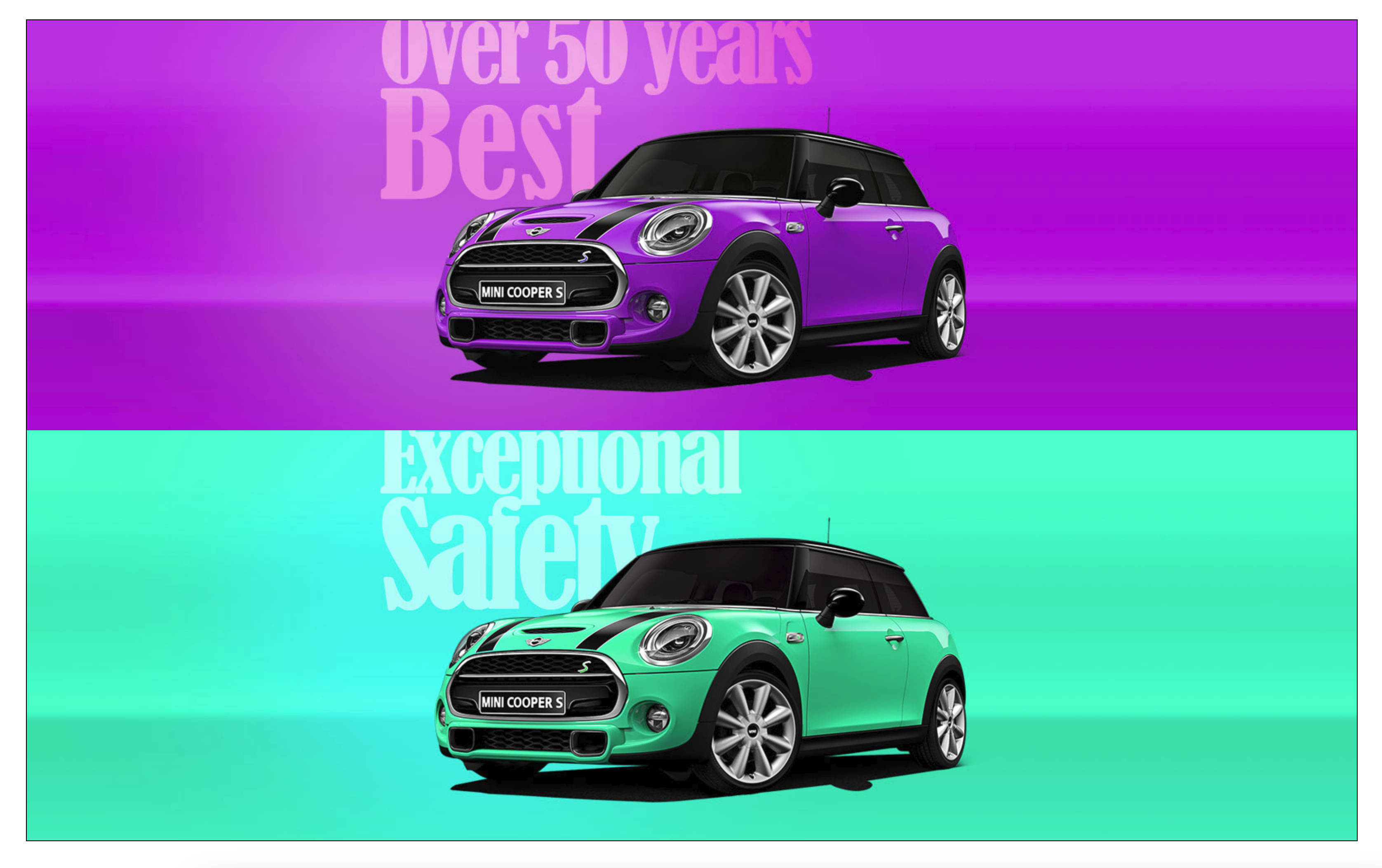
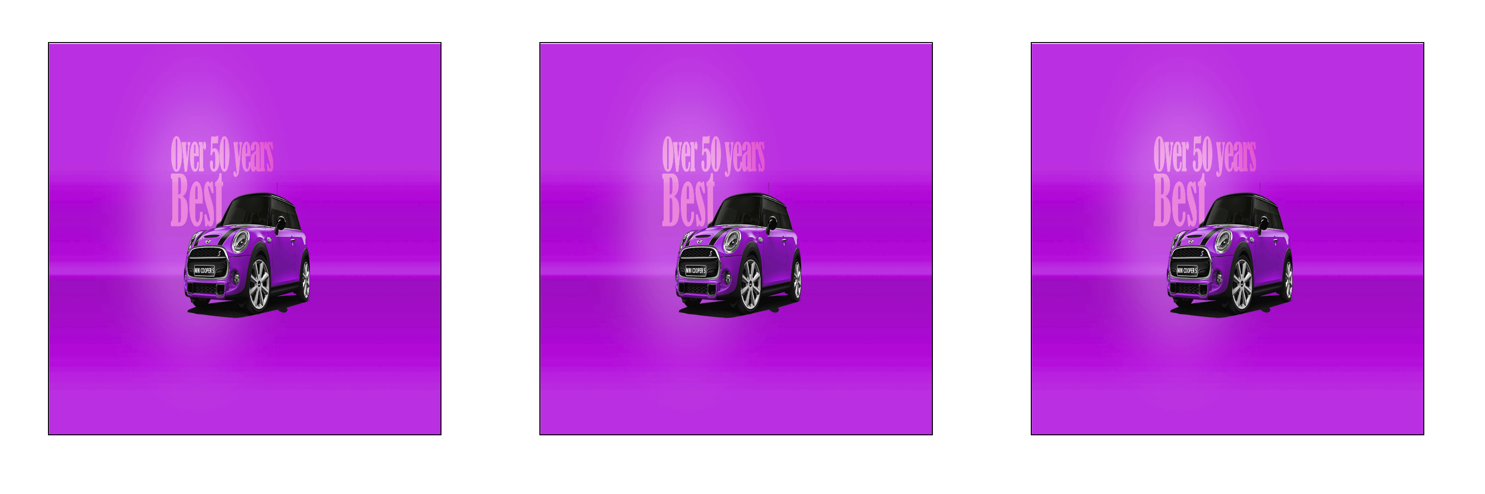
그리고 이미지 2장을 이용해 다음과 같은 처리를 하는 것이 가능하다. 다음 2 이미지를 이용해 하나의 이미지처럼 합쳐서 표현해본다.
<section>
  <article></article>
  <article></article>
</section>
section {
  width: 90vw;
  height: 90vh;
  margin: 5vh auto;
  border: 1px solid #000;
}
section article {
  width: 100%;
  height: 50%;
  background-repeat: no-repeat;
  background-position: center center;
}
section article:nth-of-type(1) {
  background-image: url("../img/car1.jpg");
}
section article:nth-of-type(2) {
  background-image: url("../img/car2.jpg");
}
section article {
  width: 100%;
  height: 50%;
  background-repeat: no-repeat;
  background-position: center center;
}
이렇게 하면 각 section의 이미지가 가운데 온다.
section {
width: 90vw;
height: 90vh;
margin: 5vh auto;
border: 1px solid #000;
}
section article {
width: 100%;
height: 50%;
background-repeat: no-repeat;
background-position: center center;
}
section article:nth-of-type(1) {
background-image: url("../img/car1.jpg");
}
section article:nth-of-type(2) {
background-image: url("../img/car2.jpg");
}
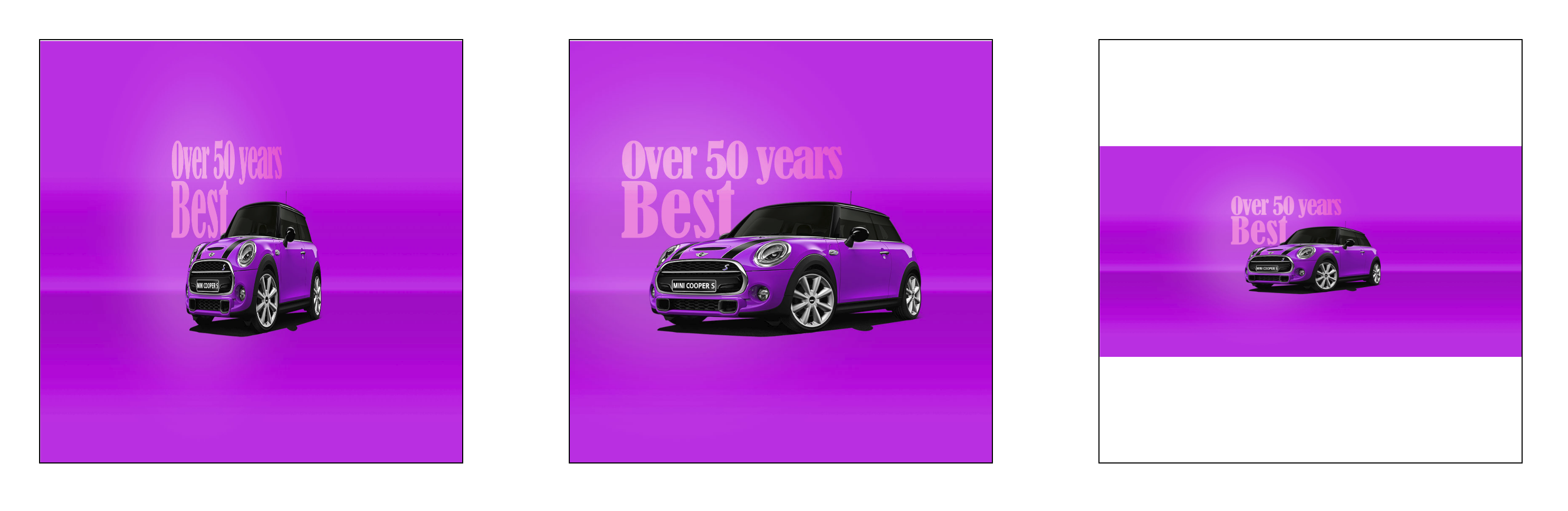
section article {
width: 100%;
height: 50%;
background-repeat: no-repeat;
background-position: center center;
background-attachment: fixed;
}
이미지 하나에 background-attachment: fixed;를 주어 하나를 다른 background 요소와 영향을 미치지 않도록 고정시켜주면
다른 하나 역시 영향을 미치는 background 가 없으므로 아래와 같이 하나의 이미지로 합쳐진 것처럼 보이게 할 수 있다.
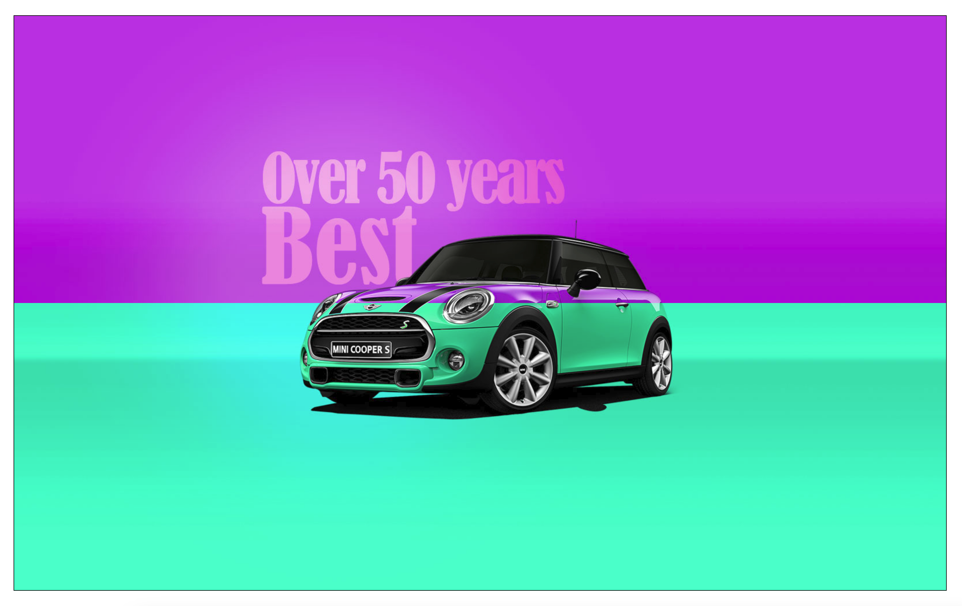
position: fixed;처럼 화면에 아예 고정되지 않는다. 스크롤 하면 태그가 움직이니 같이 따라간다.
5. CSS Initialize 👩💻
<article>
  <ul>
    <li>list</li>
    <li>list</li>
  </ul>
  <a href="#">link</a>
</article>
article {
  border: 1px solid red;
}
ul li {
  border: 1px solid blue;
}
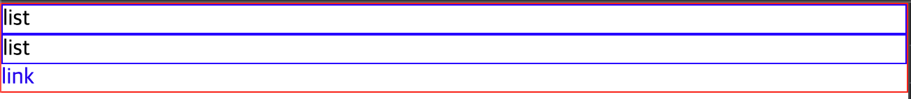
우리가 별도의 스타일을 지정하지 않아도 브라우저마다 특정 태그들의 스타일을 표현해주는 스타일이 존재한다.
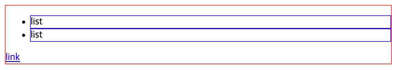
물론 이것들이 기본적인 디자인을 도와주지만 디자인을 하다보면 커스텀에 방해가 되는 상황이 발생한다. 이런 기본 디자인을 없애는 것을
CSS 초기화라고 부른다.
위에서 a태그의 밑줄을 제거하고, 모든 태그의 기본 padding, margin을 제거하고, ul, ol과 같은 태그의 꾸미기 스타일을 제거
하도록 해보자.
* {
  margin: 0px;
  padding: 0px;
}
ul, ol {
  list-style: none;
}
a {
  text-decoration: none;
}
6. Layout Positions 👩💻
1. Float & clear
block은 기본적으로 자신의 block 내에서 좌우 공간을 모두 사용한다. 그리고 이런 block 요소들은 inline 속성을 갖는
span 태그로 감싸는 것이 불가능하다(강제로 감싸봤자 잘못된 것으로 인식하고 브라우저는 이를 무시한다).
이런 block 요소들을 강제로 좌우 배치하기위해 사용하는 것이 float이다.
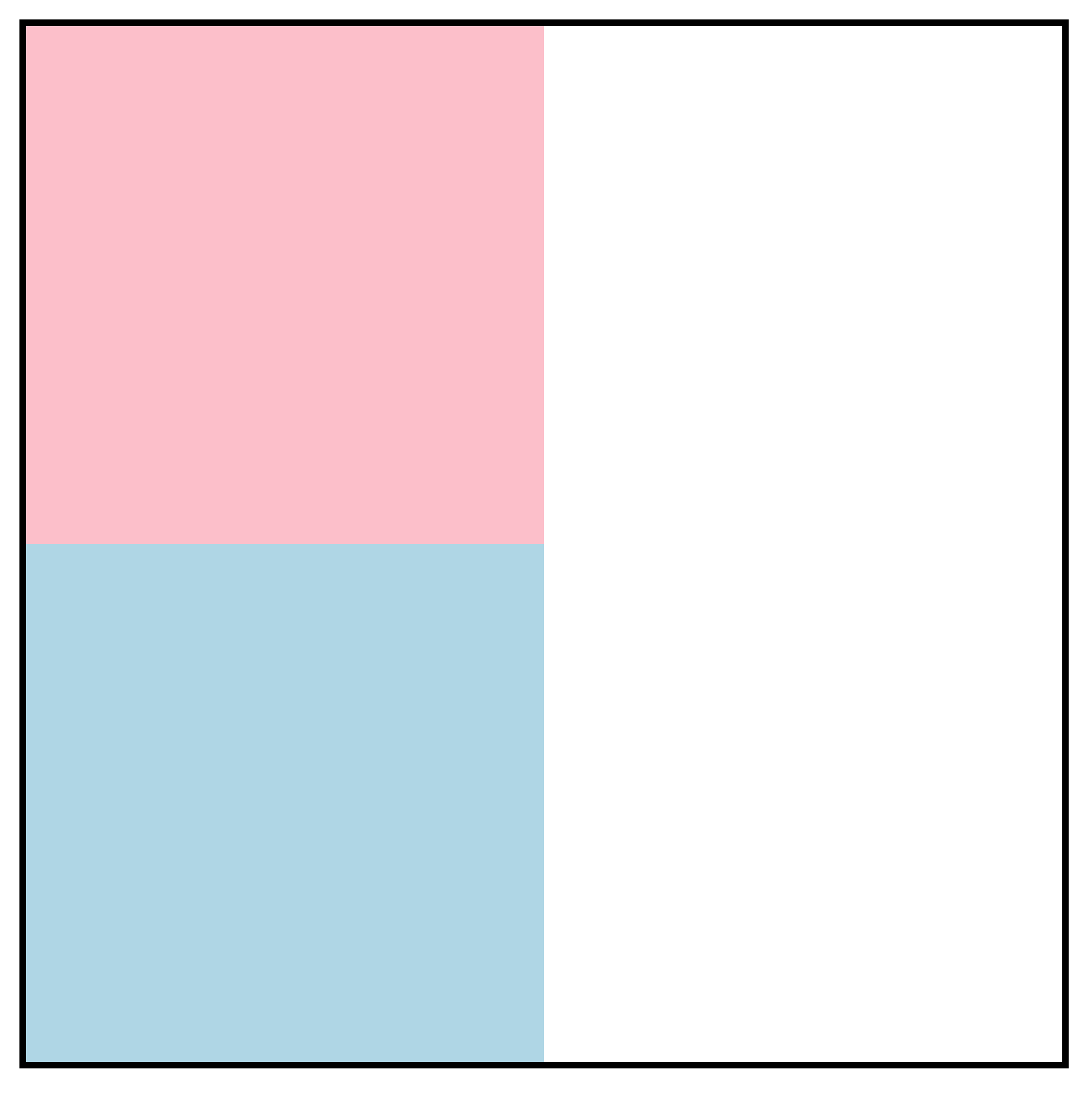
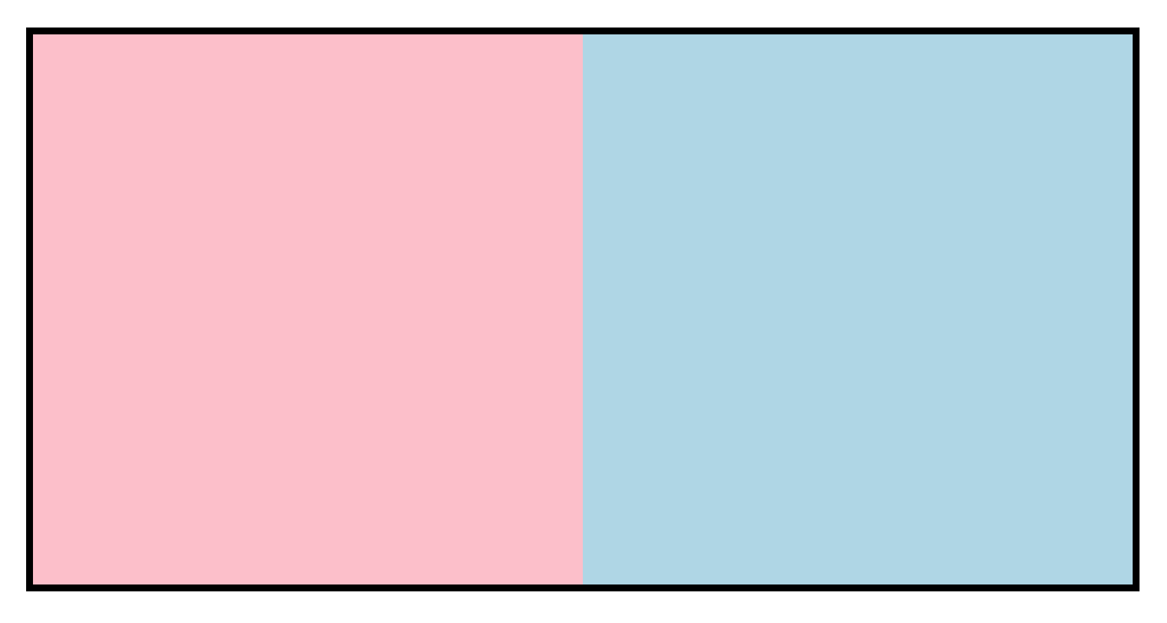
- block 요소의 기본 상하 배치
<div class="wrap">
  <section class="left"></section>
  <section class="right"></section>
</div>
.wrap {
  width: 800px;
  margin: 100px auto;
  border: 5px solid black;
}
.wrap .left {
  width: 400px;
  height: 400px;
  background-color: pink;
}
.wrap .right {
  width: 400px;
  height: 400px;
  background-color: lightblue;
}
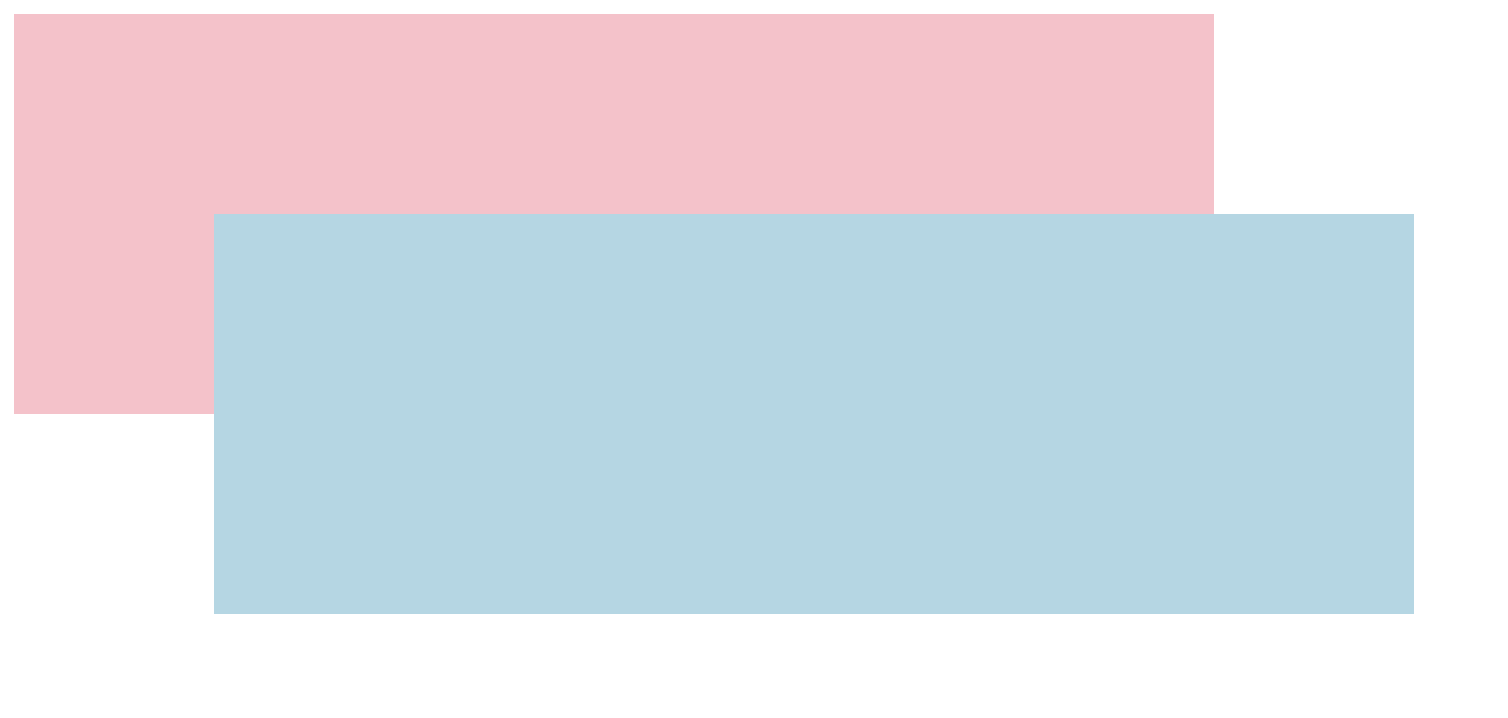
.wrap .left {
  width: 400px;
  height: 400px;
  background-color: pink;
  float: left;
}
.wrap .right {
  width: 400px;
  height: 400px;
  background-color: lightblue;
  float: left;
}
여기에 위와 같이 float을 추가하면 float은 기본 레이어에서 분리되어 float의 레이어 공간에서 inline 요소처럼 움직인다.
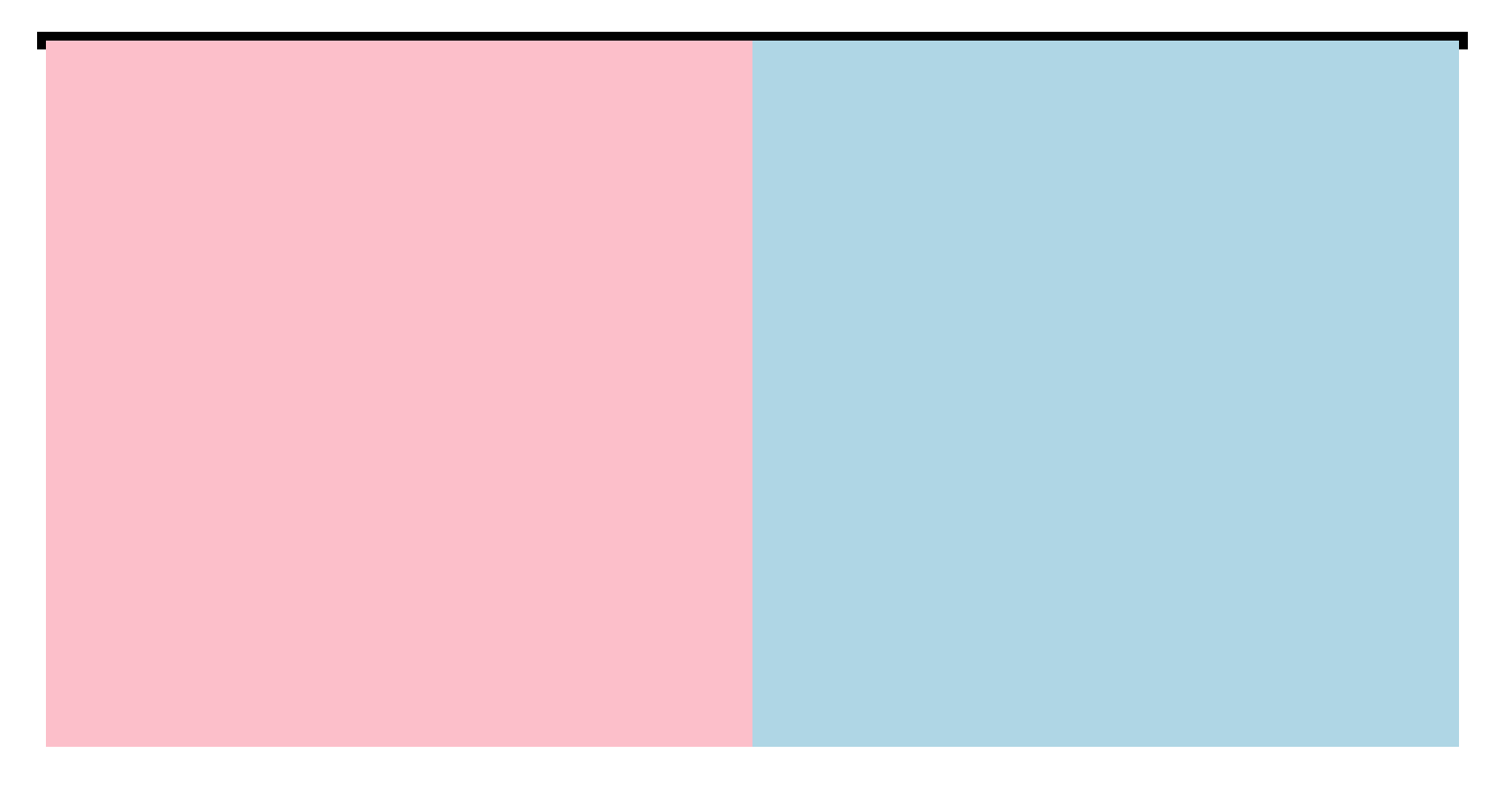
하지만 또 다른 문제가 생겼다. warp이 자식 요소들이 float 레이어에 배치되는 바람에 자신의 자식이 없는 것으로 인식해 높이가
작동하지 않는다.
float 을 부모 태그에 가두려면 반드시 가두려는 부모에서 float 을 clear 해줘야한다. 일반적으로 이를 해결하는 방법은 2가지가 존재한다.
1 ) 부모의 ::after에 content: ''; display: block; clear: both; 적용하기
Pseudo Classes 중 ::after를 이용해 빈 content 를 넣어주고, block 요소로 정의한 다음
clear:both를 넣어주면 가상의 공간을 강제로 인식하도록 해 정상적인 표현이 가능해진다.
.wrap::after {
  content: '';
  display: block;
  clear: both;
}
.wrap::after {
  content: '';
  display: block;
  clear: both;
}
는 거의 상용구처럼 사용되는 용법이니 외웠다 그대로 사용해도 무방하다.
2 ) 부모에 display: flow-root; 적용하기
.wrap {
  width: 800px;
  margin: 100px auto;
  border: 5px solid black;
  display: flow-root;
}
별도의 Pseudo Classes 를 추가로 삽입할 필요 없이 부모에게 display: flow-root; 속성을 주기만 하면 된다. 이것을 이용하면 after나
content가 영향을 받지 않으므로 필요시 자유롭게 사용이 가능하다. 단, IE에서는 안 된다고 한다.
2. Position - Relative
<section></section>
<section></section>
section {
  width: 600px;
  height: 200px;
}
section:nth-of-type(1) {
  background-color: pink;
}
section:nth-of-type(2) {
  background-color: lightblue;
  position: relative;
  top: -100px;
  left: 100px;
}
3. Position - Absolute
<div class="left"></div>
<div class="right">
  <p class="box"></p>
</div>
<div class="bottom"></div>
.wrap {
  width: 800px;
  border: 5px solid black;
  margin: 50px auto;
}
.wrap::after {
  content: "";
  display: block;
  clear: both;
}
.wrap .left {
  width: 400px;
  height: 400px;
  background-color: lightgreen;
  float: left;
}
.wrap .right {
  width: 400px;
  height: 400px;
  background-color: lightblue;
  float: left;
}
.wrap .right .box {
  width: 100px;
  height: 100px;
  background-color: red;
  position: absolute;
  bottom: 30px;
  right: 20px;
}
.wrap .bottom {
  width: 800px;
  height: 100px;
  background-color: pink;
  float: left;
}
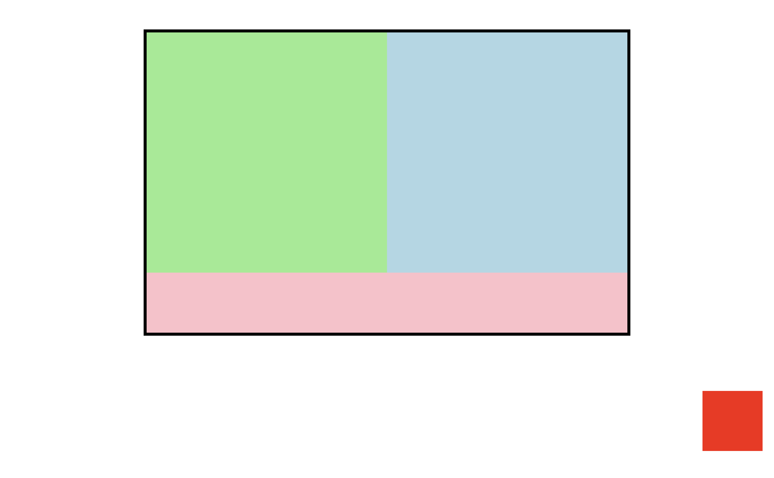
position: absolute;를 주지 않으면 bottom, right가 적용되지 않아 속성값을 주었으나 전체 페이지를 기준으로
bottom: 30px; right: 20px;가 적용되었다.
정확히는
position: absolute는position이 존재하는 부모를 절대위치(absolute)로 계산한다. 그런데.wrap .right .box의 부모인.wrap .right역시 position 이 존재하지 않으며, 그 부모인.wrap역시 존재하지 않아body까지 올라간 것이다.
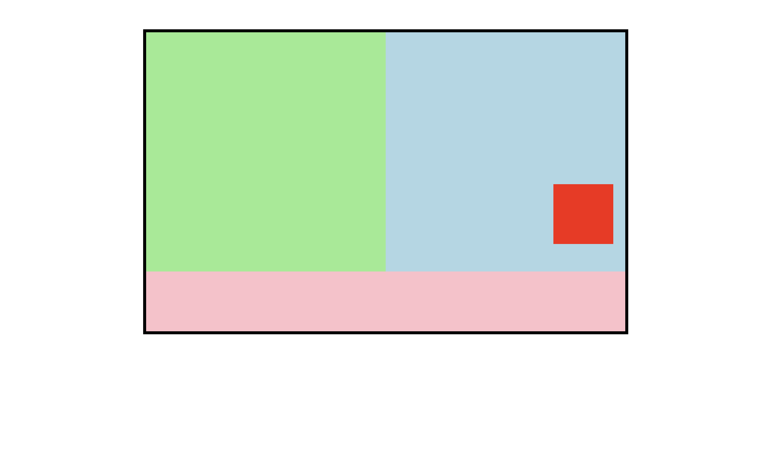
우리는 이 문제를 해결하기 위해 position: relative;를 함께 사용한다. position: relative;는
Position - Relative 에서 처럼 자신의 위치를 상대값으로 적용하기 위해서도 사용하지만 자식의
absolute에게 자신의 position을 제공하기 위해서 사용하기도 한다.
.wrap .right {
  width: 400px;
  height: 400px;
  background-color: lightblue;
  float: left;
  position: relative;
}
와 같이 바로 위 부모에게 position: relative;를 주면 의도한대로 표현이 가능하다.
4. Position - Fixed
<section>
  <article></article>
</section>
<section></section>
<section></section>
section {
  width: 100%;
  height: 100vh;
}
section:nth-of-type(1) {
  background-color: orange;
}
section:nth-of-type(2) {
  background-color: lightblue;
}
section:nth-of-type(3) {
  background-color: pink;
}
3개의 section는 viewport 를 가득 채우는 배경을 순서대로 배치한다. 이번에는 absolute가 아닌 fixed를 사용해보자.
section article {
  width: 10vw;
  height: 10vw;
  background-color: #000;
  position: fixed;
  bottom: 50px;
  right: 50px;
}
See the Pen CSS display fixed by SB Park (@sbpark88) on CodePen.
fixed는 다른 요소와 완전히 무관하게 무조건 브라우저의 viewport 를 기준으로 고정된다. 즉, 화면 크기가 바뀌어 viewport 영역 자체가
변경되지 않는 한 HTML 내 어떤 요소들이 움직이든 viewport 에 fixed되어있다.
5. object-fit
이미지를 div로 만든 box 에 넣어보자.
<div class="box1">
  <img src="img/car1.jpg" alt="자동차">
</div>
<div class="box2">
  <img src="img/car1.jpg" alt="자동차">
</div>
<div class="box3">
  <img src="img/car1.jpg" alt="자동차">
</div>
div {
  width: 400px;
  height: 400px;
  border: 1px solid #000;
  float: left;
  margin: 50px;
}
div img {
  width: 100%;
  height: 100%;
}
영역 크기에 맞춰 이미지가 찌그러진다.
이를 제어하기 위해 img 태그에 object-fit 속성을 줘보자.
.box1 img {
  object-fit: fill;
}
.box2 img {
  object-fit: cover;
}
.box3 img {
  object-fit: contain;
}
이는 background-image: url("");를 사용해 삽입한 태그의 배경을 제어하기 위해 사용했던 background-size 속성값의으로
cover, contain 등의 값을 사용하는 것과 같다. 단, background-image 가 아니라 img태그로 삽입된 이미지를 제어한다.
6. z-index
<div class="wrap">
  <div class="left"></div>
  <div class="right"></div>
</div>
.wrap {
  width: 400px;
  height: 400px;
  border: 1px solid #000;
  margin: 100px auto;
  position: relative;
}
.wrap .left {
  width: 200px;
  height: 200px;
  background-color: blue;
  position: absolute;
  top: 50px;
  left: 50px;
}
.wrap .right {
  width: 200px;
  height: 200px;
  background-color: red;
  position: absolute;
  bottom: 50px;
  right: 50px;
}
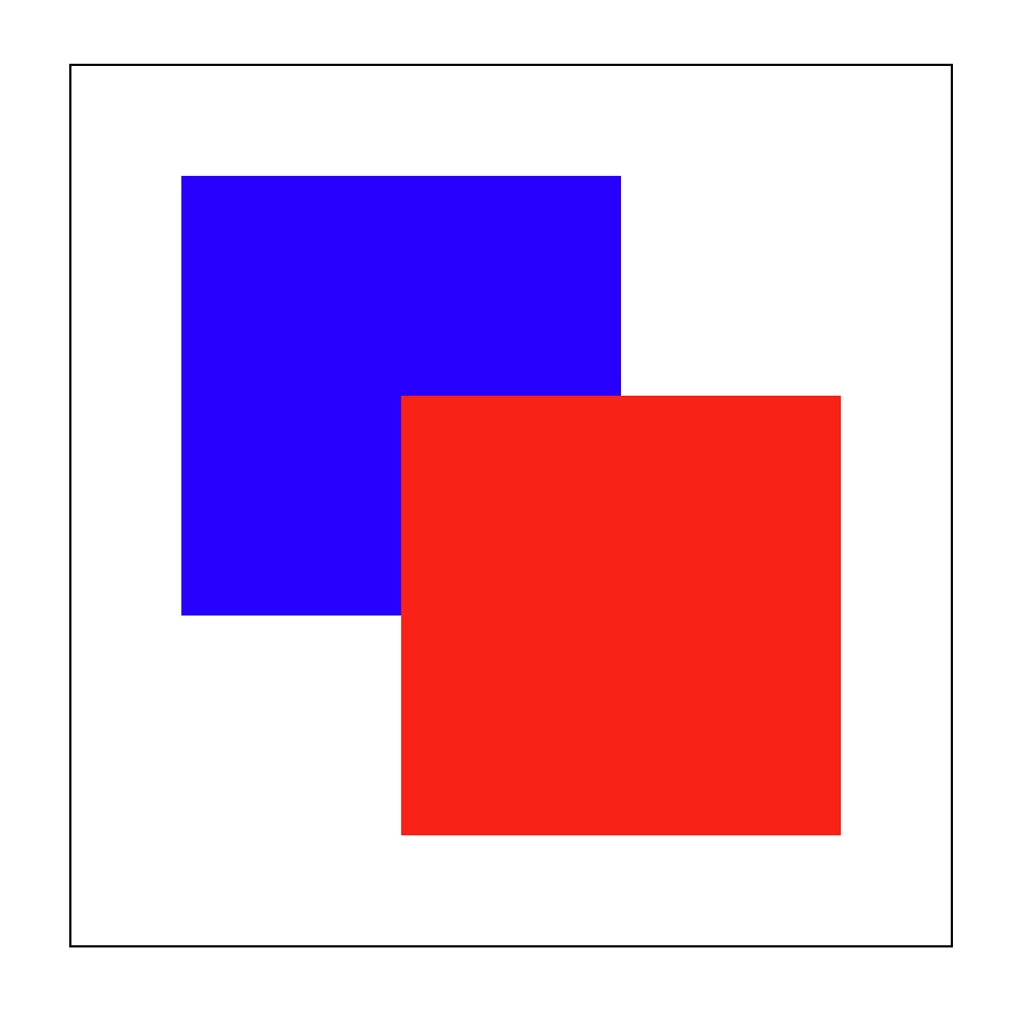
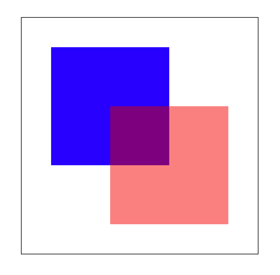
렌더링 순서에 의해 파란 상자 위에 빨간 상자가 그려지게된다. 하지만 우리는 z-index를 이용해 z-axis의 값을 임의로 조정해
순서를 컨트롤 할 수 있다.
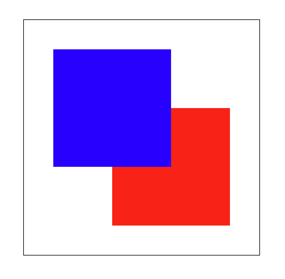
z-index의 default 값은 0 이므로 파란 상자에 z-index: 1;만 주어도 빨간 상자보다 위로 오게 된다.
.wrap .left {
  width: 200px;
  height: 200px;
  background-color: blue;
  position: absolute;
  top: 50px;
  left: 50px;
  z-index: 1;
}
하지만 이런식으로 상대적인 값을 정의할 때는 두 요소 모두 정의를 해 명확한 의도로 표현하고 다른 속성이 방해하지 않도록 하는 것이
더 좋다. 따라서 파란 상자와 빨간 상자의 z-index를 각각 2와 1로 주는 것이 더 좋다.
.wrap .left {
  width: 200px;
  height: 200px;
  background-color: blue;
  position: absolute;
  top: 50px;
  left: 50px;
  z-index: 2;
}
.wrap .right {
  width: 200px;
  height: 200px;
  background-color: red;
  position: absolute;
  bottom: 50px;
  right: 50px;
  z-index: 1;
}
7. Opacity & RGBA
<div class="wrap">
  <div class="left"></div>
  <div class="right"></div>
</div>
.wrap {
  width: 400px;
  height: 400px;
  border: 1px solid #000;
  margin: 100px auto;
  position: relative;
}
.wrap .left {
  width: 200px;
  height: 200px;
  background-color: blue;
  position: absolute;
  top: 50px;
  left: 50px;
}
.wrap .right {
  width: 200px;
  height: 200px;
  background-color: red;
  position: absolute;
  bottom: 50px;
  right: 50px;
  opacity: 0.5;
}
우리는 opacity를 이용해 대상의 투명도를 조절할 수 있다. 이것은 rgba의 4번째 parameter 와 동일하다.
.wrap .right {
  width: 200px;
  height: 200px;
  background-color: rgba(255, 0, 0, 0.5);
  position: absolute;
  bottom: 50px;
  right: 50px;
}
Reference
- “Do it! 인터랙티브 웹 페이지 만들기.” Youtube. Feb. 09, 2022, Do it! 인터랙티브 웹 페이지 만들기.
- “Universal selectors.” MDN Web Docs. Feb. 21, 2023, MDN - Universal selectors.