 Hogwarts
Basic CSS Style 2
shadow, gradient, animation, svg, media query, responsive, flex, justify, align, order
7. Graphic Styling 👩💻
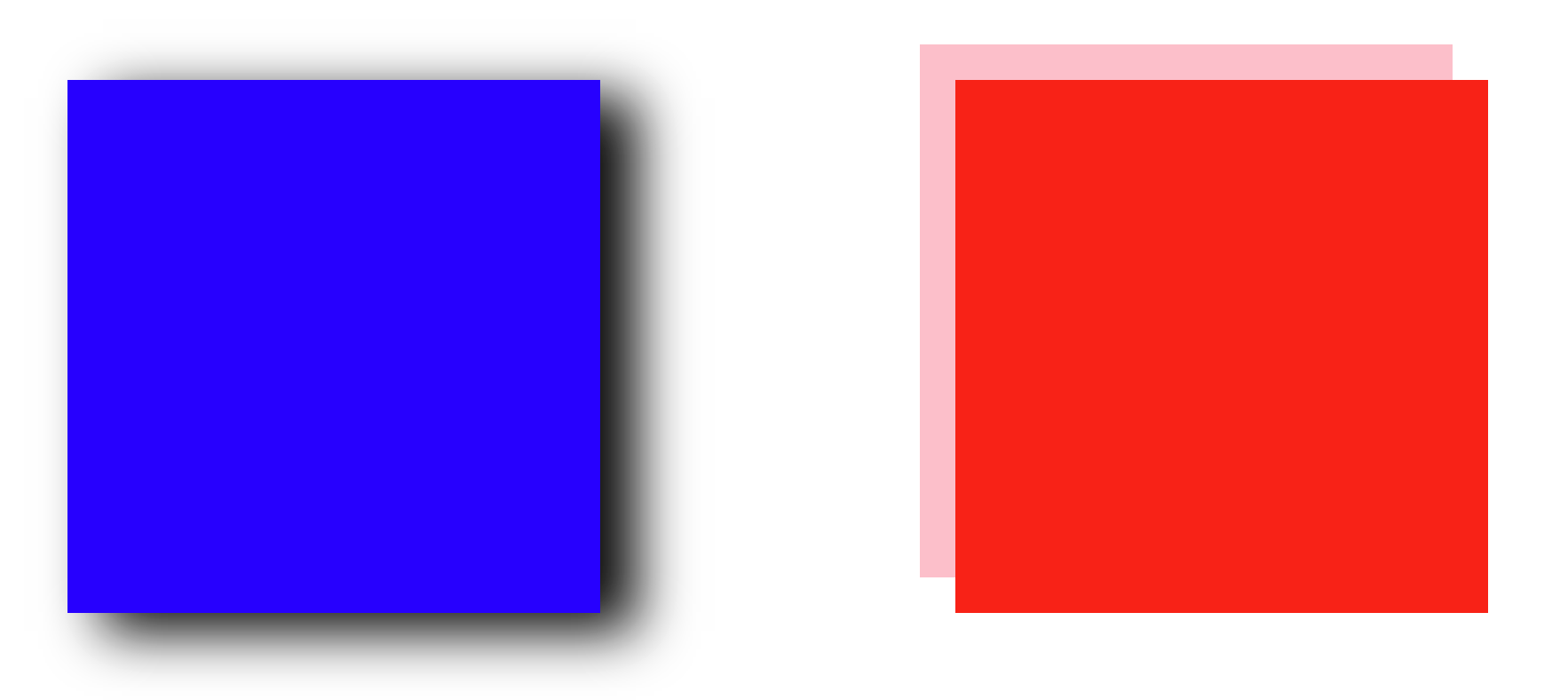
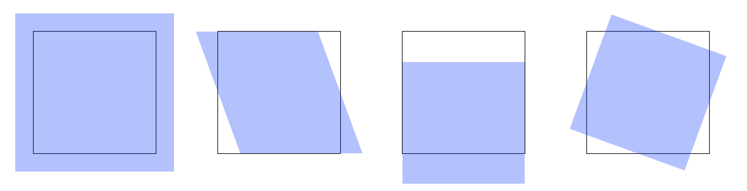
1. box-shadow
<div class="box1"></div>
<div class="box2"></div>
.box1 {
  width: 300px;
  height: 300px;
  background: blue;
  margin: 100px;
  float: left;
  box-shadow: 20px 10px 30px black;
}
.box2 {
  width: 300px;
  height: 300px;
  background: red;
  margin: 100px;
  float: left;
  box-shadow: -20px -20px 0 pink;
}
x-axis, y-axis, blur, color 순으로 지정한다.
2. text-shadow
<p>HELLO WORLD!!</p>
p {
  font-weight: bold;
  font-size: 100px;
  font-family: "arial";
  color: #111;
  margin: 100px;
  text-shadow: 30px 30px 10px #aaa;
}
box-shadow와 속성값을 주는 방식은 동일하다.

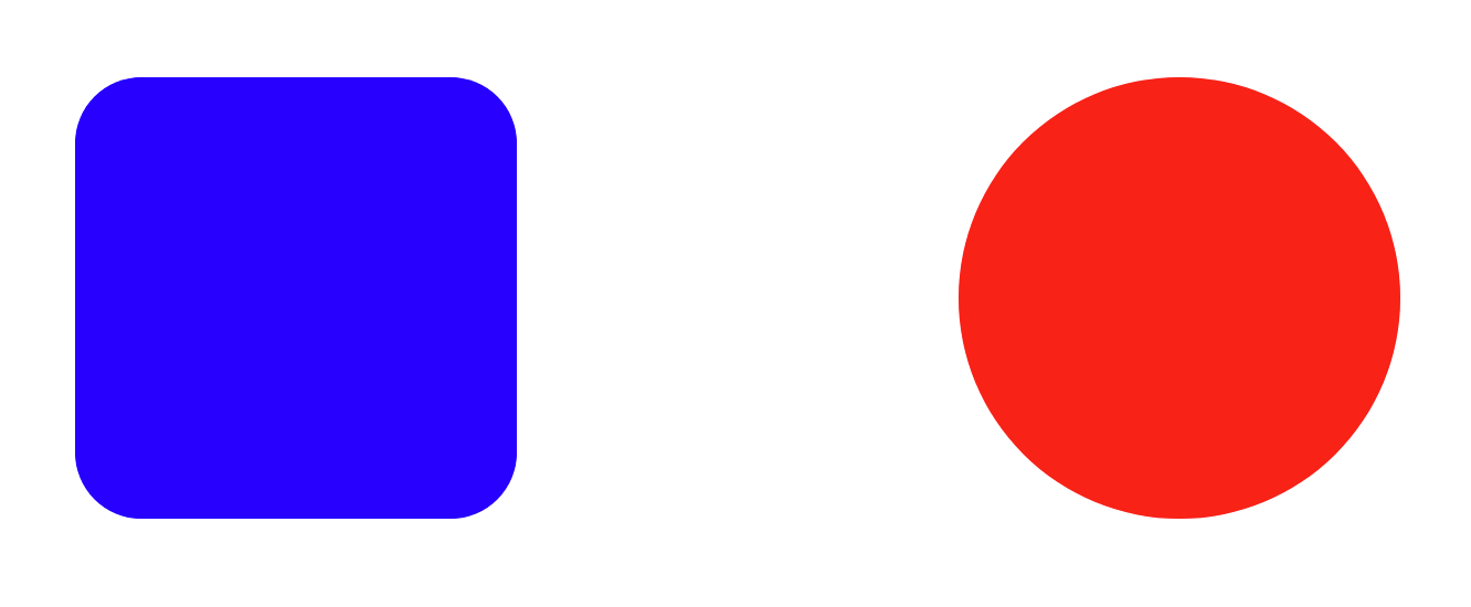
3. border-radius
<div class="box1"></div>
<div class="box2"></div>
.box1 {
  width: 200px;
  height: 200px;
  background-color: blue;
  margin: 100px;
  float: left;
  border-radius: 30px;
}

.box2 {
  width: 200px;
  height: 200px;
  background-color: red;
  margin: 100px;
  float: left;
  border-radius: 50%;
}
border-radius의 속성값은 radius. 즉, 반지름의 값을 주면 된다.
4. linear-gradient
<div></div>
<div></div>
<div></div>
<div></div>
<div></div>
div {
  width: 200px;
  height: 200px;
  float: left;
  margin: 50px;
}
div:nth-of-type(1) {
  background: linear-gradient(to bottom, blue, red);
}
div:nth-of-type(2) {
  background: linear-gradient(to top, blue, red);
}
div:nth-of-type(3) {
  background: linear-gradient(to right, blue, red);
}
div:nth-of-type(4) {
  background: linear-gradient(to left, blue, red);
}
div:nth-of-type(5) {
  background: linear-gradient(45deg, blue, red);
}
direction, start color, end color 순으로 지정한다.

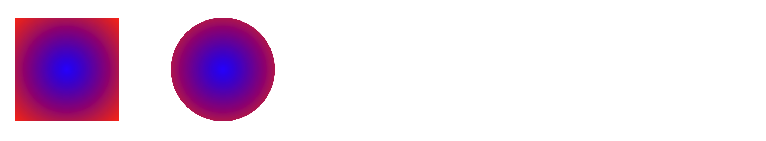
5. radial-gradient
<div></div>
<div></div>
div:nth-of-type(1) {
  background: radial-gradient(blue, red);
}
div:nth-of-type(2) {
  border-radius: 50%;
  background: radial-gradient(blue, red);
}
start color, end color만 지정한다. 방향은 자동으로 중심에서 바깥을 향한다.
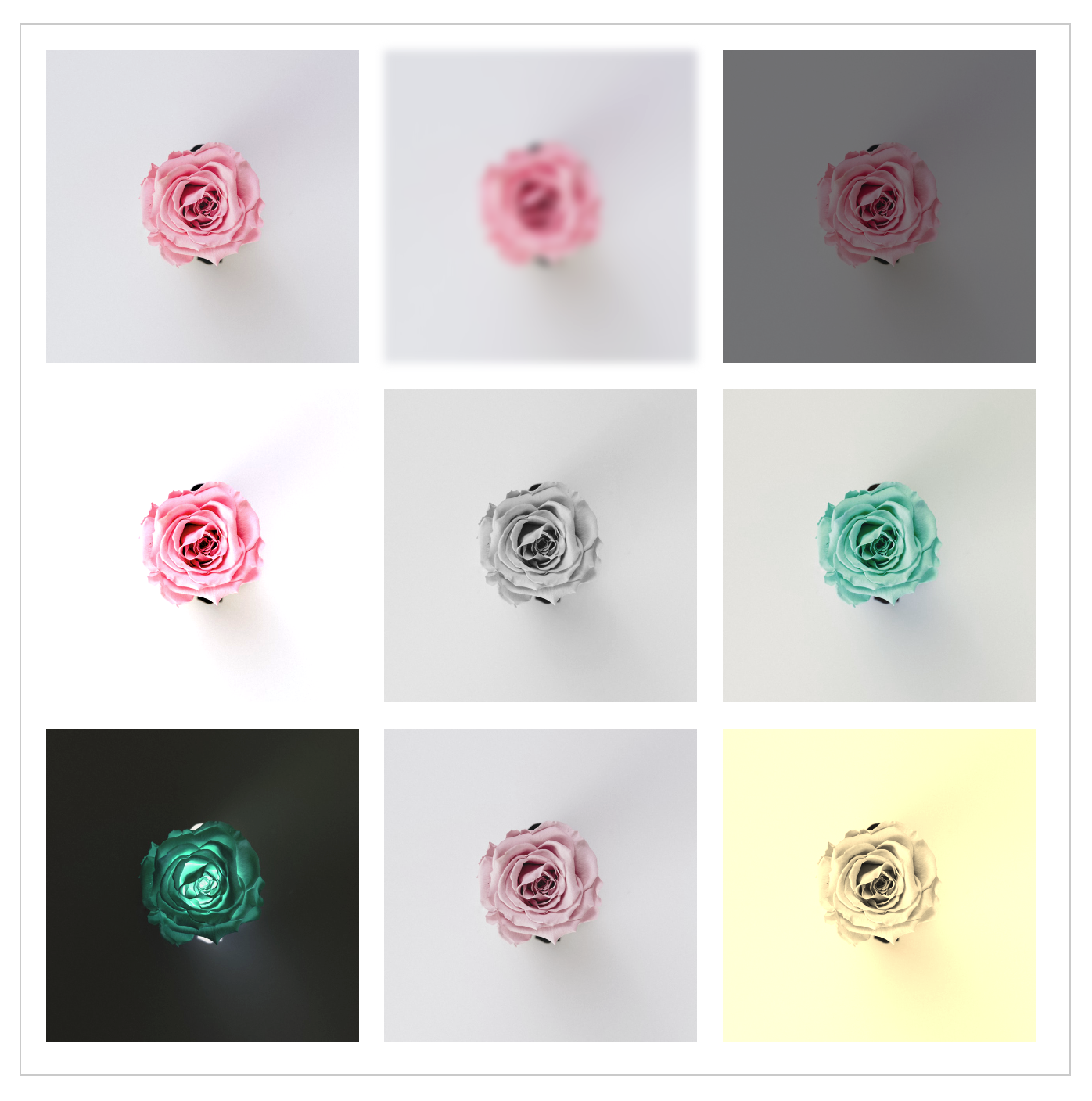
6. filter
<div>
  <img src="img/rose.jpg" alt="장미">
  <img src="img/rose.jpg" alt="장미">
  <img src="img/rose.jpg" alt="장미">
  <img src="img/rose.jpg" alt="장미">
  <img src="img/rose.jpg" alt="장미">
  <img src="img/rose.jpg" alt="장미">
  <img src="img/rose.jpg" alt="장미">
  <img src="img/rose.jpg" alt="장미">
  <img src="img/rose.jpg" alt="장미">
</div>
/* 필터를 이용한 특수 효과 지정하기 */
div {
  width: 650px; margin: 100px auto;
  border: 1px solid #ccc;
  padding: 10px;
}
div img {
  width: 200px; margin: 6px;
}
/* 수치값이 커질수록 blur 효과 증가 */
div img:nth-of-type(2) {
  filter: blur(3px);
}

/* 1보다 작아지면 어두워지고 커지면 밝아짐 */
div img:nth-of-type(3) {
  filter: brightness(0.5);
}

/* 100%작아지면 대비효과가 낮아지고 높아지면 대비증가 */
div img:nth-of-type(4) {
  filter: contrast(150%);
}

/* 100%로 근접할수록 흑백으로 전환 */
div img:nth-of-type(5) {
  filter: grayscale(100%);
}

/* 0deg는 원래 이미지 색상 0~360deg까지 변경할수록 색상 변경 */
div img:nth-of-type(6) {
  filter: hue-rotate(180deg);
}

/* 100%로 근접할 수록 색감이 정 반대로 전환 */
div img:nth-of-type(7) {
  filter: invert(100%);
}

/* 0으로 근접할 수록 색감의 채도가 낮아짐 */
div img:nth-of-type(8) {
  filter: saturate(0.5);
}

/* 100%로 근접할 수록 갈색톤으로 색감이 변경 */
div img:nth-of-type(9) {
  filter: sepia(100%);
}
8. Animations 👩💻
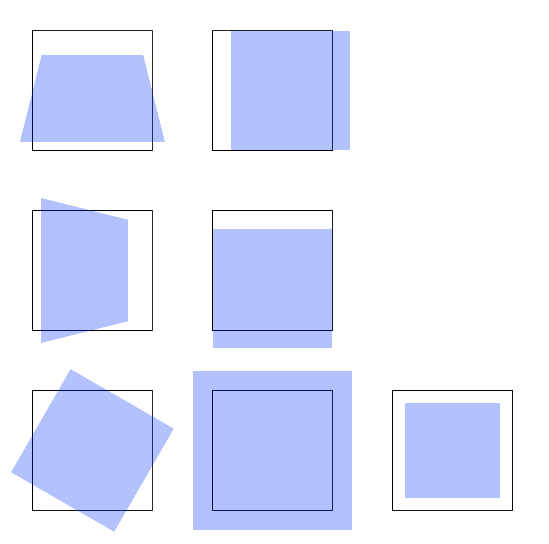
1. transform 2D
transform은 대상의 크기의 비율을 조절하거나 x/y 축으로 틀거나 이동 또는 회전 등의 효과를 줄 수 있다. transform을 적용하려면 반드시
block 또는 inline-block elements 이어야한다. 따라서 단순 inline elements 일 경우
CSS 를 이용해 display: inline-block;를 주어야 한다.
<section>
  <article></article>
</section>
<section>
  <article></article>
</section>
<section>
  <article></article>
</section>
<section>
  <article></article>
</section>
section {
  width: 200px;
  height: 200px;
  border: 1px solid #000;
  float: left;
  margin: 50px;
}
section article {
  width: 100%;
  height: 100%;
  background: blue;
  opacity: 0.3;
}
section:nth-of-type(1) article {
  transform: scale(1.3);
}
section:nth-of-type(2) article {
  transform: skewX(20deg);
}
section:nth-of-type(3) article {
  transform: translateY(50px);
}
section:nth-of-type(4) article {
  transform: rotate(20deg);
}
2. transform 3D
마찬가지로 block 또는 inline-block elements 이어야한다. 그리고 3D 효과를 주기 위해서 원근법
설정을 해야하는데 perspective를 이용해 효과를 준다. 대상으로부터 관찰자가 얼마만큼 떨어져 있는지를 정의하며 일반적으로 block elements 의
2배 정도면 적당하다.
이미지의 정 중앙앙을 기준으로 x, y, z축이 설정된다. rotateX는 x축을 기준으로 회전시키고, translateX는 x축 방향으로 밀어버린다고
생각하면 된다.
<div>
  <section>
    <article></article>
  </section>
  <section>
    <article></article>
  </section>
</div>
<div>
  <section>
    <article></article>
  </section>
  <section>
    <article></article>
  </section>
</div>
<div>
  <section>
    <article></article>
  </section>
  <section>
    <article></article>
  </section>
  <section>
    <article></article>
  </section>
</div>
div {
  display: flow-root;
}
section {
  width: 200px;
  height: 200px;
  border: 1px solid #000;
  float: left;
  margin: 50px;
  perspective: 400px;
}
section article {
  width: 100%;
  height: 100%;
  background: blue;
  opacity: 0.3;
}
div:nth-of-type(1) section:nth-of-type(1) article {
  transform: rotateX(45deg);
}
div:nth-of-type(1) section:nth-of-type(2) article {
  transform: translateX(30px);
}
div:nth-of-type(2) section:nth-of-type(1) article {
  transform: rotateY(45deg);
}
div:nth-of-type(2) section:nth-of-type(2) article {
  transform: translateY(30px);
}
div:nth-of-type(3) section:nth-of-type(1) article {
  transform: rotateZ(30deg);
}
div:nth-of-type(3) section:nth-of-type(2) article {
  transform: translateZ(100px);
}
div:nth-of-type(3) section:nth-of-type(3) article {
  transform: translateZ(-100px);
}
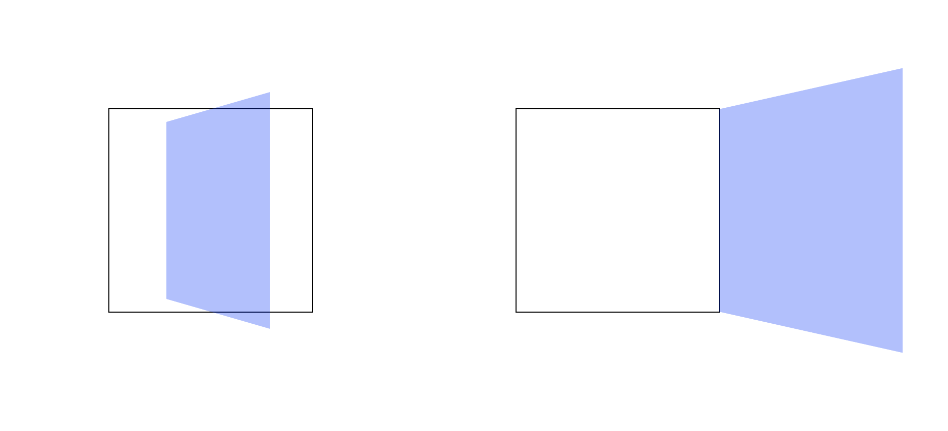
추가로 중심축을 이동하고 싶다면 transform-origin attribute 를 이용해 옮길 수 있다. 기본값은 center center다.
<section>
  <article></article>
</section>
<section>
  <article></article>
</section>
section {
  width: 200px;
  height: 200px;
  border: 1px solid #000;
  float: left;
  margin: 100px;
  perspective: 600px;
}
section article {
  width: 100%;
  height: 100%;
  background: blue;
  opacity: 0.3;
}
section:nth-of-type(1) article {
  transform: rotateY(120deg);
  transform-origin: center center;
}
section:nth-of-type(2) article {
  transform: rotateY(120deg);
  transform-origin: right center;
}
3. transition
transition attribute 를 사용하면 이미지에 움직이는 효과를 줄 수 있다.
<section>
  <article></article>
</section>
<section>
  <article></article>
</section>
<section>
  <article></article>
</section>
<section>
  <article></article>
</section>
<section>
  <article></article>
</section>
section {
  width: 200px;
  height: 200px;
  border: 1px solid #000;
  float: left;

  margin: 50px;
  perspective: 400px;
}
section article {
  width: 100%;
  height: 100%;
  background: blue;
  opacity: 0.3;
  transform: rotateX(30deg);
  transform-origin: top left;
}
section:not(:last-of-type) article {
  transition-property: transform, background-color;
  transition-duration: 1s;
  transition-delay: 0s;
}
section:nth-of-type(1) article {
  transition-timing-function: steps(5);
}
section:nth-of-type(2) article {
  transition-timing-function: ease; /* slow -> fast -> slow */
}
section:nth-of-type(3) article {
  transition-timing-function: ease-in; /* slow -> fast */
}
section:nth-of-type(4) article {
  transition-timing-function: ease-out; /* fast -> slow */
}
section:nth-of-type(1) article {
  transition-timing-function: steps(5);
}
section:nth-of-type(5) article {
  transition-timing-function: cubic-bezier(0.46, -0.64, 0.58, 1.39);
}
section:last-of-type article {
  transition: all 2s cubic-bezier(.46, -0.64, .58, 1.39) 0s;
}
section:hover article {
  transform: rotateY(45deg);
  background: red;
}
See the Pen CSS Transition by SB Park (@sbpark88) on CodePen.
cubic-bezier의 함수에 넣을 parameters 는 cubic-bezier 에서 만들 수 있다.
4. animation with @keyframes
<section>
  <article></article>
</section>
<section>
  <article></article>
</section>
<section>
  <article></article>
</section>
<section>
  <article></article>
</section>
section {
  width: 250px;
  height: 250px;
  margin: 20px;
  border: 1px solid #000;
  float: left;
  display: flex;
  align-items: center;
  justify-content: center;
}

@keyframes rotation {
  0% {
    transform: rotate(0deg);
  }
  100% {
    transform: rotate(360deg);
  }
}
article {
  width: 200px;
  height: 100px;
  background-color: blue;
  background-size: contain;
  background-repeat: no-repeat;
  animation-name: rotation;
  animation-duration: 2s;
  animation-timing-function: linear;
  animation-delay: 0s;
}
section:nth-of-type(1) article {
  animation-iteration-count: 2;
}
section:nth-of-type(2) article {
  /*animation 축약문*/
  animation: rotation 5s linear infinite 0s;
}

section:nth-of-type(3) article {
  animation-iteration-count: infinite;
  animation-play-state: paused;
}
/* 마우스 커서를 올리면 재생하기 */
section:nth-of-type(3) article:hover {
  animation-play-state: running;
}
section:nth-of-type(4) article {
  animation-iteration-count: infinite;
}
/* 마우스 커서를 올리면 일시 정지하기 */
section:nth-of-type(4) article:hover {
  animation-play-state: paused;
}
See the Pen CSS Animation with @keyframes by SB Park (@sbpark88) on CodePen.
9. Vector Images 👩💻
1. SVG Images
대표적인 Bitmap 기반 이미지는 jpg가 있으며 pixel 단위로 저장된다. 반면 대표적인 Vector 기반 이미지는 svg가 있으며 vector
함수를 이용해 vector 함수를 저장한다.
Bitmap 기반 이미지는 사진과 같이 디테일이 많고 색상이 풍부한 실제 사진 같은 것을 저장하는데 적합하고, Vector 기반 이미지는 수학을 이용해 실시간으로 그려내므로 디테일이 많이 필요하지 않은 애니메이션이나 일러스트 같은 것을 저장하는데 적합하다.
<article>
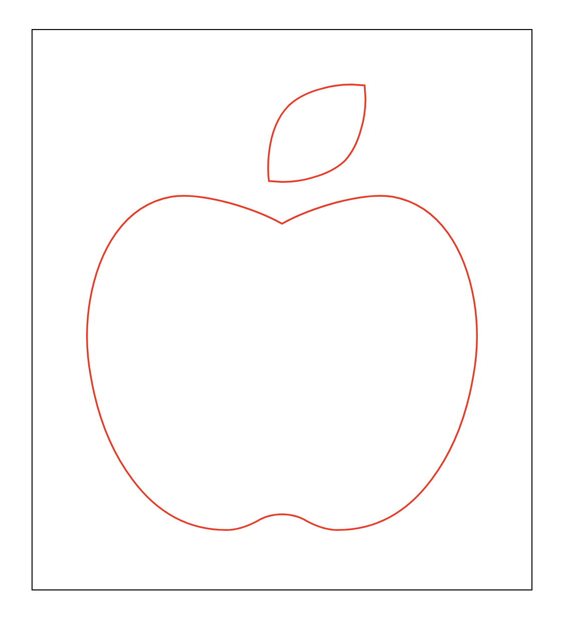
<svg viewBox="0 0 448 512">
<path
d="M350.85 129c25.97 4.67 47.27 18.67 63.92 42 14.65 20.67 24.64 46.67 29.96 78 4.67 28.67 4.32 57.33-1 86-7.99 47.33-23.97 87-47.94 119-28.64 38.67-64.59 58-107.87 58-10.66 0-22.3-3.33-34.96-10-8.66-5.33-18.31-8-28.97-8s-20.3 2.67-28.97 8c-12.66 6.67-24.3 10-34.96 10-43.28 0-79.23-19.33-107.87-58-23.97-32-39.95-71.67-47.94-119-5.32-28.67-5.67-57.33-1-86 5.32-31.33 15.31-57.33 29.96-78 16.65-23.33 37.95-37.33 63.92-42 15.98-2.67 37.95-.33 65.92 7 23.97 6.67 44.28 14.67 60.93 24 16.65-9.33 36.96-17.33 60.93-24 27.98-7.33 49.96-9.67 65.94-7zm-54.94-41c-9.32 8.67-21.65 15-36.96 19-10.66 3.33-22.3 5-34.96 5l-14.98-1c-1.33-9.33-1.33-20 0-32 2.67-24 10.32-42.33 22.97-55 9.32-8.67 21.65-15 36.96-19 10.66-3.33 22.3-5 34.96-5l14.98 1 1 15c0 12.67-1.67 24.33-4.99 35-3.99 15.33-10.31 27.67-18.98 37z"></path>
</svg>
</article>
article {
  width: 500px;
  border: 1px solid #000;
  box-sizing: border-box;
  padding: 50px;
  margin: 50px auto;
}
article svg {
  width: 100%;
}
svg에서 반드시 필요한 값은viewBox와 path 의d2가지다.
2. Modify SVG Images
CSS 를 이용해 SVG 를 수정해보자.
article svg path {
  fill: transparent;  /* background-color */
  stroke: red;       /* border-color */
  stroke-width: 2;   /* border-width */
}
기본적으로 CSS 에서 사용하는 attributes 가 아니라 svg 가 정의하는 attributes 에 맞게 해줘야한다.
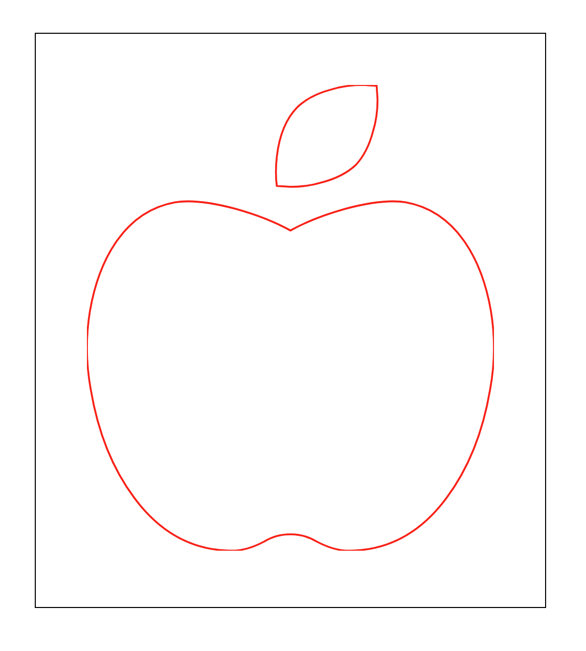
그런데 이미지 가장자리가 잘리는 것을 볼 수 있다.
svg를 보면 viewBox="0 0 448 512"인 것을 알 수 있다. 즉, 도화지의 크기가 (0, 0) ~ (448, 512) 사이의 공간에서 그려지는
것이다. 그런데 article 내에 svg 이미지가 담인 영역의 공간을 계산해보면
width = 500px(box size) - 2 * 1px(border) - 2 * 50px(padding) 즉, 398px밖에 안 되는 것이다. 마찬가지로 height
역시 잘리게 된다.
svg의 값을 수정에 정상으로 만들어보자. viewBox="0 0 448 512"의 크기를 viewBox="-5 -5 458 522"로 바꿔보자. 이것은
도화지의 시작점을 (-5, -5)만큼 이동한다는 것이다. 따라서 이전과 동일하게 이미지가 중앙에 위치하려면 끝점은 (+5, +5)만큼 이동해야한다.
그런데 svg 가 Vector 기반이므로 이 도화지의 시작점과 끝점은 Cartesian Coordinates 의 절대 기준점이 아닌 Vector 함수를 이용한
상태값이다. 따라서 변경된 시작점으로부터 종료점 위치까지 가려면 (+10, +10)을 해줘야 하는 것이다.
이제 이미지의 가장자리까지 정상적으로 표현이 된다.
3. stroke-dasharray
SVG 이미지는 기본적으로 수많은 Vector 의 조합으로 이루어진 선으로 정의된다. 그런데 이 선을 - - - -와 같은 dash 형태로 만들고
싶을 때는 어떻게 할 수 있을까? 이때 사용되는 속성이 stroke-dasharray와 stroke-dashoffset다.
SVG 이미지는 Vector 이미지이므로 Bitmap 이미지처럼 모든 좌표점을 개별적으로 표현하지 않는다. 이것은 수많은 Vector 값의 조합으로 이루어지는
만큼 각 Vector 가 도화지에 보여지는 가시 영역(viewBox)과 비가시 영역으로 나뉜다.
stroke-dasharray 의 값은 가시 영역과 비가시 영역의 연속으로 정의된다
예를 들어 stroke-dasharray="4"일 경우 가시(4) - 비가시(4) - 가시(4) - 비가시(4)가 연속된다.
만약 stroke-dasharray="4 1"일 경우 가시(4) - 비가시(1) - 가시(4) - 비가시(1)가 연속된다.
그 이상일 때 역시 마찬가지다. stroke-dasharray="4 1 2"일 경우 가시(4) - 비가시(1) - 가시(2) - 비가시(4)가 연속된다.
- No dashes nor gaps
<svg viewBox="0 0 30 2" xmlns="http://www.w3.org/2000/svg">
  <style>svg { background-color: lightgray; }</style>
  <line x1="0" y1="1" x2="30" y2="1" stroke="red" />
</svg>
- Dashes and gaps of the same size
<svg viewBox="0 0 30 2" xmlns="http://www.w3.org/2000/svg">
  <style>svg { background-color: lightgray; }</style>
  <line x1="0" y1="1" x2="30" y2="1" stroke="red" stroke-dasharray="4" />
</svg>
- Dashes and gaps of different sizes
<svg viewBox="0 0 30 2" xmlns="http://www.w3.org/2000/svg">
  <style>svg { background-color: lightgray; }</style>
  <line x1="0" y1="1" x2="30" y2="1" stroke="red" stroke-dasharray="4 1" />
</svg>
- Dashes and gaps of various sizes with an odd number of values
<svg viewBox="0 0 30 2" xmlns="http://www.w3.org/2000/svg">
  <style>svg { background-color: lightgray; }</style>
  <line x1="0" y1="1" x2="30" y2="1" stroke="red" stroke-dasharray="4 1 2" />
</svg>
- Dashes and gaps of various sizes with an even number of values
<svg viewBox="0 0 30 2" xmlns="http://www.w3.org/2000/svg">
  <style>svg { background-color: lightgray; }</style>
  <line x1="0" y1="1" x2="30" y2="1" stroke="red" stroke-dasharray="4 1 2 3" />
</svg>
- Dashes starting with a gap
<svg viewBox="0 0 30 2" xmlns="http://www.w3.org/2000/svg">
  <style>svg { background-color: lightgray; }</style>
  <line x1="0" y1="1" x2="30" y2="1" stroke="red" stroke-dasharray="0 4 0" />
</svg>
4. stroke-dashoffset
stroke-dasharray 가 각각의 선을 표현하는 Vector 와 Vector 사이의 간격을 정의했다면, stroke-dashoffset은
선의 시작 위치를 shift한다. 즉, offset이란 이름답게 어느 지점부터 시작하는 것이 아닌 Vector 자체를 주어진 값 평행이동 시키듯 라인 내에서
밀어버린다. 따라서 가시 영역에 있는 Vector 가 일부 비가시 영역으로 넘어가면 그 부분은 표현이 되지 않게 된다.
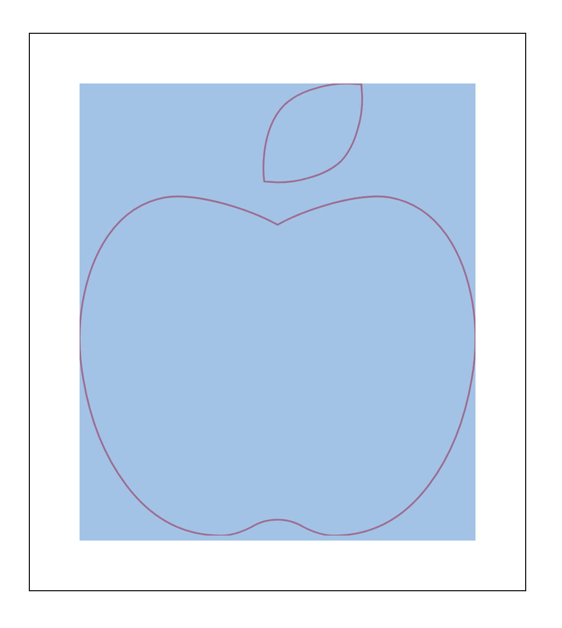
5. SVG stroke-dasharray Examples
아까 전 사과 그림에 이어서 진행한다.
<article>
  <svg viewBox="0 0 448 512">
    <path
        d="M350.85 129c25.97 4.67 47.27 18.67 63.92 42 14.65 20.67 24.64 46.67 29.96 78 4.67 28.67 4.32 57.33-1 86-7.99 47.33-23.97 87-47.94 119-28.64 38.67-64.59 58-107.87 58-10.66 0-22.3-3.33-34.96-10-8.66-5.33-18.31-8-28.97-8s-20.3 2.67-28.97 8c-12.66 6.67-24.3 10-34.96 10-43.28 0-79.23-19.33-107.87-58-23.97-32-39.95-71.67-47.94-119-5.32-28.67-5.67-57.33-1-86 5.32-31.33 15.31-57.33 29.96-78 16.65-23.33 37.95-37.33 63.92-42 15.98-2.67 37.95-.33 65.92 7 23.97 6.67 44.28 14.67 60.93 24 16.65-9.33 36.96-17.33 60.93-24 27.98-7.33 49.96-9.67 65.94-7zm-54.94-41c-9.32 8.67-21.65 15-36.96 19-10.66 3.33-22.3 5-34.96 5l-14.98-1c-1.33-9.33-1.33-20 0-32 2.67-24 10.32-42.33 22.97-55 9.32-8.67 21.65-15 36.96-19 10.66-3.33 22.3-5 34.96-5l14.98 1 1 15c0 12.67-1.67 24.33-4.99 35-3.99 15.33-10.31 27.67-18.98 37z"></path>
  </svg>
</article>
article {
  width: 500px;
  border: 1px solid #000;
  box-sizing: border-box;
  padding: 50px;
  margin: 50px auto;
}
article svg {
  width: 100%;
}
다음 CSS 를 추가하자.
article svg path {
  fill: transparent;
  stroke: red;
  stroke-width: 2;
  stroke-dasharray: 0;
  stroke-dashoffset: 0;
}
크롬 개발자 도구 창을 열고 값을 계속 증가시키다보면 전체 길이와 같아져 stroke-dasharray: 0;일때와 같아지는 순간이 온다. 그 지점을 찾아보자.
article svg path {
  fill: transparent;
  stroke: red;
  stroke-width: 2;
  stroke-dasharray: 1420;
  stroke-dashoffset: 0;
}
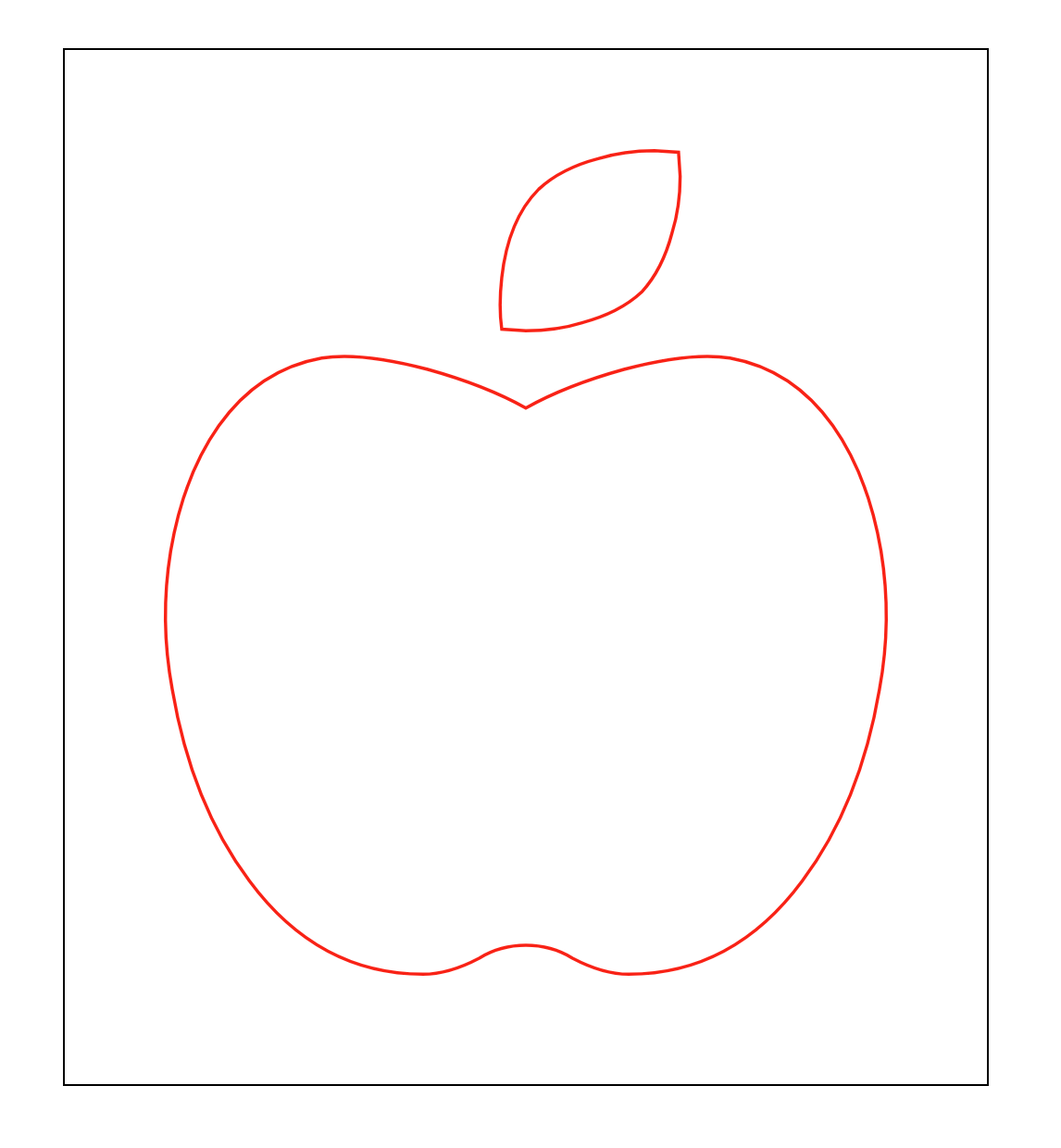
1420 에서 전체 길이와 첫 번째 viewBox Vector 의 길이가 같아졌다.
그리고 이제 이 stroke-dasharray: 1420;의 크기 만큼 반대 방향으로 stroke-dashoffset: 0;을 이동해보자. 값은 -1420 이 될 것이다.
article svg path {
  fill: transparent;
  stroke: red;
  stroke-width: 2;
  stroke-dasharray: 1420;
  stroke-dashoffset: -1420;
}
다시 반대 방향으로 동일한 크기 만큼 shift 시켰으니 이미지가 보이지 않는다.
여기에 transition 효과를 주고, 마우스를 올리면 stroke-dashoffset: 0;를 다시 0 으로 돌아가게 해보자.
See the Pen SVG Stroke Control by SB Park (@sbpark88) on CodePen.
10. Responsive Web Design - Media Queries 👩💻
@media를 사용하면 화면 크기에 따라 다른 CSS 를 적용할 수 있개 해준다. 이를 반응형 웹 디자인이라 한다.
<article></article>
article {
  width: 200px;
  height: 200px;
  background: pink;
  margin: 100px auto;
}

@media screen and (max-width: 900px) {
  article {
    background: orange;
  }
}

@media screen and (max-width: 400px) {
  article {
    background: aqua;
  }
}
위 CSS 는 화면의 가로 pixel 값에 따라 article 의 배경색이 변경된다.
- ~ 400px : aqua
- 401px ~ 900px : orange
- 901px ~ : pink
이때 주의해야 할 것이 아래 있는 CSS 가 위에 있는 CSS 보다 우선순위가 높다는 것이다. Media Query 는 !important 와 같은 절대적인
조건을 주는 것이 아니고 if와 같이 조건이 맞을 때만 활성화되는 것이다. 예를 들어 다음과 같은 순서로 적용하면 제대로 분리가 되지 않는다.
article {
	width: 200px;
	height: 200px;
	background: pink;
	margin: 100px auto;
}

@media screen and (max-width:400px) {
  article {
    background:aqua;
  }
}

@media screen and (max-width: 900px) {
	article {
		background: orange;
	}
}
- ~ 400px : orange
- 401px ~ 900px : orange
- 901px ~ : pink
400px 이하일 때
@media screen and (max-width:400px)의 조건이 true 이므로 배경색이aqua가 된다. 그런데 다음에 오는@media screen and (max-width: 900px)조건 역시 true 이므로 배경색은 다시orange로 변경된다.
11. Flex 👩💻
1. flex
float 은 웹 layout 을 만들기 위한 문법이라기 보다는 글, 이미지를 배치하기 위한 문법이었다. 하지만 당시에는 레이아웃을 위한 별도의 문법이
없었기 때문에 float 을 이용해서 layout 작업을 했던 것이고, 지금은 flex라는 표준 layout 문법이 존재한다.
<main>
  <section>
    <article></article>
    <article></article>
    <article></article>
    <article></article>
    <article></article>
  </section>
</main>
* {
  margin: 0;
  padding: 0;
}

main {
  width: 100%;
  height: 100vh;
  background: lightcyan;
}

section {
  border: 10px solid blue;
}

section article {
  width: 100px;
  height: 100px;
  background: aqua;
  border: 1px solid #000;
}
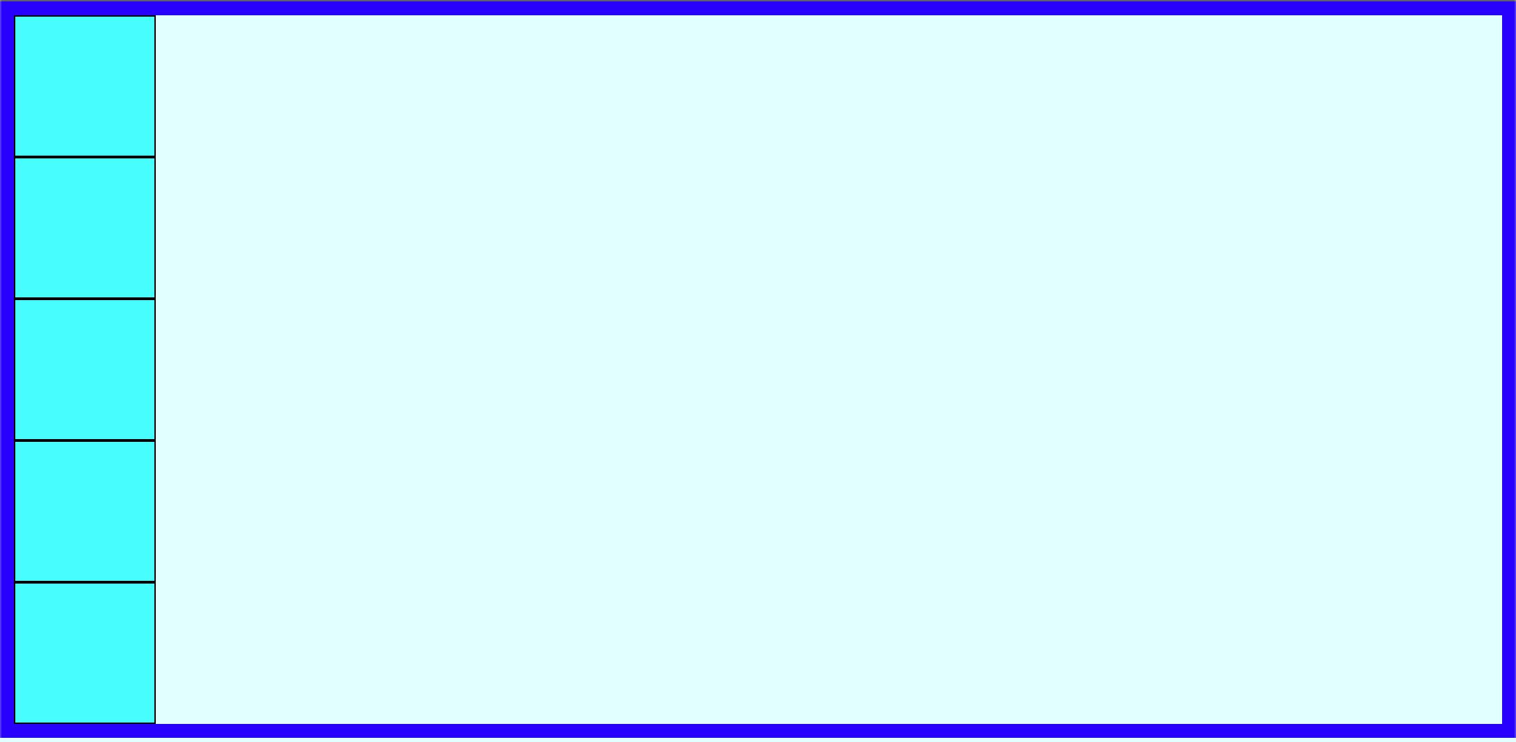
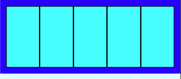
article 의 부모인 section 에 flex를 적용해보자.
section {
  border: 10px solid blue;
  display: flex;
}
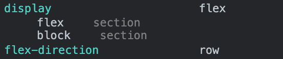
float을 이용할 때는 모든 자식 elements 에 float 을 적용 후 부모에서 clear해야하므로 코딩량이 매우 많았다. 하지만 display: flex;는
손쉽게 처리한다.
부모 element 에
display: flex;을 적용하면, 자식이block이든inline이든 상관 없이inline-block으로 다룬다.
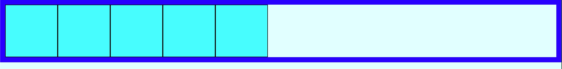
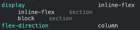
2. inline-flex
이번에는 flex 대신 inline-flex를 주어보자.
section {
  border: 10px solid blue;
  display: inline-flex;
}
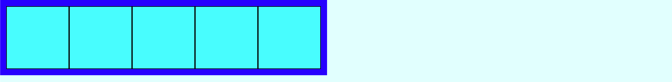
- flex : 부모 element 는
block을 유지하며, 자식 elements 는inline-block으로 다룬다. - inline-flex : 부모 element 와 자식 elements 모두
inline-block으로 다룬다.
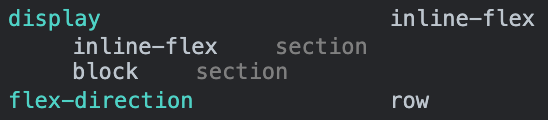
3. flex-direction
flex-direction의 기본값은 row다. 이를 column으로 변경해보자.
section {
  border: 10px solid blue;
  display: inline-flex;
  flex-direction: column;
}
4. flex-wrap
section {
  border: 10px solid blue;
  display: flex;
}
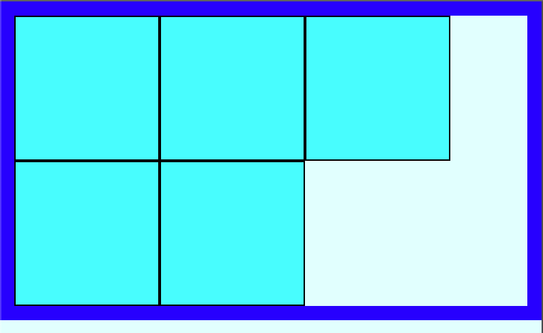
다시 flex 로 변경하고 크기를 줄여보자.
float 은 공간이 부족하면 다음 라인으로 자식 elements 가 내려가 새 block 라인을 만들었는데 flex 는 그대로 부모와 함께 자식이 찌그러진다.
만약 float 에서와 같이 자동으로 라인 바꿈을 처리하려면 flex-wrap: wrap; attribute 를 주어 처리할 수 있다.
section {
  /*width: 100%;*/
  border: 10px solid blue;
  /*box-sizing: border-box;*/
  display: flex;
  flex-wrap: wrap;
}
5. flex-flow
flex-flow = flex-direction + flex-wrap 을 한 번지 정의할 수 있다.
section {
  border: 10px solid blue;
  display: flex;
  flex-flow: row wrap;
}
section {
  border: 10px solid blue;
  display: flex;
  flex-flow: column wrap;
}
12. Alignment children of the Flex Parent 👩💻
flex를 적용한 부모의 자식 elements 를 정렬해보자.
우선 정렬을 처리할 수 있도록 영역을 키워주기 위해 section 의 크기를 100% 로 바꾼다.
section {
  width: 100%;
  height: 100%;
  border: 10px solid blue;
  display: flex;
  flex-flow: row wrap;
}
border 의 굵기로 인해 view page 를 넘어간다. border 를 box 에 포함시키기 위해 box-sizing: border-box;를 추가해준다.
section {
  width: 100%;
  height: 100%;
  border: 10px solid blue;
  box-sizing: border-box;
  display: flex;
  flex-flow: row wrap;
}
1. justify-content
이제 정렬을 시작해보자. 현재 flex-direction 은 row 다. 이 flex-direction 내 content elements 의 정렬은
justify-content를 사용한다. 이 경우 flex-direction 이 row 이므로 자식 elements 들의 가로 정렬이 이루어진다.
section {
  width: 100%;
  height: 100%;
  border: 10px solid blue;
  box-sizing: border-box;
  display: flex;
  flex-flow: row wrap;
  justify-content: start; /* flex-start */
}
section {
  width: 100%;
  height: 100%;
  border: 10px solid blue;
  box-sizing: border-box;
  display: flex;
  flex-flow: row wrap;
  justify-content: space-evenly;
}
section {
  width: 100%;
  height: 100%;
  border: 10px solid blue;
  box-sizing: border-box;
  display: flex;
  flex-flow: row wrap;
  justify-content: center;
}
section {
  width: 100%;
  height: 100%;
  border: 10px solid blue;
  box-sizing: border-box;
  display: flex;
  flex-flow: row wrap;
  justify-content: end; /* flex-end */
}
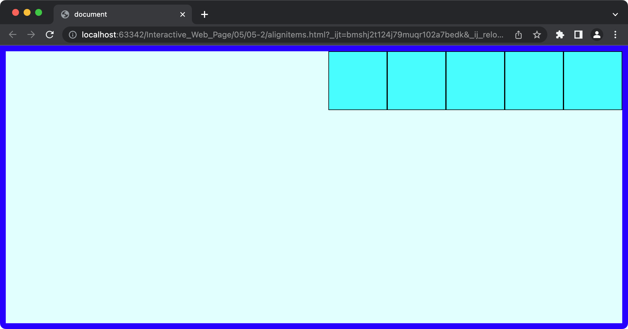
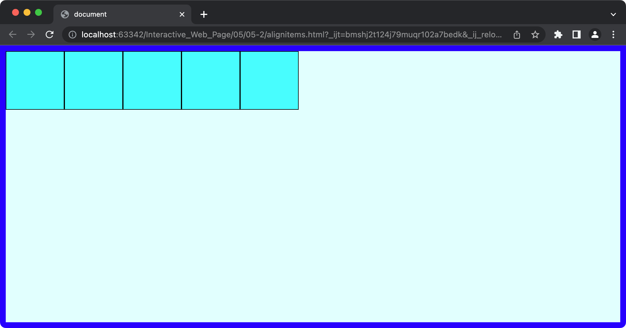
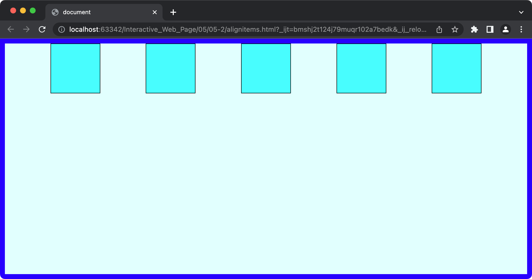
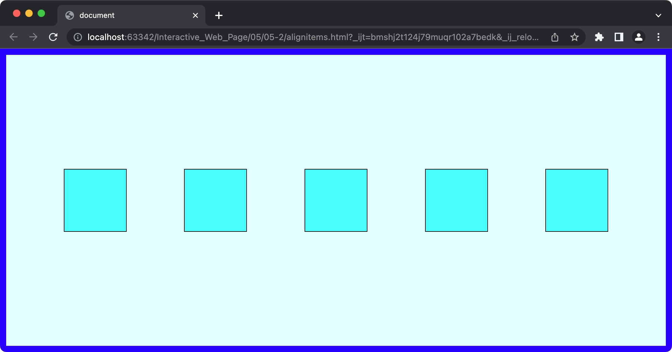
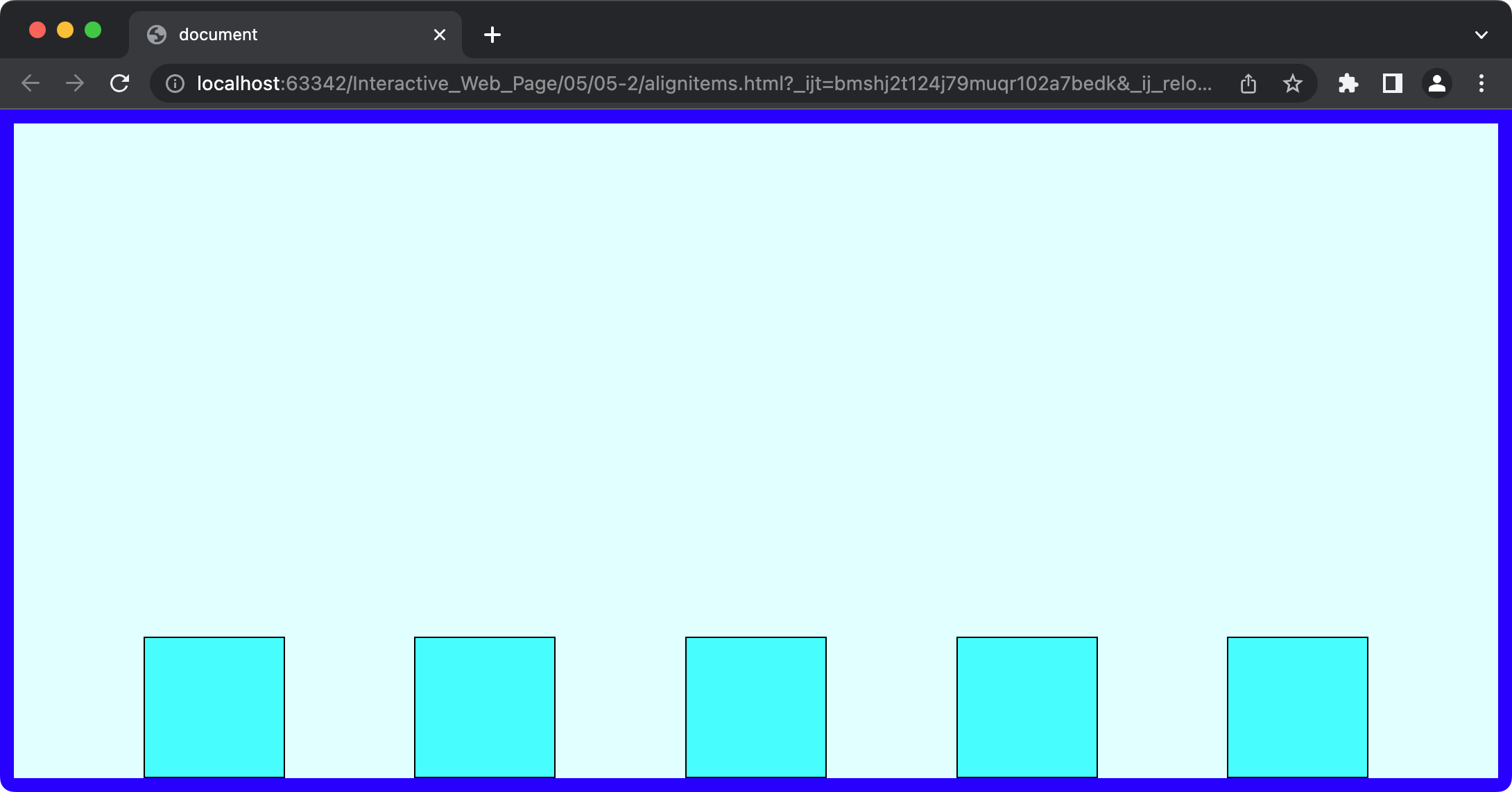
2. align-items
이제 이 flex-direction 축 자체를 이동시켜보자. 이 경우 flex-direction 이 row 이므로 이 축은 세로로 움직인다.
section {
  width: 100%;
  height: 100%;
  border: 10px solid blue;
  box-sizing: border-box;
  display: flex;
  flex-flow: row wrap;
  justify-content: space-evenly;
  align-items: start; /* flex-start */
}
section {
  width: 100%;
  height: 100%;
  border: 10px solid blue;
  box-sizing: border-box;
  display: flex;
  flex-flow: row wrap;
  justify-content: space-evenly;
  align-items: center;
}
section {
  width: 100%;
  height: 100%;
  border: 10px solid blue;
  box-sizing: border-box;
  display: flex;
  flex-flow: row wrap;
  justify-content: space-evenly;
  align-items: end; /* flex-end */
}
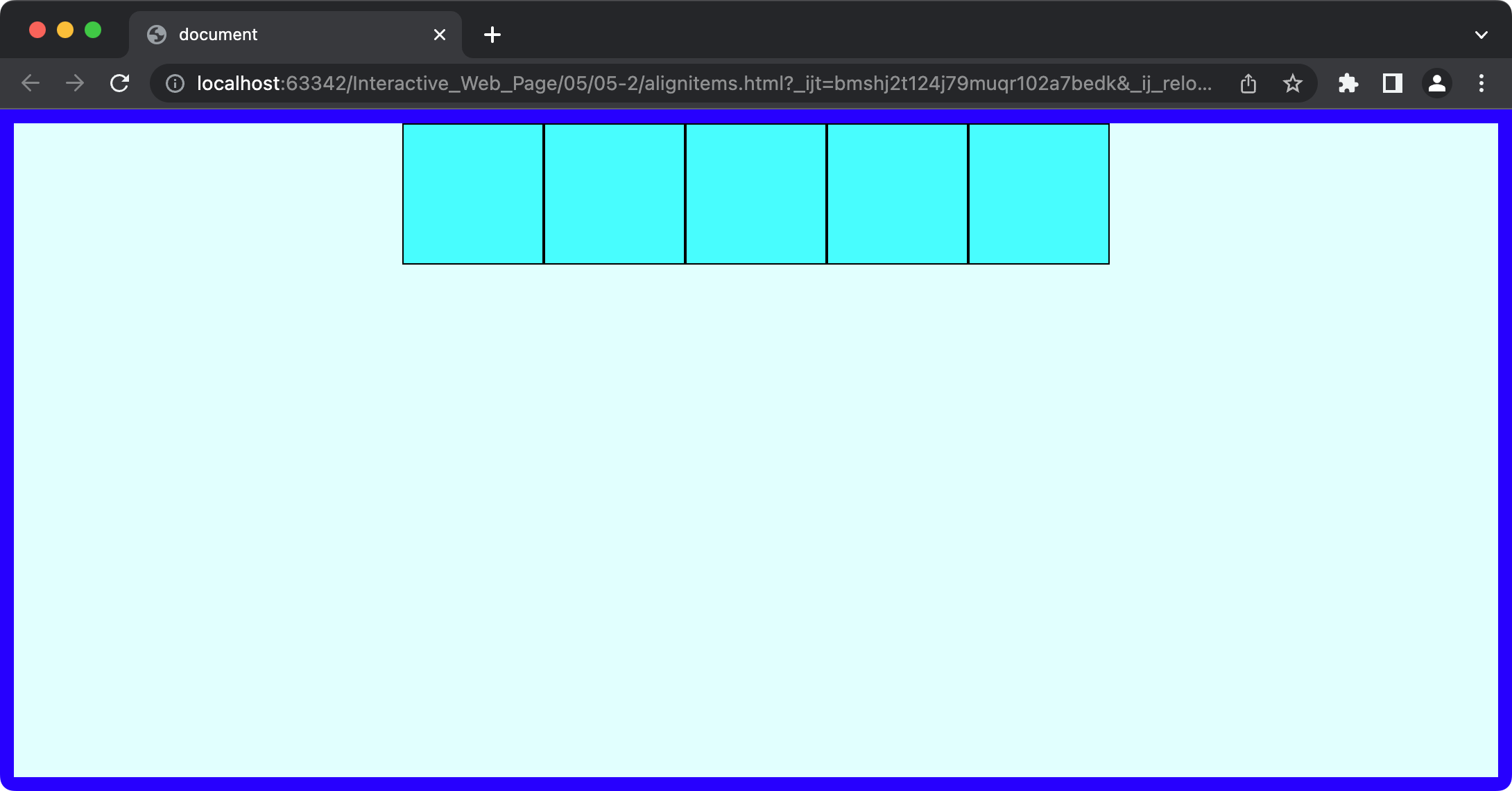
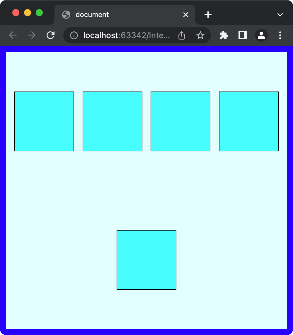
3. align-content
이제 이 flex-direction 축 자체를 이동시키는 방법으로 align-content가 추가로 존재한다. 라인이 하나일 때는 둘이 동일한 모양으로
정렬을 하지만, 두 줄 이상일 경우는 모양이 달라진다.
- align-items
section {
  width: 100%;
  height: 100%;
  border: 10px solid blue;
  box-sizing: border-box;
  display: flex;
  flex-flow: row wrap;
  justify-content: space-evenly;
  align-items: center;
}
- align-content
section {
  width: 100%;
  height: 100%;
  border: 10px solid blue;
  box-sizing: border-box;
  display: flex;
  flex-flow: row wrap;
  justify-content: space-evenly;
  align-content: center;
}
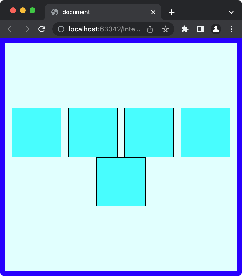
원하는 모양에 따라 align-items 또는 align-content을 적절히 사용해야한다.
align-content를 사용할 때는 반드시flex-wrap: wrap;을 적용해줘야한다.
4. order
기존에 DOM 의 보여지는 순서를 변경하려면 transform을 이용해 위치를 직접 지정해 눈속임 하지 않는 한 반드시 DOM 을 수정해야했다. 하지만 flex를
사용하면 container 안에 포함된 elements 가 보여지는 순서를 DOM 의 제어 없이 CSS 만을 이용해 변경할 수 있다.
<section>
  <article>1</article>
  <article>2</article>
  <article>3</article>
</section>
* {
  margin: 0;
  padding: 0;
}

section {
  width: 100%;
  background: lightcyan;
  display: flex;
}

section article {
  width: 100px;
  height: 100px;
  background: aqua;
  border: 1px solid #000;
  font-size: 50px;
  color: #fff;
  display: flex;
  justify-content: center;
  align-items: center;
  transition: all 5s;
}
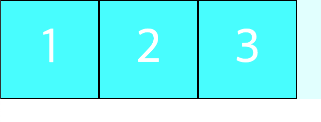
section article:nth-of-type(1) {
  order: 2;
}
section article:nth-of-type(2) {
  order: 3;
}
section article:nth-of-type(3) {
  order: 1;
}
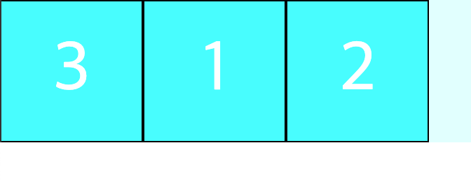
order 에 들어가는 숫자는 elements 의 순서나 이런 값이 아니다.z-index 와 마찬가지로 단지 우선순위일 뿐이며, 기본값은0이다. 따라서 모든 order 값을 동일하게 주면 순서가 변경되지 않으며, 동일 order 값일 경우 DOM 순서대로 정렬된다.
5. flex-grow
<section>
  <article>FLEX GROW</article>
  <article>FLEX GROW</article>
  <article>FLEX GROW</article>
</section>
section {
  width: 100%;
  background: lightcyan;
  display: flex;
}

section article {
  background: aqua;
  border: 1px solid #000;
  box-sizing: border-box;
  font-size: 50px;
  color: #fff;
}

section 에 flex를 주어 section 은 block이므로 라인을 차지하고, 그리고 자식 article 은 flex가 되어
content 크기만큼 공간을 차지하고 있다.
그런데 만약 flex를 사용하면서 부모의 block을 채우고 싶을 경우는 어떻게 해야할까? 이때 사용할 수 있는 것이 flex-grow다.
section article:nth-of-type(1) {
  flex-grow: 1;
}
section article:nth-of-type(2) {
  flex-grow: 1;
}
section article:nth-of-type(3) {
  flex-grow: 1;
}

section article:nth-of-type(1) {
  flex-grow: 1;
}
section article:nth-of-type(2) {
  flex-grow: 2;
}
section article:nth-of-type(3) {
  flex-grow: 3;
}

flex-grow 에 들어가는 숫자역시 비율값이다. 단, 주의해야 할 것이 자식 elements block 의 크기 비율이 아니고 자식에 넣을 여백의 비율이다. 따라서 elements 자체 크기의 비율을 맞출 수는 없다.
6. flex-shrink
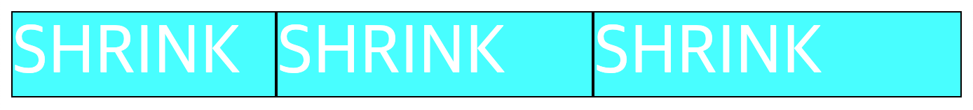
flex-grow의 반대되는 개념으로 여백을 줄이는 flex-shrink가 있다.
<section>
  <article>SHRINK</article>
  <article>SHRINK</article>
  <article>SHRINK</article>
</section>
section {
  width: 100%;
  background: lightcyan;
  display: flex;
}

section article {
  width: 300px;
  background: aqua;
  border: 1px solid #000;
  box-sizing: border-box;
  font-size: 50px;
  color: #fff;
}
이번에는 flex-shrink를 적용을 구분하기 위해 기본 크기를 300px 로 주었다.
section article:nth-of-type(1) {
  flex: 3;
}
section article:nth-of-type(2) {
  flex: 2;
}
section article:nth-of-type(3) {
  flex: 1;
}
아직 부모의 block 크기가 자식의 전체 크기보다 커 아무련 효과도 나타나지 않는다.
부모의 block 크기가 자식의 전체 크기보다 작아지자 주어진 비율대로 여백을 줄인다.
flex-grow: 부모의block에 맞게 자식의 여백을 주어진 비율에 여백을 넣어 부모의block을 채운다.flex-shrink: 부모의block이 자식의 전체 크기보다 작아질 때 자식의 여백을 주어진 비율에 맞게 줄인다.
7. flex
flex-grow와 flex-shrink 모두 부모가 display: flex; 속성을 갖는 container 안에서 부모의 block 크기와 상호
작용을 했다. 하지만 elements 의 크기가 아닌 여백의 크기를 조절하기 때문에 UI 적으로 좋지 않아 잘 사용되지 않는다.
이번에는 flex를 attribute 로 줘보자. 이것은 앞의 두 attributes 와 다르게 자식 elements 자체의 크기를 비율로써 조절한다.
위 두 attributes 와 마찬가지로 숫자는 비율을 나타낸다.
section article:nth-of-type(1) {
  flex: 1;
}

section article:nth-of-type(2) {
  flex: 2;
}

section article:nth-of-type(3) {
  flex: 1;
}

부모에게 설정하는
display attribute 의 value 로써의 flex와, 자식에게 설정하는flex attribute는 서로 다른 것이다!!
Reference
- “Do it! 인터랙티브 웹 페이지 만들기.” Youtube. Feb. 09, 2022, Do it! 인터랙티브 웹 페이지 만들기.
- “stroke-dasharray.” MDN Web Docs. Mar. 06, 2023, MDN - stroke-dasharray.