Hogwarts
Parent's height of the absolute children
Absolute child is not contained in parent's content
1. One Child 👩💻
1. Problem
<section class="container">
  <div class="child child-1"></div>
</section>
.container {
  border: 4px solid #a00;
  box-sizing: border-box;
  width: 300px;
  position: relative;
}

.child {
  position: absolute;
  width: 200px;
  height: 150px;
  background-color: #37e;
  top: 0;
  right: 20px;
}
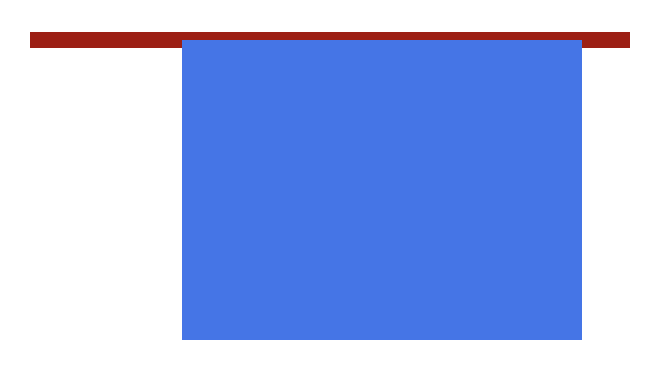
이런식으로 자식이 부모로부터 자유로워지다보니 부모는 content 가 없는 것이나 마찬가지인 상황이 되어 높이를 갖지 못하는 문제가 발생한다.
2. Solution 1 - Calculate Height
가장 쉽지만 별로 쓰고 싶지 않은 방법이다. 자식을 감싸기 위해 필요한 높이를 미리 계산해서 넣는 것이다. 문제는 자식이 변경되면 부모 역시 크기를 수정해줘야하며, 반응형으로 작성하는 데 무리가 생긴다. 이 포스팅을 쓰게 된 계기가 인강에서 이런식으로 가르치는 것을 본 적이 있다. 인강이 이러면 안 되는거 아냐? 🤨
.container {
  border: 4px solid #a00;
  box-sizing: border-box;
  width: 300px;
  position: relative;
  height: 158px;
}

.child {
  position: absolute;
  width: 200px;
  height: 150px;
  background-color: #37e;
  top: 0;
  right: 20px;
}
3. Solution 2 - Use float
요즘에야 flex와 grid가 나와서 가로 배치를 위해 굳이 float을 안 쓰지만 이런 경우 좋은 해결책이 될 수 있다.
<section class="container clearfix">
  <div class="child child-1"></div>
</section>
.container {
  border: 4px solid #a00;
  box-sizing: border-box;
  width: 300px;
}

.clearfix {
  display: flow-root;
}

.child {
  width: 200px;
  height: 150px;
  background-color: #37e;
  float: right;
  margin-right: 20px;
}
또는
.container {
  border: 4px solid #a00;
  box-sizing: border-box;
  width: 300px;
}

.clearfix::after {
  content: "";
  display: block;
  clear: both;
}

.child {
  width: 200px;
  height: 150px;
  background-color: #37e;
  float: right;
  margin-right: 20px;
}
4. Solution 4 - Use flex/grid
바로 위 float 을 사용한 문제 해결 과 마찬가지로 absolute 대신 문제를 해결하기 위해 사용할 수 있다.
.container {
  border: 4px solid #a00;
  box-sizing: border-box;
  width: 300px;
  display: flex;
  justify-content: flex-end;
}

.child {
  width: 200px;
  height: 150px;
  background-color: #37e;
  margin-right: 20px;
}
또는
.container {
  border: 4px solid #a00;
  box-sizing: border-box;
  width: 300px;
  display: grid;
  justify-content: end;
}

.child {
  width: 200px;
  height: 150px;
  background-color: #37e;
  margin-right: 20px;
}
2. Children 👩💻
<section class="container">
  <div class="child child-1"></div>
  <div class="child child-2"></div>
</section>
그렇다면 자식이 둘 이상이고, 이들의 배치가 절대값을 가져야 한다면(= absolute 를 통한 겹침) 어떻게 해야할까?
1. Solution 1 - Calculate Height
이 경우 당연하게도 높이를 계산해 넣어주면 정상적으로 표현이 가능하다. 하지만 위에서도 언급했듯이 반응형에 대응할 수 없어 좋은 방법이 아니다.
.container {
  border: 4px solid #a00;
  width: 300px;
  position: relative;
  box-sizing: border-box;
  height: 158px;
}

.child {
  position: absolute;
  width: 200px;
  height: 150px;
  background-color: #37e;
  top: 0;
  right: 20px;

  &.child-2 {
    background-color: #3e7;
    opacity: 0;

    &:hover {
      opacity: 1;
    }
  }
}
2. Solution 2 - Use float
이 경우 float과 relative/absolute를 모두 사용해야한다.
- 부모에게 높이를 제공하기 위해
float이 필요. - 자식이 서로 겹치기 위해
relative/absoltue가 필요.
하기 때문이다.
.container {
  border: 4px solid #a00;
  box-sizing: border-box;
  width: 300px;
  position: relative;
}

.clearfix {
  display: flow-root;
}

.child {
  width: 200px;
  height: 150px;
  background-color: #37e;

  &.child-1 {
    float: right;
    margin-right: 20px;
  }

  &.child-2 {
    background-color: #3e7;
    opacity: 0;
    position: absolute;
    top: 0;
    right: 20px;

    &:hover {
      opacity: 1;
    }
  }
}
3. Solution 3 - Use flex/grid
이 경우 역시 바로 위 float 을 사용한 문제 해결 과 마찬가지로 flex/grid와 relative/absolute를
모두 사용해 해결할 수 있다.
.container {
  border: 4px solid #a00;
  box-sizing: border-box;
  width: 300px;
  position: relative;
  display: flex;
  justify-content: flex-end;
}

.child {
  width: 200px;
  height: 150px;
  background-color: #37e;

  &.child-1 {
    margin-right: 20px;
  }

  &.child-2 {
    background-color: #3e7;
    opacity: 0;
    position: absolute;
    top: 0;
    right: 20px;

    &:hover {
      opacity: 1;
    }
  }
}
4. Solution 4 - Use block
하지만 위 케이스들은 모두 CSS 작동 원리에 기반해 어떻게 문제를 해결할 수 있는지를 보여주기 위한 예제일 뿐 실제로 저런 케이스는 보기 힘들다.
주로 많이 볼 수 있는 것은 2개가 겹치지만 부모가 단지 Wrapper 로서의 역할만 할 경우 위와 같이 복잡하게 생각할 필요 없이 부모는 relative를
갖고, 자식 하나는 position 기본값을 가져 높이를 제공하고, 다른 자식은 absolute를 가져 겹치도록 하면 된다.
.container {
  border: 4px solid #a00;
  box-sizing: border-box;
  width: 300px;
  position: relative;
}

.child {
  width: 100%;
  height: 150px;
  background-color: #37e;

  &.child-2 {
    background-color: #3e7;
    opacity: 0;
    position: absolute;
    top: 0;
    left: 0;

    &:hover {
      opacity: 1;
    }
  }
}
이것은 주로 ‘그림과 gif 를 겹치거나’, ‘그림과 동영상을 겹칠 때’ 사용된다. 아래는 사용 예시다.