 Hogwarts
CSS Alignment
How to align elements using CSS?
1. margin: auto 👩
<div class="outer">
  <img src="coral-box.png" alt="coral box" class="inner">
</div>
.inner {
  display: block;
  width: 100px;
  margin: 0 auto;
}

display: block,width,margin: 0 auto
block 속성과 width를 가질 때만 적용이 가능하며, 가로 정렬만 가능하다(inline 엘리먼트일 경우
displya: block;으로 속성을 바꿔야 한다).
크기를 가질 수 있는 부모 block 엘리먼트의 가로 중앙에 위치시키는 방법으로 가로 가운데 정렬만 필요할 경우 손쉽게 정렬이 가능해 많이 사용된다.
2. position: absolute 👩
position: absolute를 사용함으로 별도로 명시하지 않아도 block 속성을 갖게 되며, 좌측, 우측, 가운데 정렬이 모두 가능하다.
또한 가운데 정렬을 제외하면 width나 height를 갖지 않아도 정렬이 가능하다.
1. Horizontal Alignment
1. left: default
다음과 같이 강제로 지정할 수 있지만 기본적으로 왼쪽에 정렬되기 때문에, 전역에서 중앙 또는 우측에 정렬되게 작성된 속성이 존재해 더 높은 우선순위로써 덮어 써야 하는 경우가 아니라면 별도의 정렬이 필요하지 않다.
<div class="outer">
  <img src="coral-box.png" alt="coral box" class="inner">
</div>
.outer {
  position: relative;

  .inner {
    position: absolute;
    left: 0;
  }
}
position: absolute,left: 0
2. right
<div class="outer">
  <img src="coral-box.png" alt="coral box" class="inner">
</div>
.outer {
  position: relative;

  .inner {
    position: absolute;
    right: 0;
  }
}
position: absolute,right: 0
absolute 를 사용한 정렬은 가운데 정렬을 제외하면 width 를 가질 필요가 없다.
3. center
<div class="outer">
  <img src="coral-box.png" alt="coral box" class="inner">
</div>
1 ) margin auto
.outer {
  position: relative;

  .inner {
    position: absolute;
    width: 100px;
    left: 0;
    right: 0;
    margin: 0 auto;
  }
}
position: absolute,width,left: 0,right: 0,margin: 0 auto
margin: auto 와 마찬가지로,
absolute속성에 의해block속성을 가지게 되므로width와margin: 0 auto만 주어도 가운데 정렬이 될 것 같지만, 반드시left: 0,right: 0이 추가로 주어져야만 가운데 정렬이 가능하다.
2 ) percentage & margin calc
.outer {
  position: relative;

  .inner {
    position: absolute;
    width: 100px;
    left: 50%;
    margin-left: calc(100px / -2);
  }
}
position: absolute,width,left: 50%,margin-left: calc(width / -2)
px단위로margin-left를 계산하기 위해 정확한 width 가 필요하다. width 가 변경되면 calc 역시 변경해줘야 하기 때문에 SCSS 를 사용해 변수로 관리하는 것이 좋다..outer { position: relative; .inner { $box-width: 100px; position: absolute; width: $box-width; left: 50%; margin-left: calc($box-width / -2); } }
3 ) percentage & translate
.outer {
  position: relative;

  .inner {
    position: absolute;
    left: 50%;
    transform: translateX(-50%);
  }
}
position: absolute,left: 50%,transform: translateX(-50%)
위 calc 를 사용한 것과 같은 방법이지만,
margin-left는 부모의 width 를 100% 로 하기** 때문에, 비율로 가운데 지점을 계산하는 것이 불가능하기 때문에 자신의 크기의 절반 만큼px단위로 이동해야했다. 반면, **translate** 는 **margin 과 달리 엘리먼트 자신의 width 를 100% 로 하기 때문에, 비율을 사용하는 것이 가능해 width 와 width 는 필요가 없다.absolute 를 사용한 가운데 정렬 중 유일하게 width 가 필요 없는 정렬 방법이다.
2. Vertical Alignment
1. top: default
다음과 같이 강제로 지정할 수 있지만 기본적으로 상단에 정렬되기 때문에, 전역에서 중앙 또는 하단에 정렬되게 작성된 속성이 존재해 더 높은 우선순위로써 덮어 써야 하는 경우가 아니라면 별도의 정렬이 필요하지 않다.
<div class="outer">
  <img src="coral-box.png" alt="coral box" class="inner">
</div>
.outer {
  position: relative;

  .inner {
    position: absolute;
    top: 0;
  }
}
position: absolute,top: 0
2. bottom
<div class="outer">
  <img src="coral-box.png" alt="coral box" class="inner">
</div>
.outer {
  position: relative;

  .inner {
    position: absolute;
    bottom: 0;
  }
}
position: absolute,bottom: 0
absolute 를 사용한 정렬은 가운데 정렬을 제외하면 height 를 가질 필요가 없다.
3. center
<div class="outer">
  <img src="coral-box.png" alt="coral box" class="inner">
</div>
1 ) margin auto
.outer {
  position: relative;

  .inner {
    position: absolute;
    height: 100px;
    top: 0;
    bottom: 0;
    margin: auto 0;
  }
}
position: absolute,height,top: 0,bottom: 0,margin: auto 0
반드시
height를 가져야 가운데 정렬이 가능하다.
2 ) percentage & margin calc
.outer {
  position: relative;

  .inner {
    position: absolute;
    height: 100px;
    top: 50%;
    margin-top: calc(100px / -2);
  }
}
position: absolute,height,top: 50%,margin-top: calc(height / 2)
px단위로margin-top을 계산하기 위해 정확한 height 가 필요하다. height 가 변경되면 calc 역시 변경해줘야 하기 때문에 SCSS 를 사용해 변수로 관리하는 것이 좋다..outer { position: relative; .inner { $box-height: 100px; position: absolute; height: $box-height; top: 50%; margin-top: calc($box-height / -2); } }
3 ) percentage & translate
.outer {
  position: relative;

  .inner {
    position: absolute;
    top: 50%;
    transform: translateY(-50%);
  }
}
position: absolute,top: 50%,transform: translateY(-50%)
위 calc 를 사용한 것과 같은 방법이지만,
margin-top은 부모의 height 를 100% 로 하기** 때문에, 비율로 가운데 지점을 계산하는 것이 불가능하기 때문에 자신의 크기의 절반 만큼px단위로 이동해야했다. 반면, **translate** 는 **margin 과 달리 엘리먼트 자신의 height 를 100% 로 하기 때문에, 비율을 사용하는 것이 가능해 width 와 height 는 필요가 없다.absolute 를 사용한 가운데 정렬 중 유일하게 height 가 필요 없는 정렬 방법이다.
3. Center Alignment
<div class="outer">
  <img src="coral-box.png" alt="coral box" class="inner">
</div>
1 ) margin auto
.outer {
  position: relative;

  .inner {
    position: absolute;
    width: 100px;
    height: 100px;
    inset: 0;
    margin: auto;
  }
}
position: absolute,width,height,inset: 0,margin: auto
반드시
width와height를 가져야 가운데 정렬이 가능하다.
2 ) percentage & margin calc
.outer {
  position: relative;

  .inner {
    position: absolute;
    width: 100px;
    height: 100px;
    top: 50%;
    left: 50%;
    margin-top: calc(100px / -2);
    margin-left: calc(100px / -2);
  }
}
position: absolute,width,height,top: 50%,left: 50%,
margin-top: calc(height / 2),margin-left: calc(width / -2)
px단위로margin-top과margin-left를 계산하기 위해 정확한 width 와 height 가 필요하다. width 또는 height 가 변경되면 calc 역시 변경해줘야 하기 때문에 SCSS 를 사용해 변수로 관리하는 것이 좋다..outer { position: relative; .inner { $box-width: 100px; $box-height: 100px; position: absolute; width: $box-width; height: $box-height; top: 50%; left: 50%; margin-top: calc($box-height / -2); margin-left: calc($box-width / -2); } }
3 ) percentage & translate
.outer {
  position: relative;

  .inner {
    position: absolute;
    top: 50%;
    left: 50%;
    transform: translate(-50%, -50%);
  }
}
position: absolute,top: 50%,left: 50%.transform: translate(-50%, -50%)
위 calc 를 사용한 것과 같은 방법이지만,
margin-top과margin-left는 부모의 width 와 height 를 100% 로 하기 때문에, 비율로 가운데 지점을 계산하는 것이 불가능하기 때문에 자신의 크기의 절반 만큼px단위로 이동해야했다. 반면, translate 는 margin 과 달리 엘리먼트 자신의 width, height 를 100% 로 하기 때문에, 비율을 사용하는 것이 가능해 width 와 height 는 필요가 없다.absolute 를 사용한 가운데 정렬 중 유일하게 width 와 height 가 필요 없는 정렬 방법이다.
3. display: flex 👩
flex를 이용한 정렬은 width, height 가 지정되지 않은 경우 또는,
inline 속성에도 모두 적용할 수 있는 정렬방법이다. 물론, cross-axis
정렬을 명시하지 않을 경우, width, height 가 지정되지 않는 엘리먼트는 그것이 block 속성이든, inline 속성이든
cross-axis 방향으로 늘어나기 때문에 실제로 이런식으로 사용하진 않겠지만 flex 를 이용한 정렬 자체는 width,
height 가 필요 없는 정렬이라는 것이 중요하다.
1. Horizontal Alignment
1. left: default
다음과 같이 강제로 지정할 수 있지만 기본적으로 왼쪽에 정렬되기 때문에, 전역에서 중앙 또는 우측에 정렬되게 작성된 속성이 존재해 더 높은 우선순위로써 덮어 써야 하는 경우가 아니라면 별도의 정렬이 필요하지 않다.
<div class="outer">
  <img src="coral-box.png" alt="coral box" class="inner">
</div>
.outer {
  display: flex;
  justify-content: flex-start;
}
display: flex,justify-content: flex-start
2. right
<div class="outer">
  <img src="coral-box.png" alt="coral box" class="inner">
</div>
.outer {
  display: flex;
  justify-content: flex-end;
}
display: flex,justify-content: flex-end
3. center
<div class="outer">
  <img src="coral-box.png" alt="coral box" class="inner">
</div>
.outer {
  display: flex;
  justify-content: center;
}
display: flex,justify-content: flex-end
2. Vertical Alignment
1. top: default
다음과 같이 강제로 지정할 수 있지만 기본적으로 상단에 정렬되기 때문에, 전역에서 중앙 또는 하단에 정렬되게 작성된 속성이 존재해 더 높은 우선순위로써 덮어 써야 하는 경우가 아니라면 별도의 정렬이 필요하지 않다. 단, 자식 엘리먼트가 cross-axis 방향의 크기를 지정하지 않으면 엘리먼트가 늘어나기 때문에, 이 경우 직접 정렬이 필요할 수 있다(물론, 가능하면 크기를 지정해주는 것이 더 좋은 방법이다).
<div class="outer">
  <img src="coral-box.png" alt="coral box" class="inner">
</div>
1 ) align-items
.outer {
  display: flex;
  align-items: flex-start
}
display: flex,align-items: flex-start
2 ) wrap & align-content
.outer {
  display: flex;
  flex-wrap: wrap;
  align-content: flex-start;
}
display: flex,flex-wrap: wrap,align-content: flex-start
2. bottom
<div class="outer">
  <img src="coral-box.png" alt="coral box" class="inner">
</div>
1 ) align-items
.outer {
  display: flex;
  align-items: flex-end;
}
display: flex,align-items: flex-end
2 ) wrap & align-content
.outer {
  display: flex;
  flex-wrap: wrap;
  align-content: flex-end;
}
display: flex,flex-wrap: wrap,align-content: flex-end
3. center
<div class="outer">
  <img src="coral-box.png" alt="coral box" class="inner">
</div>
1 ) align-items
.outer {
  display: flex;
  align-items: center;
}
display: flex,align-items: center
2 ) wrap & align-content
.outer {
  display: flex;
  flex-wrap: wrap;
  align-content: center;
}
display: flex,flex-wrap: wrap,align-content: center
3. Center Alignment
<div class="outer">
  <img src="coral-box.png" alt="coral box" class="inner">
</div>
1 ) justify-content & align-items
.outer {
  display: flex;
  justify-content: center;
  align-items: center;
}
display: flex,justify-content: center,align-items: center
2 ) justify-content & wrap & align-content
.outer {
  display: flex;
  flex-wrap: wrap;
  justify-content: center;
  align-content: center;
}
display: flex,flex-wrap: wrap,justify-content: center,align-content: center
엘리먼트의 정확한 크기를 지정할 수 없는 경우, width 또는 height 의 값이 없어도 적용할 수 있는 정렬 방법이 필요한데, 가운데 정렬이 필요할 때 사용할 수 있는 방법은 두 가지가 있다.
- absolute 와 translate 를 사용한 방법 (e.g. 가로, 세로 모두 가운데 정렬을 예로 들면 position: absolute 를 사용한 가운데 정렬 을 이야기한다).
- flex 를 사용한 방법 (e.g. 가로, 세로 모두 가운데 정렬을 예로 들면 display: flex 를 사용한 가운데 정렬 을 이야기한다).
차이점은, absolute 와 translate 를 사용한 첫 번째 방법은 엘리먼트에 적용하는 속성인 반면, flex 를 사용한 두 번째 방법은 부모에게 적용하는 속성이다.
4. Various Cases 👩
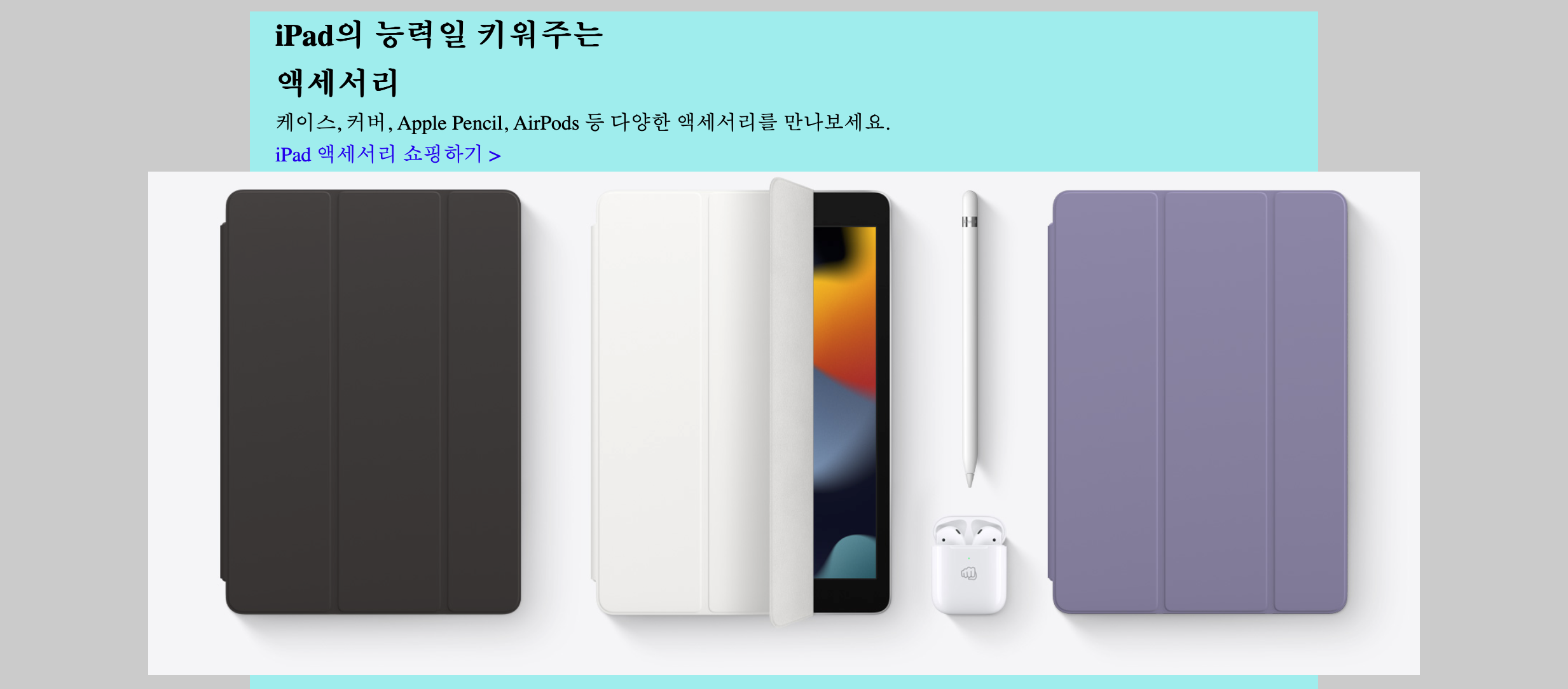
1. Target in Small Container
웹 페이지의 가로 영역을 제한하기 위해 .inner와 같은 클래스를 사용하는데, 이러한 컨테이너의 폭 제한으로 인해 정렬할 수 있는 방법에
제약이 생기는 경우에 대해 알아보자.
<div class="inner">
<section>
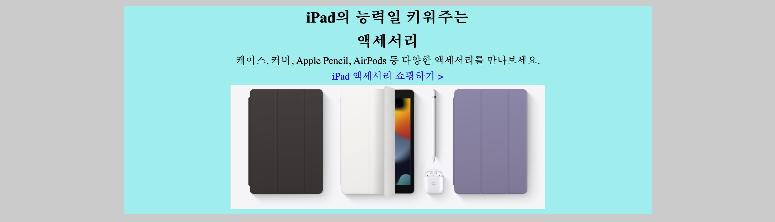
<h1>iPad의 능력일 키워주는<br>액세서리</h1>
<p>케이스, 커버, Apple Pencil, AirPods 등 다양한 액세서리를 만나보세요.</p>
<a href="javascript:void(0)">
iPad 액세서리 쇼핑하기 >
</a>
<img src="image-url" alt="다양한 액세서리 이미지">
</section>
</div>
body {
  background-color: #ccc;
}
.inner {
  position: relative;
  max-width: 800px;
  background-color: #9ee;
  margin: 10px auto;
  padding: 0 20px;
  line-height: 1.6;
}
section {
  text-align: center;
}
h1 {
  font-size: 24px;
  font-weight: 700;
}
a {
  text-decoration: none;
  display: block;
}
일반적으로 .inner 안에 들어가도록 콘텐츠를 구성하고 다음과 같은 방법으로 가운데 정렬을 한다.
img가inline속성임을 이용해 부모에text-align: center를 사용한다.- 부모의 text-align 을 수정할 수 없다면,
img를display: block으로 바꾸고margin: 0 auto를 사용한다.
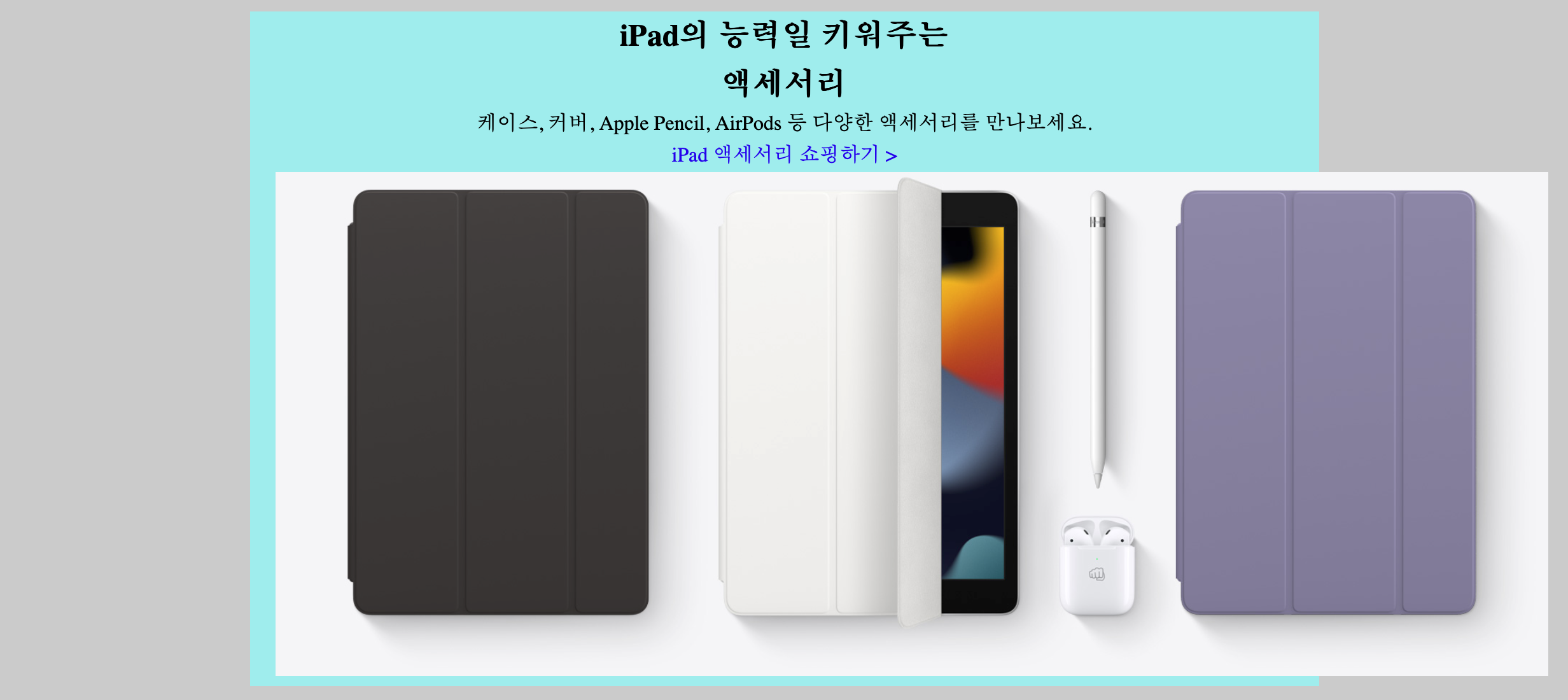
하지만 경우에 따라 위와 같이 의도적으로 body영역을 최대한 활용해 .inner보다 큰 이미지를 표현해야 할 때가 있다. 이 경우는
이미지의 크기가 부모가 가질 수 있는 영역의 크기보다 크기 때문에 text-align이나 margin으로 정렬을 할 수가 없다.
이러한 경우 absolute 와 transform 을 사용한 정렬 또는 flex 를 사용한 정렬을 사용할 수 있다.
section {
  text-align: center;
}
img {
  position: absolute;
  left: 50%;
  transform: translateX(-50%);
}
section {
  display: flex;
  flex-direction: column;
  align-items: center;
}
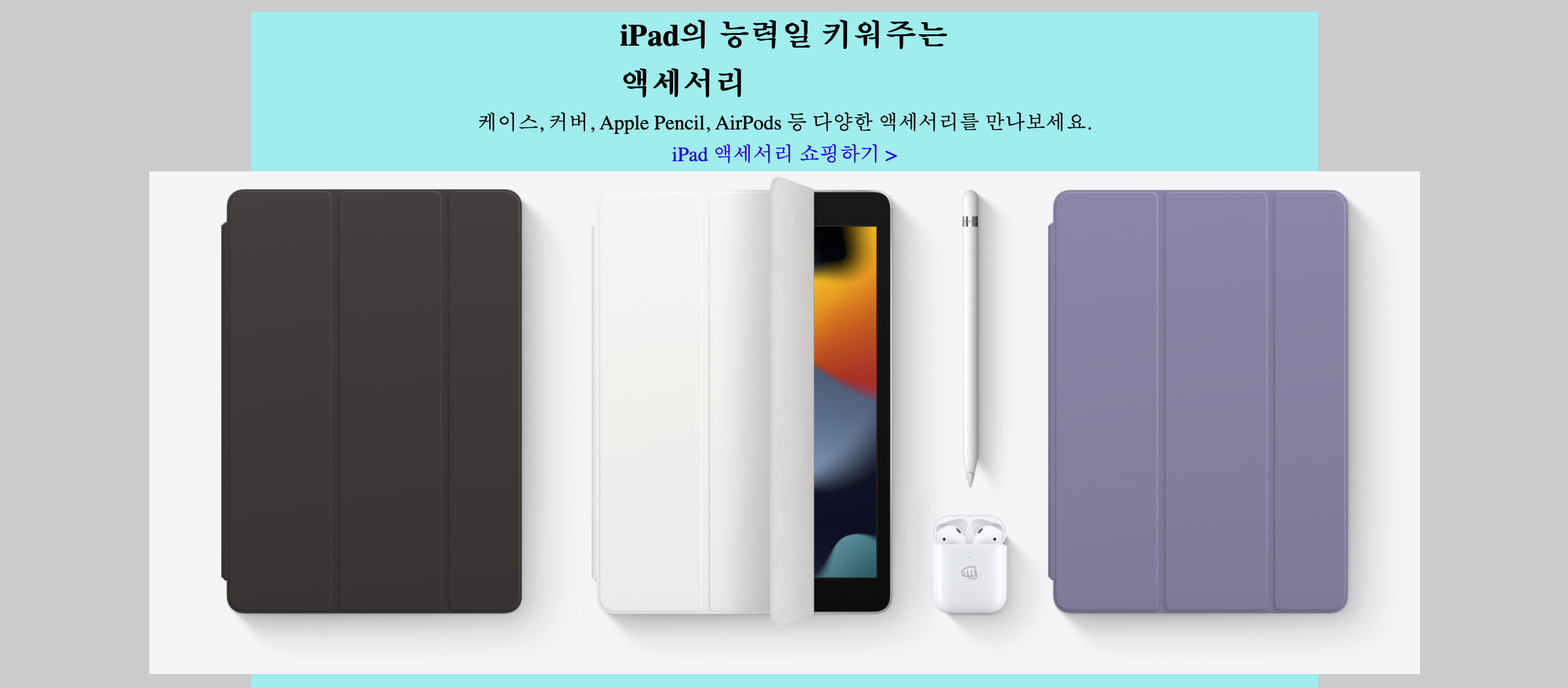
만약 다른 엘리먼트는 그대로 두고, 이미지만 가운데 정렬을 원할 경우 다음과 같이 text-align을 제거하거나, align-self를 사용할 수 있다.
img {
  position: absolute;
  left: 50%;
  transform: translateX(-50%);
}
section {
  display: flex;
  flex-direction: column;
}
img {
  align-self: center;
}
2. Media Query Responsive Design
일반적으로 웹페이지는 앱과 다르게 세로축은 별도의 제한이 없이 스크롤이 이루어지며, 가로축은 좌측 또는 우측에 Sidebar 를 두거나 양 옆에 여백을 주고 가운데로 정렬한다.
이때 일반적으로 많이 사용하는 것이 inner라는 클래스를 만들어 컨테이너가 필요한 모든 엘리먼트 내에 wrapper 를 추가하는 것이다.
.inner {
  max-width: 980px;
  margin: 0 auto;
  padding: 0 20px;
  position: relative;
}
<body>
  <div class="app">
    <header>
      <div class="inner"></div>
    </header>
    <main>
      <section>
        <div class="inner"></div>
      </section>
      <section>
        <div class="inner"></div>
      </section>
    </main>
    <footer>
      <div class="inner"></div>
    </footer>
  </div>
</body>
와 같은 식으로 사용해 전체 틀을 가운데 정렬하고, 부모 엘리먼트에 inner를 추가하는 것 만으로 position: relative를 줄 수 있는
장점을 갖는다.
하지만 margin: 0 auto를 사용하기 때문에 반응형 디자인을 할 때 유의해야 할 점이 있다. 다으 mixin을 사용해 반응형 디자인을
작업중이라고 가정해보자.
/* BREAK POINT */
$breakpoint-tablet: 1000px;
$breakpoint-mobile: 740px;

@mixin tablet {
  @media screen and (max-width: $breakpoint-tablet) {
    @content;
  }
}

@mixin mobile {
  @media screen and (max-width: $breakpoint-mobile) {
    @content;
  }
}

@mixin only-tablet {
  @media screen and (min-width: $breakpoint-mobile + 1) and (max-width: $breakpoint-tablet) {
    @content;
  }
}
일반적으로 이미지를 배치할 때 vw와 같은 단위는 사용하지 않고 px단위를 사용한다. 반응형으로 디자인 할 때 특정 컴포넌트로 구현한
컨테이너의 이미지를 tablet에서는 0.8 배로 조정하고, mobile에서는 0.4배로 조정한다고 해보자.
이 케이스를 처리하기 위한 처리 방법은 크게 두 가지로 나눌 수 있다.
1. Set ratio on Component
img {
  @include tablet {
    scale: 0.7;
    transform-origin: top left;
  }

  @include mobile {
    scale: 0.4;
    transform-origin: top left;
  }
}
transform: scale을 사용하면 개별적으로 적용한 스타일에 의해 덮어 씌워질 수가 있으니 scale을 사용했고, 뿌듯하게 마무리를 한다.
이제 특정 컴포넌트에 존재하는 모든 img는 위와 같이 scale이 적용되어 태블릿과 모바일 사이즈에 맞게 이미지가 줄어들기를 기대한다.
이미지는 줄어드는데 정렬이 깨지는 문제가 발생한다. 바로 inner가 정렬을 위해 margin: 0 auto를 사용하는 데 태블릿, 모바일 사이즈로
변경되며 inner 의 max-width 가 화면의 폭보다 작아져 사실상 margin: 0 auto가
작동하기 위해 필요한 width가 존재하지 않는 셈이 되어버리는 것이다.
결과적으로 scale은 작동했으나 정렬이 깨져버리는 문제가 발생한다.
.inner {
  max-width: 980px;
  margin: 0 auto;
  padding: 0 20px;
  position: relative;

  @include tablet {
    max-width: 692px;
  }

  @include mobile {
    max-width: 300px;
  }
}
위와 같이 mobile, tablet 사이즈에 맞도록 미디어쿼리를 사용해 max-width를 변경해주는 것이다. 만약 이미지 배치를 위해
transform: translate를 사용했다면, 각 페이지마다 위치 조정은 다시 해주어야한다. 이렇게 하면 별도의 flex 디자인을 하지 않아도
데스크탑, 태블릿, 모바일 사이즈 모두에
2. Calculate size for tablet, mobile
ratio 를 사용할 때 문제점은 일괄적으로 줄어들게 할 수 있으나 태블릿이나 모바일 화면을 수정해 재배치 해야할 경우 관리하기가 힘들다는 문제가 존재한다. 따라서 각 모드별로 사이즈를 계산해주는 것이 처음에 할 건 많아도 추후 수정이나 유지보수를 더 쉽게 해준다.
.inner {
  max-width: 980px;
  margin: 0 auto;
  padding: 0 20px;
  position: relative;

  @include tablet {
    max-width: 692px;
  }
}
이때도 마찬가지로 전체 레이아웃 정렬을 위해 inner는 지정해주어야 한다. 하지만 사실 mobile은 워낙 화면이 작기 때문에
좌우에 고정 여백을 포함하는 inner는 썩 좋은 레이아웃이 아니다. 따라서 inner를 사용한 정렬은 tablet 화면까지만 사용하고,
mobile은 flex를 사용한 정렬로 처리하는 방법이 더 좋다.
$resize-to-tablet: 0.7;
$resize-to-mobile: 0.4;

img {
  $width: 724px;
  $height: 502px;

  width: $width;
  height: $height;

  @include tablet {
    width: $width * $resize-to-tablet;
    height: $height * $resize-to-tablet;
  }
  @include mobile {
    width: $width * $resize-to-mobile;
    height: $height * $resize-to-mobile;
  }
}
각 모드별로 사이즈를 계산하고 img를 포함한 부모 엘리먼트를 flex를 적용해 가운데 정렬 해주도록 한다.