 Hogwarts
Grid Layout
Grid? Flex? What should I choose?
1. Grid and Flex 👩💻
일반적으로 Grid 보다는 Flex 를 더 많이 사용한다. 사실 Grid 는 사용하지 않아도 Block 엘리먼트를 컨테이너로 사용해 물리적 층을 나누고, Flex 와 margin 을 적절히 사용해주기만 해도 격자 모양의 레이아웃을 완전히 대체할 수 있다.
그럼에도 Grid 를 사용하는 이유는 무엇일까? 기본적으로 Flex 는 1차원이고, Grid 는 2차원이다. Flex 에 wrap을 사용하면 2줄,
3줄, … 늘릴 수 있지만 정확히는 2차원 배열이 아니고 1차원 배열을 내부 아이템의 크기를 우선해 잘라서 다음 줄에 붙여넣은 것이다.
즉, 시각적으로는 2차원일지라도 실제로는 1차원 배열이다.
반면 Grid 는 태생 자체가 2차원 Matrix 구조다. 애초에 Grid 라는 단어 자체가 ‘격자무늬’를 의미하니… 따라서 단순히 유동적인
반응형 구조를 원한다면 Flex 가 적합하고, 미리 완벽하게 정해진 2차원 레이아웃을 배치하는데 특화되었다는 것이다. 즉, 2차원 구조 배치에
Grid 가 편하기 때문에 사용하는 것이다.
물론, 이 모든 구조들은 Grid 도, Flex 도 없어도 가능하다. 과거 float 과 absolute, 가상 엘리먼트 선택자로 배치를 구현하기 힘드니 Table 을 테이블도 아닌데 레이아웃을 잡기 위해 사용하기도 했다는데, Flex 의 등장으로 레이아웃 잡기가 쉬워졌지만 여전히 넓은 영역의 레이아웃을 완벽히 제어하기는 힘든 부분이 있다 보니 생겨난 것이다.
Flex
- 컨테이너의 자식 엘리먼트를 배치할 방향(row, column, row-reverse, column-reverse)을 정한다.
- 컨테이너 안에 크기를 우선해 아이템을 우겨 넣을지(nowrap), 아이템 크기를 우선해 컨테이너를 자를지(wrap)를 정한다.
- 컨테이너 내 아이템의 레이아웃(justify-content, align-items, align-content)을 정한다.
- 아이템의 개별 위치(align-self)를 정한다.
Grid
- 배치하기 전 레이아웃에 사용할 격자배열의 개수(grid-template-rows, grid-template-columns)를 설정한다.
- (A행 B열) ~ (C행 D열)의 방식으로 아이템을 배치한다. 이때 grid, grid-area 등을 사용해 행렬을 지정하거나 네이밍을 붙여 사용한다.
Flex 는 이미 Flex, CSS Flex Layout, CSS display: flex 를 통해 많이 다루었니 참고하도록 하자.
2. Grid 👩💻
1. Properties
1. Container Properties
grid-template-rows: 생성할 행의 개수를 정의.grid-template-columns: 생성할 열의 개수를 정의.grid-template-areas: 텍스트로 네이밍화 시켜 행열을 정의.grid-auto-rows: 주로grid-template-columns와 함께 사용해 열의 크기를 자동으로 지정하도록 조건을 정의.grid-auto-columns: 주로grid-template-rows와 함께 사용해 행의 크기를 자동으로 지정하도록 조건을 정의.grid-auto-flow: Grid 레이아웃을 사용하지만, 배치를 빈 공간을 최소화 하도록 자동으로 배치되도록 하는 방법으로 row, column, dense, row dense, column dense 등의 값을 사용한다.row-gap: 행 간격을 정의.column-gap: 열 간격을 정의.
단축 속성
grid-template:grid-template-rows와grid-template-columns의 단축 속성.grid:grid-template과grid-auto-rows,grid-auto-columns,grid-auto-flow의 단축 속성.gap:row-gap과column-gap의 단축 속성.
2. Item Properties
grid-row-start/grid-row-end: 아이템의 행의 시작/끝을 정의.grid-column-start/grid-column-end: 아이템의 열의 시작/끝을 정의.
단축 속성
grid-row:grid-row-start와grid-row-end의 단축 속성.grid-column:grid-column-start와grid-column-end의 단축 속성.grid-area:grid-template-areas에서 정의한 네이밍을 지정하거나,
grid-row-start / grid-column-start / grid-row-end / grid-column-end의 순으로 정의 가능한 단축 속성.
3. Alignments
컨테이너와 아이템의 레이아웃을 정의하는 속성은 flex 와 동일하다.
justify-content: 컨테이너의 main-axis 방향의 content 단위의 레이아웃즐 정의.align-content: 컨테이너의 cross-axis 방향의 content 단위의 레이아웃을 정의.justify-items: 컨테이너 내 아이템들의 main-axis 방향의 레이아웃을 정의.align-items: 컨테이너 내 아이템들의 cross-axis 방향의 레이아웃을 정의.justify-self: 개별 아이템의 main-axis 방향의 레이아웃을 정의.align-self: 개별 아이템들의 cross-axis 방향의 레이아웃을 정의.
단축 속성
place-content:align-content와justify-content의 단축 속성.place-items:align-items와justify-items의 단축 속성.place-self:align-self와justify-self의 단축 속성.
2. Creation Rules of Grid Templates
1. grid-template-*
가장 기본적인 grid-template-*을 사용하는 템플릿 생성부터 시작해보자.
<div class="container">
  <div class="item item-1">1</div>
  <div class="item item-2">2</div>
  <div class="item item-3">3</div>
</div>
.container {
  display: grid;
  width: 1000px;
  background-color: aquamarine;
  grid-template-columns: 200px 100px 300px 100px;
}

.item {
  height: 100px;
  background-color: orange;
  border: 1px solid red;
  font: 700 30px 'san-serif';
  text-align: center;
  align-content: center;
}
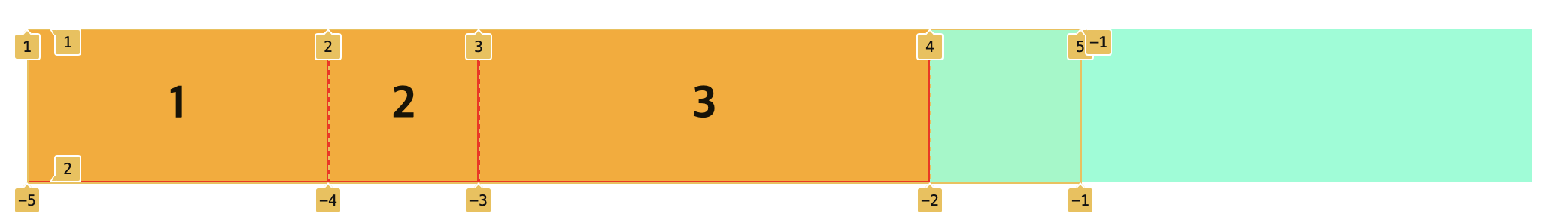
200px, 100px, 300px, 100px 4개의 셀을 만들었고, 차례대로 1, 2, 3을 채우고 한 칸이 비었다. 그리고 마지막 셀은 컨테이너를 다 채우지 못한 채 공간을 남겨두었다.
.container {
  display: grid;
  width: 1000px;
  background-color: aquamarine;
  grid-template-columns: 20% 20% 10% 20%;
}
마찬가지로 20%, 20%, 40%, 20% 4개의 셀을 만들었고, 차례대로 1, 2, 3을 채우고 한 칸이 비었다.
위와 같이 기본적으로 Grid 는 입력하는 대로 셀을 생성한다.
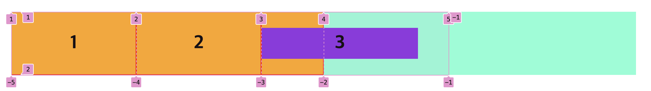
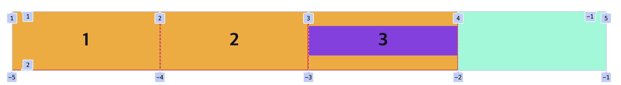
그런데 px이나 %는 크기를 완전히 고정한다. 아이템의 내부 content 가 width: 100%와 같은 단위를 사용하면 크기가 제한되지만,
고정된 크기를 갖는 자식이 있고 그 크기가 아이템 셀보다 크다면 아래와 같이 넘치게 된다.
<div class="container">
  <div class="item item-1">1</div>
  <div class="item item-2">2</div>
  <div class="item item-3">
    <div class="item-large-child">3</div>
  </div>
</div>
.container {
  display: grid;
  width: 1000px;
  background-color: aquamarine;
  grid-template-columns: 20% 20% 10% 20%;
}

.item-large-child {
  width: 250px;
  height: 50px;
  background-color: blueviolet;
  align-content: center;
}
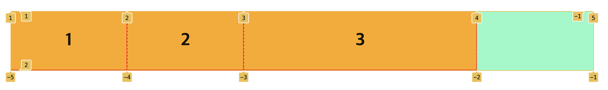
Grid 로 셀은 생성하되, Flex 를 사용할 때와 마찬가지로 내부 content 에 의해 크기가 유연하게 늘어나도록 하기 위해 우리는 fr이라는
단위를 사용할 수 있다.
.container {
  display: grid;
  width: 1000px;
  background-color: aquamarine;
  grid-template-columns: 1fr 2fr 1fr 2fr;
}
fr의 컨테이너의 전체 공간을 최솟값 비율로 잘라낸다. 따라서 기본적으로 1:2:1:2로 %를 사용할 때와 동일하지만, 필요할 경우
공간을 더 사용하도록 늘어난다.
2. fit-content
fit-content함수는 min(maximum size, max(minimum size, argument))와 같다. 예제를 사용해 좀 더 쉽게
설명해보자.
<div class="container">
  <div class="item item-1">Lorem, ipsum dolor.</div>
  <div class="item item-2">
    Lorem ipsum dolor sit amet consectetur adipisicing elit. Corrupti
    laborum fugiat nemo libero animi aspernatur ut provident excepturi ex
    unde.
  </div>
  <div class="item item-3">Lorem ipsum dolor sit.</div>
</div>
.container {
  display: grid;
  width: 1000px;
  background-color: aquamarine;
  grid-template-columns: fit-content(200px) fit-content(300px) 1fr;
}

.item {
  height: 100px;
  background-color: orange;
  border: 1px solid red;
}
fit-content(200px) fit-content(300px) 1fr이 의미하는 것은 다음과 같다.
- 첫 번째 행: 최솟값은 content 의 크기에 맞추되, 늘어날 수 있는 최댓값은 200px 이다.
- 두 번째 행: 최솟값은 content 의 크기에 맞추되, 늘어날 수 있는 최댓값은 300px 이다.
- 세 번째 행: 남은 공간을 비율로써 증가한다. 이 경우 남은 공간 전체를 사용한다.
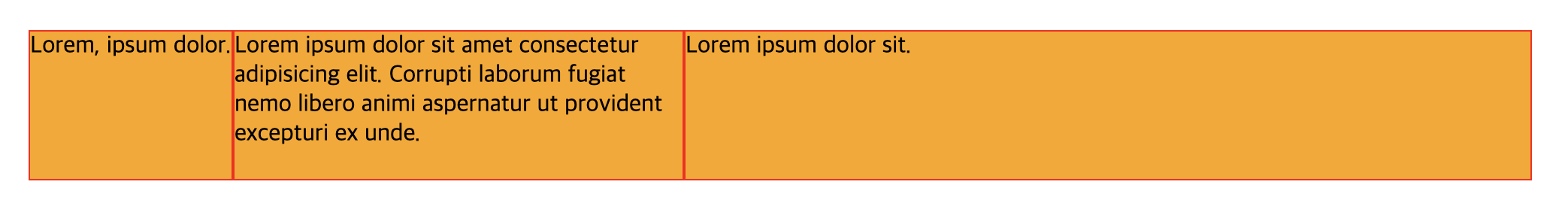
그 결과 첫 번째 행은 content 크기 만큼 너비를 가졌고, 두 번째 행은 최대로 늘어나 300px 만큼 너비를 가졌고, 나머지 공간을 세 번째 행이 가졌다.
3. repeat
2~3개 정도면 상관 없지만 행과 열이 많을 경우 같은 값이 반복된다면 일일히 적는 대신 repaet 함수를 사용할 수 있다.
<div class="container">
  <div class="item item-1">1</div>
  <div class="item item-2">2</div>
  <div class="item item-3">3</div>
  <div class="item item-4">4</div>
  <div class="item item-5">5</div>
  <div class="item item-6">6</div>
  <div class="item item-7">7</div>
  <div class="item item-8">8</div>
  <div class="item item-9">9</div>
  <div class="item item-10">10</div>
</div>
.container {
  display: grid;
  width: 1000px;
  background-color: aquamarine;
  grid-template-columns: repeat(2, 1fr) 3fr repeat(2, 2fr);
  grid-auto-rows: minmax(auto, 1fr);
}
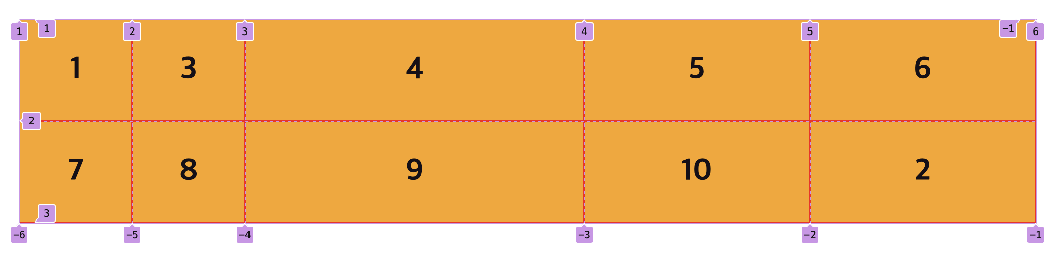
위 스타일은 1:1:3:2:2의 최솟값 비율로 셀을 생성한다. 그리고 행의 개수가 정해졌을 때, 셀을 초과하는 아이템은 Grid 가 행을
추가해 배치시킨다. 이때 행의 높이는 기본적으로 같은 행의 아이템 중 높이가 가장 큰 아이템을 포함하는 크기로 지정된다.
grid-template-columns와 grid-template-rows를 모두 정의해 셀을 전부 명시적으로 미리 생성하지 않고, 필요시 행이 추가되지만
높이값을 지정하고 싶을 경우는 grid-auto-rows에 조건을 지정하면 된다.
grid-auto-rows: 150px: 모든 행의 높이는 150px 로 고정된다. 아이템의 높이가 조건값보다 크면 겹치는 문제가 발생하므로 주의해야한다.grid-auto-rows: minmax(150px, 200px): 최소 150px 의 높이를 가지되, 추가적인 높이가 필요할 경우 모든 행이 200px 까지 늘어난다.grid-auto-rows: minmax(auto, 1fr): 기본값을 사용하되, 추가적인 높이가 필요할 경우 모든 행이 같은 비율로 필요한 만큼 늘어난다.grid-auto-rows: minmax(100px, auto): 최소 150px 의 높이를 가지되, 추가적인 높이가 필요할 경우 필요한 행만 늘어난다.
여기서 주의해야할 것이 min 또는 max 에 auto가 아닌 값을 사용할 때는 특정 행의 높이만 커지거나 작아지는 게 아니라
모든 행에 적용된다는 점이다.
4. auto-fill, auto-fit
1 ) Difference between auto-fill and auto-fit
repeat 함수를 사용할 때, 생성할 개수에 auto-fill과 auto-fit을 사용하면 생성되는 셀 자체를 유연하게 관리할 수 있다.
auto-fill 또는 auto-fit을 사용할 때는 주로 minmax 함수와 함께 사용한다.
너비를 px과 같이 고정값으로 줄 경우 auto-fill과 auto-fit이 작동할 수 없기 때문이다.
auto-fill과 auto-fit의 유일한 차이점은 ①단일 행에 ②열을 추가로 생성할 수 있는
여유 공간이 발생할 때뿐이다. 단일 행이 아닌 2행 이상일 경우는 이미 1행에서 생성 가능한 열의 공간을 모두 사용하였기
때문에 추가적인 변화가 생기지 않는다.
<div class="container">
  <div class="item item-1">1</div>
  <div class="item item-2">2</div>
  <div class="item item-3">3</div>
</div>
.container {
  display: grid;
  width: 1000px;
  background-color: aquamarine;
  grid-template-columns: repeat(auto-fill, minmax(150px, 220px));
}
1000 / 220 = 4.54...이다. 즉, 최대 4개의 열을 만들 수 있다.1000 / 150 = 6.66...이다. 즉, 최대 6개의 열을 만들 수 있다.
기본적으로 Grid 의 아이템은 최대한 늘어나려하기 때문에 max의 값을 우선 사용해 열을 생성한다.
따라서, 220px 열 4개를 만들고 남는 공간은 여백으로 둔다.
다른 조건은 그대로 두고 auto-fill만 auto-fit으로 바꿔보자. 마찬가지로 Grid 의 아이템은 최대한 늘어나기 위해 max값을
사용해 220px 열을 만든다. 하지만 열을 더 만들 수 있는 여유 공간이 있음에도 불구하고 엘리먼트 개수에 맞춰 딱 3개만 생성한다.
.container {
  display: grid;
  width: 1000px;
  background-color: aquamarine;
  grid-template-columns: repeat(auto-fit, minmax(150px, 220px));
}
대부분의 블로그에서 auto-fill은 단일 행일때 여백을 내버려두고,
auto-fit을 크기를 늘려 남은 공간을 채운다고 설명한다.
하지만 위 결과를 보면 전혀 다르다는 것을 알 수 있다. 위 두 결과를 통해 우리는 다음과 같은 결론을 내릴 수 있다.
auto-fill과auto-fit이 사용되는 위치를 생각해보자.grid-template-columns의repeat함수에서 column 을 몇 개 생성할지를 지정하는 자리에 사용한다. 따라서 이 말은 생성되는 행의 크기를 늘리거나 줄이는걸 결정하는 것이 아니라 개수를 결정하는 조건값의 자리라는 것이다. 행의 크기를 늘리거나 줄이는걸 결정하는 것은repeat함수의 두 번째 parameter 인minmax(150px, 220px)이다.
auto-fill: 엘리먼트 개수와 상관 없이 Grid 컨테이너를 채울 수 있는 만큼grid-template-columns를 계속 채워fill넣는다.auto-fit: 엘리먼트 개수에 딱 맞게fitgrid-template-columns를 생성한다.
만약 minmax(150px, 220px)를 minmax(150px, 400px)로 바꿔보면 어떨까?
1000 / 400 = 2.5다. 즉, 최대 2개의 열을 만들 수 있다.
이 경우 이미 첫 번째 행에서 열의 구조가 결정되고 두 번째 행이 생성되기 때문에 auto-fill과 auto-fit은
2개의 행과 400px 열 2개를 만들어 2x2 Matrix라는 동일한 결과를 보여준다.
2 ) Columns Size with Responsive Units fr, auto
그런데 위 결과에서 구조적인 차이점은 존재하지만, 시각적인 차이점은 존재하지 않는다. 중요한 것은 개발자 눈에만 보이는 구조적인
차이가 아니라 사용자에게 보이는 시각적인 차이이다. 이 시각적인 차이를 만들어내기 위해 repeat함수의 두 번째 파라미터인
grid-template-columns의 크기를 고정된 범위값이 아닌 fr이나 auto와 같은
유연한 단위를 사용할 것이다.
.container {
  display: grid;
  width: 1000px;
  background-color: aquamarine;
  grid-template-columns: repeat(auto-fill, minmax(150px, 1fr));
}
우선 minmax(150px, 1fr) 이 부분을 해석해보자. 위에서 기본적으로 Grid 의 아이템은 최대한 늘어나기 때문에 max의 값을
우선 사용해 열을 생성한다고 했다. 하지만 fr이나 auto와 같은 값은 auto-fill 만큼이나 유연한 값이다.
즉, auto-fill이 행을 생성할 개수를 알 수 없듯이, fr이나 auto와 같은 단위 역시 어떤 비율로 생성할지에 대한 기준이 없다는 것이다.
따라서 max값을 우선 사용해 열을 생성할 수가 없다는 것이다.
여기서 유일하게 기준값을 잡을 수 잇는 것이 바로 min값인 150px 다. 그러면 이 값을 사용해 몇 개의 열을 생성할지 auto-fill
값을 먼저 결정해야한다. 1000 / 150 = 6.66... 이므로 최대 6개의 열을 생성하고 100px 의 여유 공간이 남는다.
이제 auto-fill 은 6 으로 결정되었다. 따라서 위 스타일을 다음과 같아진다.
.container {
  grid-template-columns:
    minmax(150px, 1fr) minmax(150px, 1fr) minmax(150px, 1fr)
    minmax(150px, 1fr) minmax(150px, 1fr) minmax(150px, 1fr);
}
그러면 이제 Grid 의 아이템은 최대한 늘어난다고 했다. 모든 열이 150px에서 시작해 여유 공간 만큼 1fr의 비율로 늘어나는 것이다.
즉, 남은 여백을 모두 사용해 166.67px 열 6개를 만든다.
이번에도 다른 조건은 그대로 두고 auto-fill만 auto-fit으로 바꿔보자.
.container {
  display: grid;
  width: 1000px;
  background-color: aquamarine;
  grid-template-columns: repeat(auto-fit, minmax(150px, 1fr));
}
auto-fit은 엘리먼트 개수에 딱 맞게 columns 를 생성한다고 했다. 그러므로 auto-fit 은
이미 3 으로 결정되었다는 것을 알 수 있다. 따라서 위 스타일은 다음과 같아진다.
.container {
  grid-template-columns: minmax(150px, 1fr) minmax(150px, 1fr) minmax(150px, 1fr);
}
마찬가지로 모든 열이 150px에서 시작해 여유 공간 만큼 1fr의 비율로 늘어나므로 남은 여백을 모두 사용해 333.34px 열 3개를 만든다.
위에서 설명한 모든 것을 다시 한 번 정리해보자.
Rule 1) grid-template-columns 에 사용되는 repeat 함수의 첫 번째 파라미터 columns 의 개수
auto-fill: 엘리먼트 개수와 상관 없이 Grid 컨테이너를 채울 수 있는 만큼grid-template-columns를 계속 채워(fill) 넣는다.auto-fit: 엘리먼트 개수에 딱 맞게(fit)grid-template-columns를 생성한다.
Rule 2) grid-template-columns 에 사용되는 repeat 함수의 두 번째 파라미터 columns 의 크기
columns 의 크기가 유의미한 차이를 가지기 위해서는 max값에 fr, auto와 같은 유연한 단위를 함께 사용할 때 뿐이다.
auto-fill: 생성할 columns 의 개수를 구하기 위해min값을 사용해 컨테이너에 생성할grid-template-columns의 개수를 구한 다음max값으로 남은 여백을 모두 사용해 크기를 키운다.auto-fit: 생성할 columns 의 개수가 엘리먼트의 개수에 의해 이미 정해진다. 이후 동일하게max값으로 남은 여백을 모두 사용해 크기를 키운다.
3. Creation Rules of Grid Templates Areas
위에서 살펴본 Creation Rules of Grid Templates은 서로 다른 사이즈를 갖는 아이템을 여러 행과 열에 배치할 때 정확한 격자 구조가 필요한 경우가 아니라면 Flex 를 사용하는게 Responsive 한 디자인을 만들기도 더 쉽다.
Grid 의 가장 큰 특징은 order 속성을 하용하지 않고도 원하는 레이아웃 위치에 배치시킬 수 있다는 것이다. 아이템에 grid-row,
grid-column, grid-area 속성을 사용해 엘리먼트의 순서와 상관 없이 자유롭게 배치가 가능하다. grid-template의 영역을
지정하고 즉시 배치시키는 것이 가능하다.
1. Designate the Start to End of Items
<div class="container">
  <div class="item item-1">1</div>
  <div class="item item-2">2</div>
  <div class="item item-3">3</div>
  <div class="item item-4">4</div>
  <div class="item item-5">5</div>
</div>
.container {
  display: grid;
  width: 1000px;
  background-color: aquamarine;
  grid-template: repeat(4, minmax(100px, 1fr)) / repeat(4, 1fr);
}

.item {
  background-color: orange;
  border: 1px solid red;
  font: 700 30px 'san-serif';
  text-align: center;
  align-content: center;
}
컨테이너의 템플릿이 최소 높이를 100px 로 지정할 것이기 때문에 아이템의 높이는 기본값인 auto로 되돌려준다.
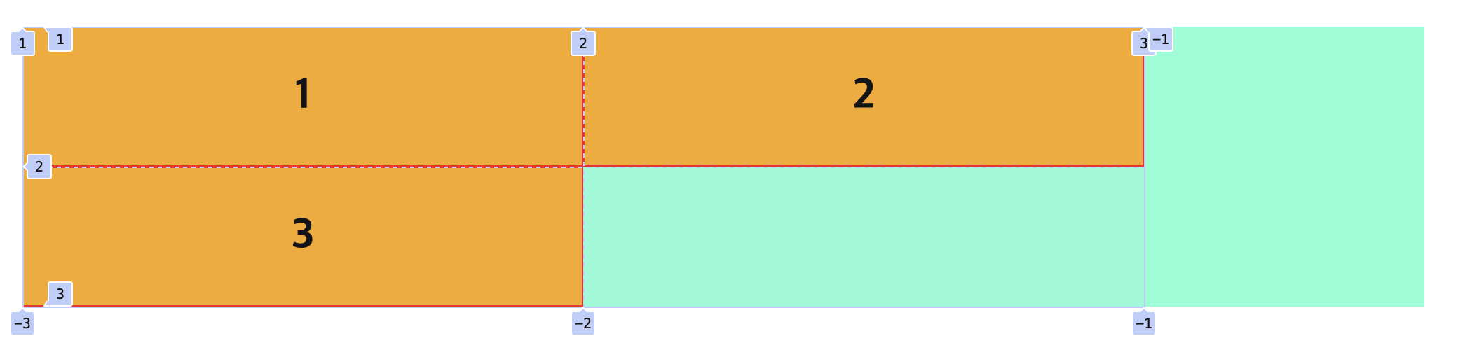
아무것도 하지 않은 상태의 배치 모습이다. 이제 grid-row, grid-column을 사용해 자유롭게 배치해볼 것이다. 배치할 때
포지션 지정은 위 사진에서 볼 수 있듯이 Cell이 기준이 아니고 각 Line이 기준이 되며, 양수와 음수를 모두 사용할 수 있다.
- 각 아이템을 감싸는 사각형 네 변의 행과 열을 지정하는 것이기 때문에 순서는 상관이 없다.
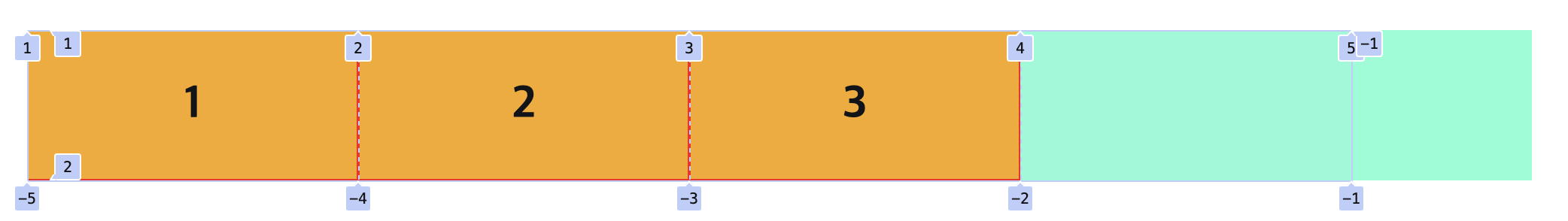
.item-1 {
  grid-row: 1 / 2;
  grid-column: 2 / 3;
}
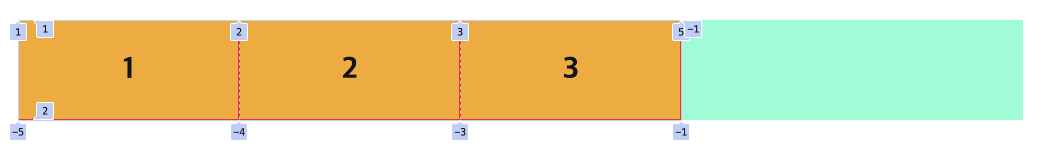
.item-1 {
  grid-row: 2 / 1;
  grid-column: 3 / 2;
}
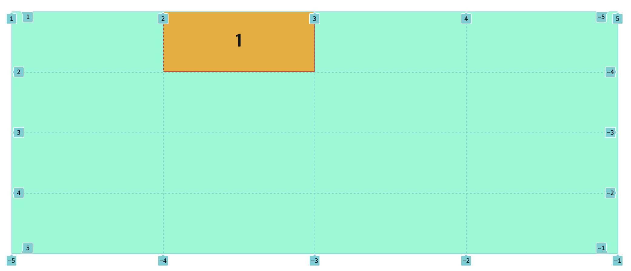
table엘리먼트를 사용하듯span을 지정할 수도 있다.
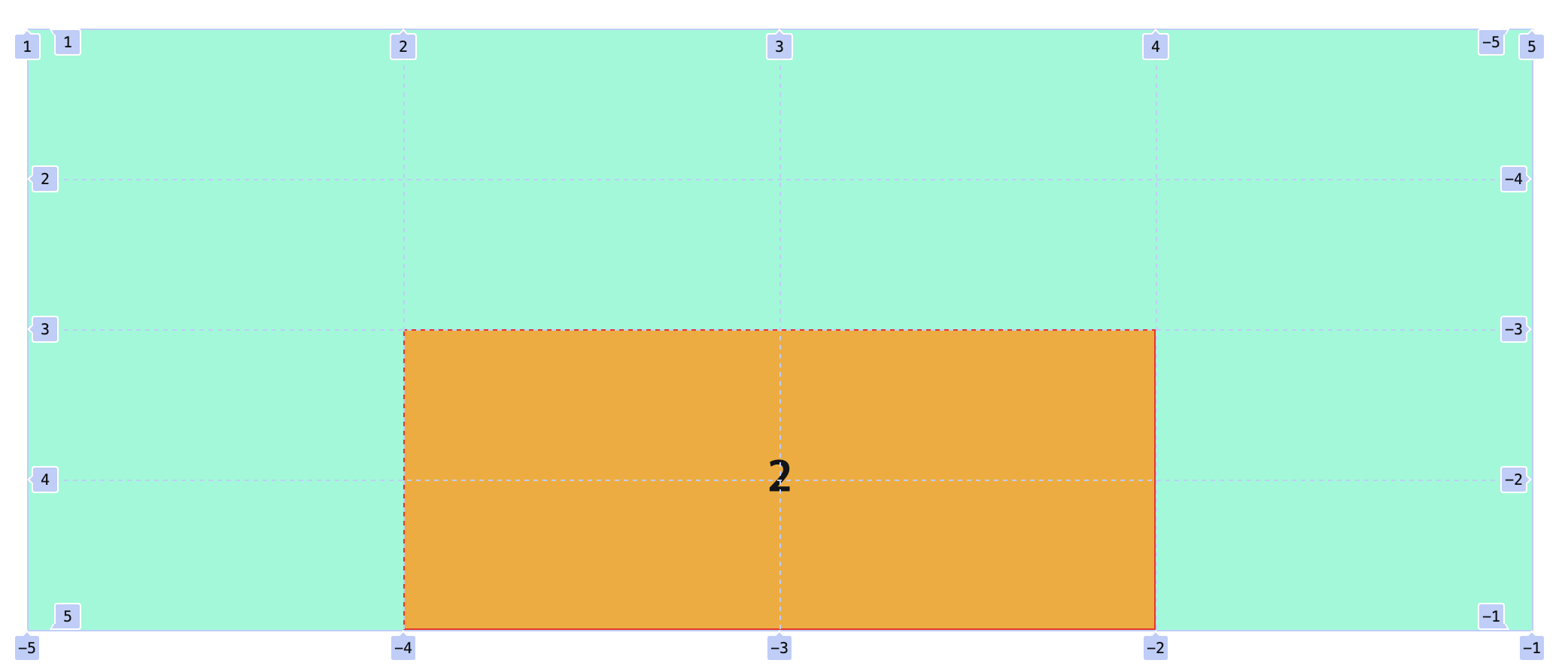
.item-2 {
  grid-row: 3 / 5;
  grid-column: 2 / 4;
}
.item-2 {
  grid-row: 3 / span 2;
  grid-column: 2 / span 2;
}
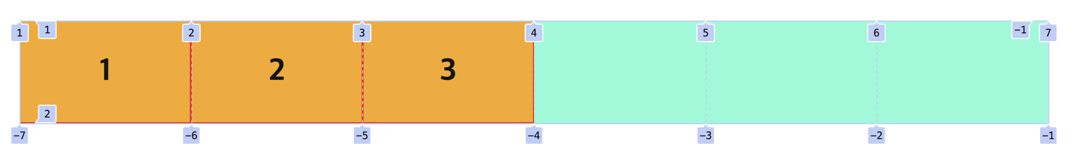
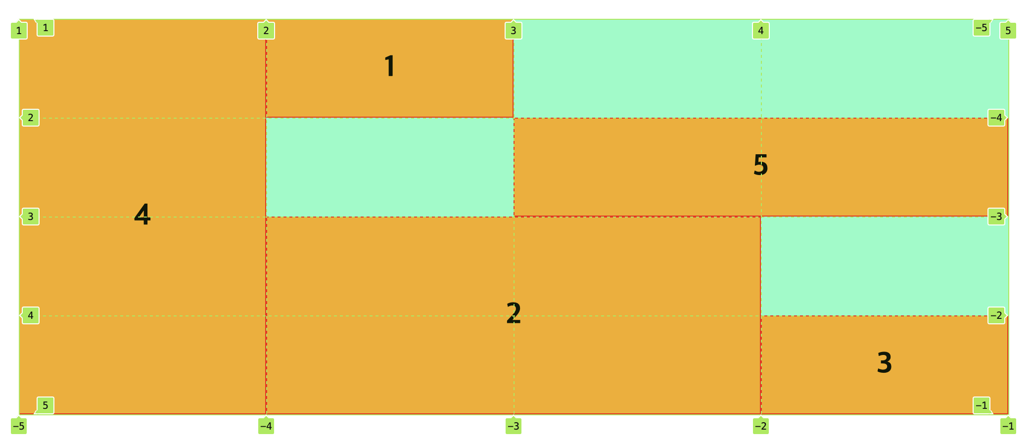
전체 스타일 영역을 완성시켜보자.
.item-1 {
  grid-row: 1 / 2;
  grid-column: 2 / 3;
}
.item-2 {
  grid-row: 3 / 5;
  grid-column: 2 / 4;
}
.item-3 {
  grid-row: -1 / -2;
  grid-column: -1 / -2;
}
.item-4 {
  grid-row: 1 / -1;
  grid-column: 1 / 2;
}
.item-5 {
  grid-row: 2 / 3;
  grid-column: 3 / 5;
}
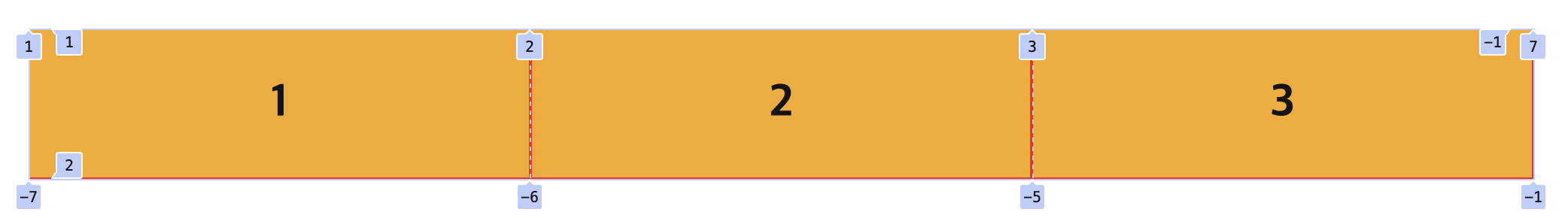
그리고 이 grid-row, grid-column는 grid-area라는 단축 속성으로 사용할 수 있다.
grid-row-start / grid-column-start / grid-row-end / grid-column-end 의 단축 속성으로 사용
.item-1 {
  grid-area: 1 / 2 / 2 / 3;
}
.item-2 {
  grid-area: 3 / 2 / 5 / 4;
}
.item-3 {
  grid-area: -1 / -1 / -2 / -2;
}
.item-4 {
  grid-area: 1 / 1 / -1 / 2;
}
.item-5 {
  grid-area: 2 / 3 / 3 / 5;
}
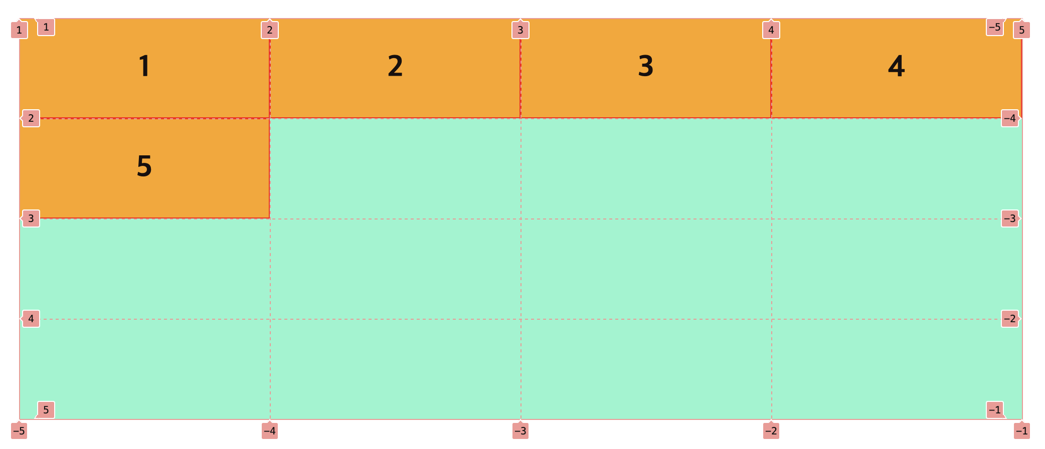
2. Named-Position
grid-area는 두 가지 방법으로 사용이 가능하다. 첫 번째 방법은 위에서와 같이 grid-row, grid-column의 단축 속성으로
사용하는 것이고, 두 번째 방법은 컨테이너에 grid-template-columns, grid-template-rows를 사용하는 대신
grid-template-areas를 사용해 네이밍 템플릿을 생성하고, 이 네이밍을 지정하는 것이다.
.container {
  display: grid;
  width: 1000px;
  background-color: aquamarine;
  grid-template-areas:
    "four one . ."
    "four . five five"
    "four two two ."
    "four two two three";
  grid-auto-rows: minmax(100px, 1fr);
}

.item {
  background-color: orange;
  border: 1px solid red;
  font: 700 30px 'san-serif';
  text-align: center;
  align-content: center;
}

.item-1 {
  grid-area: one;
}
.item-2 {
  grid-area: two;
}
.item-3 {
  grid-area: three;
}
.item-4 {
  grid-area: four;
}
.item-5 {
  grid-area: five;
}
그리고 네이밍은 주로 다음과 같이 넓은 영역의 전체 레이아웃을 구성할 때 적합하다.
<div class="container">
  <header class="item">Header</header>
  <nav class="item">Navigation</nav>
  <aside class="item">Aside</aside>
  <main class="item">
    <section>
      <div class="item item-1">1</div>
    </section>
  </main>
  <footer class="item">Footer</footer>
</div>
.container {
  display: grid;
  width: 1000px;
  background-color: aquamarine;
  grid-template-columns: 200px 1fr;
  grid-template-areas:
    "header header"
    "aside main"
    "footer footer";
}

.item {
  background-color: orange;
  border: 1px solid red;
  font: 700 30px 'san-serif';
  text-align: center;
  align-content: center;
}

header {
  grid-area: header;
}
nav {
  grid-area: nav;
}
aside {
  grid-area: aside;
}
main {
  grid-area: main;
}
footer {
  grid-area: footer;
}
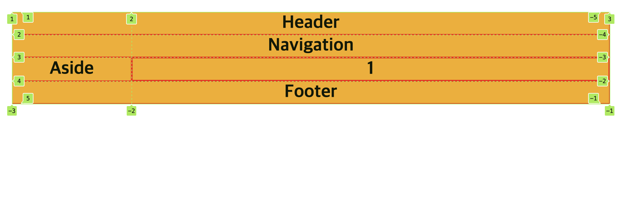
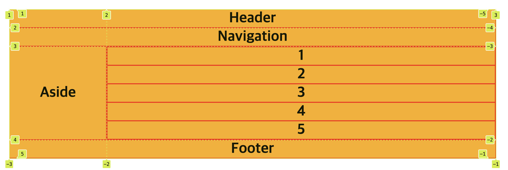
main의 구조가 바뀌거나 content 가 늘어나도 항상 같은 레이아웃을 유지할 수 있다.
<div class="container">
  <header class="item">Header</header>
  <nav class="item">Navigation</nav>
  <aside class="item">Aside</aside>
  <main class="item">
    <section>
      <div class="item item-1">1</div>
      <div class="item item-2">2</div>
      <div class="item item-3">3</div>
    </section>
    <section>
      <div class="item item-4">4</div>
      <div class="item item-5">5</div>
    </section>
  </main>
  <footer class="item">Footer</footer>
</div>
Reference
- “Grid.” MDN Web Docs. Jul. 18, 2023, accessed Mar. 25, 2024, MDN - Grid.
- “Flex.” MDN Web Docs. Jul. 18, 2023, accessed Mar. 25, 2024, MDN - Flex.